 | InDesign SDK 20.5 |
This document offers step-by-step instructions to developers embarking on Adobe ® InDesign® development tasks. It includes references to other SDK documentation, tools, and samples, and it helps developers determine which InDesign API to use for different tasks.
The content in this guide assumes you are familiar with the basics of InDesign plug-in development. If not, read Getting Started With the Adobe InDesign Products SDK, which provides an overview of the SDK, as well as a tutorial that guides you through the steps needed to build your first plug-in.
This chapter presents layout-related use cases. To solve a layout-related programming problem, like creating a spread or finding the frames in a spread, look for a use case that matches your needs.
To learn about how layout works and how it is organized, do the following:
SnippetRunner is a plug-in that lets you run code snippets provided in the SDK. Several code snippets are provided that let you explore the layout-related objects in a document.
Solution
Sample code
Related APIs
You can locate assets in the SDK that will help you program with the layout subsystem.
Solution
Solution
A document (kDocBoss) is characterized by the IDocument interface. A UIDRef that can instantiate an IDocument interface is a document.
To iterate through documents, use IDocumentList to list the documents that are open in the application. See Iterating through documents.
If you have an IDataBase pointer, call IDataBase::GetRootUID. The document associated with a database (if any) can be discovered using code like the following:
If you have a UIDRef:
If you have an interface pointer for any interface on a UID-based object (for example, an IHierarchy interface):
If you have an IActiveContext interface, call IActiveContext::GetContextDocument. The document associated with this context (if any) can be found using code like the following:
If you have a layout view, call ILayoutControlData::GetDocument. For details, in the Layout Fundamentals chapter of Adobe InDesign Programming Guide, see "The Layout Window and View" section. This call often is used by trackers (ITracker).
To work with the document the user is editing, call ILayoutUIUtils::GetFrontDocument.
Related API
Creating a document with a setup of your own choice
You can create a document and specify the number of pages, page size, and so on that the new document should have.
Solution
Sample Code
Creating a document using the default document setup
Solution Call IDocumentCommands::New with the styleToUse parameter set to nil.
Related APIs
Creating a document from a document preset
Solution
Related APIs
Solution
Use IDocumentCommands::Open.
Sample Code
Related APIs
Saving a document to a file
Solution
If you already know where the file to save into is located or you want full control over how the user is prompted for the file location, call IDocumentCommands::SaveAs.
If you want the user to be asked to identify the file to save to using the application's save file dialog, call IDocFileHandler::SaveAs.
Sample code
Related API
Saving a document
You can save a document that was saved to a file at least once before (IDocument::IsSaved indicates this).
Solution
Call one of the following
Related APIs
Solution
To close any layout windows that are open, then schedule a command to close the document, use IDocFileHandler::Close.
To process a command to close the document immediately, use IDocumentCommands::Close.
Sample code
Related API
You can examine all open documents.
Solution
Sample code
Related API
You can find the properties displayed in the File > Document Setup and File > New Document dialogs.
Solution
To get the defaults inherited by new documents, use IPageSetupPrefs on kWorkspaceBoss.
To get the settings for a document, use IPageSetupPrefs on kDocWorkspaceBoss.
Sample code
Related API
Solution
Use kSetPageSetupPrefsCmdBoss.
Related documentation
Related API
Solution
Sample code
Related APIs
Solution
A spread (kSpreadBoss) is characterized by the ISpread interface. A UIDRef that can instantiate an ISpread interface is a spread.
To iterate through the spreads (kSpreadBoss) in a document (see Acquiring a reference to a document), use ISpreadList.
If you have an IHierarchy interface on a page item, use the following:
If you have a layout view and want to find the spread being edited, use ILayoutControlData::GetSpread.
If you have a document and want to find the spread being edited, use IID_ICURRENTSPREAD on kDocBoss. This is an IPersistUIDData interface that stores the current spread for a document.
To hit test for a spread, use IPasteboardUtils.
Sample code
Related APIs
Solution
Use kNewSpreadCmdBoss.
Related APIs
Solution
Use kDeleteSpreadCmdBoss.
Related APIs
You can examine all spreads in a document.
Solution
Use ISpreadList.
Sample code
Related APIs
You can rearrange the order of spreads in a document; for example, move the spread containing pages 2 and 3 so these pages precede the spread containing pages 6 and 7.
Solution
Use kMoveSpreadCmdBoss.
Related APIs
You can duplicate a spread and the page items it contains.
Solution
To append the duplicated spread to the spread list (ISpreadList) in the target document, process kCreateSpreadFromSpreadCmdBoss.
To control where in the spread list (ISpreadList) the spread is positioned:
Solution
Use IHierarchy on kSpreadBoss.
Related documentation
Sample code
Solution
A page (kPageBoss) is characterized by the IMasterPage interface. A UIDRef that can instantiate an IMasterPage interface is a page.
If you have a document (see Acquiring a reference to a document) and want to iterate through its pages, use IPageList. See "Acquiring a reference to a page".
If you have a spread (see Acquiring a reference to a spread) and want to iterate through its pages, use the following:
If you have a page item and want to know the page, if any, on which it lies or is drawn, use the following:
If you have a layout view(kLayoutWidgetBoss), use ILayoutControlData::GetPage, to get the page being viewed by the user in layout view.
Sample code
Related API
Solution
Use kNewPageCmdBoss.
Related API
You can delete a page and the page items on it.
Solution
Use kDeletePageCmdBoss.
Related API
You can examine the pages in a document or the pages in a spread.
Solution
To iterate through all pages in a document, use IPageList.
To iterate through all pages in a spread, use ISpread.
Sample code
Related APIs
You can rearrange the order of pages in a document.
Solution
Use kMovePageCmdBoss.
Related APIs
You can duplicate a page together with the page items on it.
Solution
To append the duplicated page to the target document, use kCreatePageFromPageCmdBoss.
To control the spread in which the duplicate is made, do one of the following:
Related API
You can iterate through page items on a page.
Solution
Sample code
Related APIs
Solution
If you have a reference to a page (kPageBoss), use IGeometry::GetStrokeBoundingBox to get the size of each page.
If you have a reference to the document's workspace (kDocWorkspaceBoss), use  IPageSetupPrefs to get the default page size inherited by new pages.
Sample code
Related API
You can change the default page size in a document.
Solution
Use kSetPageSetupPrefsCmdBoss to change the document page size. When the document page size and orientation settings are changed, the changes are also applied to any pages whose size and orientation matched the document settings prior to the change.
Related API
Solution
Use IMargins. Each page (kPageBoss) has its own margins.
Sample Code
Related API
Solution
Sample code
Related API
Solution
Use IColumns. Each page (kPageBoss) has its own column guides.
Sample Code
Related API
Solution
Use the following:
Sample code
Related API
Solution
Implement a document observer interested in IID_ISPREADLIST.
Related APIs
A layer comprises a document layer with two corresponding spread layers in each spread in the document. Spread layers own page items. If you want a boss object to act as a parent for a new page item, you will need a reference to a spread layer.
Acquiring a reference to a document layer
Solution
A document layer (kDocumentLayerBoss) is characterized by the IDocumentLayer interface. A UIDRef that can instantiate an IDocumentLayer interface is a document layer.
If you have a document (see Acquiring a reference to a document) and want to examine all the document layers, use ILayerList.
If you have a document and want to find the document layer targeted for edit operations, use ILayerUtils::QueryDocumentActiveLayer.
If you have a spread layer and want to find its associated document layer, use ISpreadLayer::QueryDocLayer.
If you have a reference to a page item and want to find its associated document layer, Call ILayerUtils::GetLayerUID to get the spread layer that owns the page item, then call ISpreadLayer::QueryDocLayer.
If you have a layout view and want to find the document layer targeted for edit, use ILayoutControlData::QueryActiveDocLayer or ILayoutControlData::GetActiveDocLayerUID give the active document layer.
If you have an IActiveContext interface, use ILayerUIUtils::QueryContextActiveLayer.
Sample code
Related API
Acquiring a reference to a spread layer
Solution
A spread layer (kSpreadLayerBoss) is characterized by the ISpreadLayer interface. A UIDRef that can instantiate an ISpreadLayer interface is a spread layer.
If you have a spread (see "Acquiring a reference to a spread") and a document layer (see Acquiring a reference to a document layer), use ISpread::QueryLayer to get the content or guide spread layer (kSpreadLayerBoss) associated with the document layer.
If you have a page item and want to know the spread layer that owns it, use IHierarchy::GetLayerUID.
If you have a layout view and want to find the spread layer targeted for edit operations, use ILayoutControlData::QueryActiveLayer or ILayoutControlData::GetActiveLayerUID to get the active spread layer. This is useful if you want to parent page items created by your plug-in on the same layer the user is editing.
Sample code
Related API
Solution
Use kNewLayerCmdBoss.
Sample code
Related APIs
You can delete a layer and its associated content.
Solution
Use kDeleteLayerCmdBoss.
Related APIs
You can examine the layers in a document.
Solution
Sample code
Related APIs
Solution
Use kMoveLayerCmdBoss.
Related APIs
Solution
To append the duplicated layer to the end of the layer list (ILayerList) in the target document, use kCreateLayerFromLayerCmdBoss.
To position the duplicate at a position of choice in the layer list (ILayerList), use the following:
Related APIs
You can examine all page items assigned to a given layer on a spread.
Solution
Sample code
Solution
Use kLockLayerCmdBoss.
Related API
Solution
Use kShowLayerCmdBoss.
Related API
Solution
Related API
Solution
Related API
You can merge two or more layers and the page items assigned to them into one layer.
Solution
Use kMergeLayersCmdBoss.
Related APIs
Solution
Implement a document observer that's interested in IID_ILAYERLIST
Related APIs
Solution
A master spread (kMasterpagesBoss) is characterized by the IMasterSpread interface. A UIDRef that can instantiate an IMasterSpread interface is a master spread.
If you have a document (see Acquiring a reference to a document) and want to examine all the master spreads, use IMasterSpreadList.
If you have a page (see Acquiring a reference to a page) and want to find its master spread, use IMasterPage::GetMasterPageUID.
Related APIs
Solution
Related documentation
Related APIs
Solution
Use kDeleteMasterSpreadCmdBoss.
Related APIs
Solution
The order of master spreads in the document is given by their index order in IMasterSpreadList. To rearrange the order process, use kMoveMasterSpread.
Related APIs
You can duplicate a master spread and the page items it contains.
Solution
To append the duplicated master spread to the master spread list (IMasterSpreadList) in the target document, use kCreateMasterFromMasterCmdBoss.
To control where in the master spread list (IMasterSpreadList) the master spread is positioned:
You can create a master spread from a spread and the page items it contains.
Solution
To append the duplicated spread to the master spread list (IMasterSpreadList) in the target document, use kCreateMasterFromSpreadCmdBoss.
To control where in the master spread list (IMasterSpreadList) the master spread is positioned:
Related APIs
You can change the name or prefix of a master spread.
Solution
Use kRenameMasterSpreadCmdBoss.
Related APIs
Solution
To get a page if you do not have one, see Acquiring a reference to a page.
Follow these steps:
Sample code
Related APIs
Solution
Both pages and master pages are represented by the same boss class, kPageBoss (see Acquiring a reference to a page). To tell them apart, call ILayoutUtils::IsAMaster. A master page is a page owned by a master spread (kMasterPagesBoss). This utility encapsulates the tests that need to be made to determine this.
Related APIs
Solution
Use kApplyMasterSpreadCmdBoss.
Related APIs
Solution
Related API
Solution
To override master page items of your choice, use kOverrideMasterPageItemCmdBoss.
To override all the master page items associated with a range of spreads of pages, use IMasterSpreadUtils::CreateOverrideMasterPageItemsCmd.
Related APIs
Solution
To remove the master page item overrides of your choice, use kRemoveMasterPageOverrideCmdBoss.
To remove master page item overrides of objects that are selected, use IMasterPageSuite.
Related APIs
Solution
Implement a document observer interested in IID_ISPREADLIST.
Related APIs
Creating an empty graphic frame
Solution
The following example shows code that, given a UIDRef to a document (kDocBoss), creates a frame at the origin of the first page in the document. The parent for the frame is the spread layer associated with the first content layer in the first spread in the document.
This example creates a 100*100 point square graphic frame at the origin of the first page:
Sample code
Related API
Creating a path
Solution
Related documentation
Sample Code
Related API
Creating a text frame
Solution
Use kCreateMultiColumnItemCmdBoss.
Sample code
Related APIs
Solution
Use kDeleteCmdBoss.
Solution
Use kMoveToSpreadCmdBoss.
Solution
To move page items of your choice between layers, use kMoveToLayerCmdBoss.
To move page items that are currently selected between layers, use ILayerSuite
You can copy a page item and any nested page items it contains, either within the same document or into another document.
Solution
Use kCopyCmdBoss.
Solution
To copy page items of your own choice to the clipboard, use kCopyCmdBoss.
To copy page items that are currently selected to the clipboard, use IScrapSuite::CanCopy and IScrapSuite::Copy.
Solution
To paste page items from the clipboard into a document of your choice (the spread layer that will be the parent of the pasted objects is specified by you), use kPasteCmdBoss.
To paste page items on the clipboard into a document being edited in layout view (the spread and layer that will contain the pasted objects is designated by the view's ILayoutControlData), use IScrapSuite::CanPaste and IScrapSuite::Paste.
Solution
To remove one page item from its hierarchy, use IHierarchyUtils::RemoveFromHierarchy.
To more than one page item from its associated hierarchy, use kRemoveFromHierarchyCmdBoss.
Related API
Solution
To add one page item into a hierarchy, use IHierarchyUtils::AddToHierarchy.
To add more than one page items to a hierarchy, use kAddToHierarchyCmdBoss.
You can examine the content of a frame.
Solution
Query the frame for IFrameType to find the type of frame you have
Solution
Sample code
Related APIs
You may want to search/replace page items with certain graphic attributes. This section describes how to set search/replace options and find page items (objects) according to object style, frame type, and graphic attributes.
Solution
Sample code
Related APIs
After finding an object, you may want to replace it with new attributes or replace and find the next object. You also may want to find objects with specific attributes and replace them with new attributes. This section describes how to set search/replace options and replace page items (objects) according to both search/replace object style and graphic attributes.
Solution
Replacing shares most steps with searching. The following are the steps to set up options and perform search and replace.
Sample code
Related APIs
Solution
A ruler (kGuideItemBoss) is characterized by the IGuideData interface. A UIDRef that can instantiate an IGuideData interface is a ruler guide.
Follow these steps:
Sample code
Related API
Solution
Use kNewGuideCmdBoss.
Ruler guide properties are given by the IGuideData interface on kGuideItemBoss. When you are creating a ruler guide, you specify the coordinates in their parent's space, normally spread coordinate space.
Sample code
The following example demonstrates how to create a vertical ruler guide item on the first page of the active spread. For code simplicity, error checking is omitted.
Related APIs
Solution
Use kDeleteCmdBoss.
Solution
To move the guide relative to its current position, use kMoveGuideRelativeCmdBoss.
To move the guide to an absolute position, use kMoveGuideAbsoluteCmdBoss.
Related API
Solution
To change the color of a ruler guide, process the command created by calling IGuideUtils::MakeChangeColorGuideCmd.
To change the view threshold of a ruler guide, use kSetGuideViewThresholdCmdBoss.
To change the horizontal or vertical orientation of a ruler guide, use kSetGuideOrientationCmdBoss.
Related API
Solution
To show or hide all guides, use kSetGuidePrefsCmdBoss.
To show or hide ruler guides associated with a specific layer, use kShowGuideLayerCmdBoss.
Related API
Solution
To lock or unlock all guides, use kSetGuidePrefsCmdBoss.
To lock or unlock ruler guides associated with a specific layer, use kLockGuideLayerCmdBoss.
Related API
Solution
Related API
Solution
Related APIs
Solution
If you have a reference to a document (kDocBoss), use IPresentationList on kDocBoss to get the windows (kLayoutPresentationBoss) that are open on a document (see Acquiring a reference to a document).
If you have an IActiveContext interface, use IActiveContext::GetContextView to get the layout view associated with the context. From there, code like that in the following example gives the layout window:
This example shows how to navigate from Layout View to Layout Window via IWidgetParent:
To work with the window displaying the document that the user is editing, use ILayoutUIUtils::QueryFrontView to get the layout view (kLayoutWidgetBoss) of the front document. See the example for the code that then gets the layout window.
To hit test for a layout window or iterate through windows on a document, use IDocumentUIUtils.
Related API
Solution
Use kOpenLayoutCmdBoss.
Related documentation
Sample Code
Solution
Use kCloseLayoutCmdBoss.
Related documentation
Related API
Solution
Related API
Solution
If you have an IActiveContext interface, use IActiveContext::GetContextView.
If you have a layout window (kLayoutPresentationBoss) reference, use IPanelControlData::FindWidget. Call with widgetId=kLayoutWidgetBoss) to get the window's layout view.
To work with the layout view that is editing the document:
Related API
Solution
Use kSetSpreadCmdBoss.
Sample Code
Related APIs
Solution
Related APIs
Solution
To fit a spread in a layout view:
To fit a page in a layout view:
Related APIs
You can increase or decrease the magnification applied by the window.
Solution
Process one of the zoom-related commands created by ILayoutUIUtils; for example, ILayoutUIUtils::MakeZoomCmd.
This chapter presents text-related use cases. To learn about how text layout is organized, do the following:
To solve a text-related programming problem, do the following:
SnippetRunner is a plug-in that lets you run code snippets provided on the SDK. Several code snippets are provided that let you explore the text-related objects in a document.
Solution
Sample code
Related APIs
Related APIs and their descriptions
| API | Description |
|---|---|
| ICompositeFont | Represents a composite font. |
| IDocFontMgr | Represents the persistent fonts in the session or document. |
| IDocumentFontUsage | Provides a shell around IUsedFontList and IFontNames. |
| Facade::ITextWrapFacade | Provides high-level APIs for dealing with text wrap. |
| IFontFamily | Represents a group of related styles of fonts. |
| IFontGroup | (Not derived from IPMUnknown) represents a font family within cooltype. |
| IFontInstance | (Not derived from IPMUnknown) is an instance of a cooltype font, characterized by a particular font size. |
| IFontMgr | Provides access to the CoolType font wrappers in the session. |
| IFontNames | Allows access to the set of fonts on which a placed asset (PDF or EPS) depends. |
| IFrameContentSuite and facade::IFrameContentFacade | Convert a page item to a container for text and manipulate the size of the page item relative to the text content. |
| IFrameList | Provides a list of containers (frames) used to display the text from a single story. |
| IHierarchy | Defines the relations of the containers within the document. |
| IMissingFontSignalData | Provides the context for missing font responders. |
| IMultiColumnTextFrame | Provides access to the associated story, frame list, and the range of text displayed. |
| IParcel | Represents an area within a frame into which some subtext for a story can flow; for example, a table cell or story footnote. |
| IParcelList | Represents a set of parcels into which some subtext for a story can flow; for example, footnotes that span multiple page items. |
| IPMFont | (Not derived from IPMUnknown) represents a single font within cooltype. |
| ITextAttrFont | Represents the text attribute defining the font applied to text. |
| ITextAttributeSuite | Represents the capabilities and functionality that can be applied to the formatting of selected text. |
| ITextFrameColumn x | Represents the capabilities and functionality that can be applied to the formatting of selected text. |
| ITextFrameOptionsSuite | Provides the ability to access and manipulate text frame options (like number of columns or gutter width) on the session workspace, document workspace, or a set of text containers. |
| ITextModel | Represents a story within the document. |
| ITextModelCmds | Provides prepackaged commands that modify a text story. |
| ITextParcelList | Provides the relationship between the rendered text (known as the wax) in a parcel list and the parcel list. |
| ITextSelectionSuite | Represents capabilities and functions that can be applied to selected text. |
| ITextUtils | Provides higher level APIs to modify and access text content. |
| IUsedFontList | Represents fonts used within text frames. |
| IWaxStrand | Represents the final rendered text. It provides an iterator (IWaxStrand::NewWaxIterator) that allows the individual lines of rendered text (wax) to be accessed. |
A text story represents a single body of textual content within the application. It encompasses the raw text and formatting applied to this text; it can be viewed as a container for all this information. This section describes common use cases when working with text stories.
For more information see the "Text Fundamentals" chapter in Adobe InDesign Programming Guide.
A document can contain zero or more stories. You can access the set of stories contained in a single document.
Solution
A document is represented by the kDocBoss boss class.
IStoryList on kDocBoss maintains the stories contained within a document. A document can contain stories purely for internal use.
Use IStoryList::GetUserAccessibleStoryCount and IStoryList::GetNthUserAccessibleStoryUID to identify and access the user-accessible stories in a document.
Use IStoryList::GetAllTextModelCount and IStoryList::GetNthTextModelUID to access all stories in a document.
Use IStoryList::GetNthTextModelAccess to test whether a particular story is user accessible.
Sample code
You can get the story that maintains the current text focus.
Solution
When dealing with a selection, you need to implement a selection extension pattern, which allows you to participate in the selection subsystem. As part of this extension pattern, you provide an add-in implementation of a concrete selection interface on the kTextSuiteBoss (and associated add-in implementation of an abstract selection interface on the kIntegratorSuiteBoss). For details on implementing this extension pattern, see the "Selection" chapter of Adobe InDesign Plug-in Programming Guide.
Use ISelectionUtils::GetActiveSelection to obtain your abstract selection, which can then provide access to the concrete selection.
ITextTarget (on kTextSuiteBoss) resides on the same boss class as your selection.
Use ITextTarget::QueryTextModel to get the text model for the selection. This interface provides other information about the text selection, like its range.
To manipulate the model through the selection, add a new suite interface onto the kTextSuiteBoss class. This provides the mechanism required to keep actual selection types separate from the selection architecture. For an example, see the use of the interface IDataUpdaterSuite in the XmlDataUpdater plug-in.
You can get from a page item to (potentially) the text story representing the text it contains.
Solution
Use ITextUtils::GetSelectedTextItemsFromUIDList on kUtilsBoss to extract text item entities from a list of UID items. Specifying a nonnil UIDList for either of the out parameters causes the associated UIDList to be populated with the set of page items containing text.
IGraphicFrameData::GetTextContentUID (the interface is on the page item) provides kInvalidUID if the page item is not a text container. This more direct approach is more effective if you are interested only in whether the page item contains text, rather than getting access to the text.
Sample code
You can create a story programmatically.
Solution
Stories are rarely created directly. Normally, they are created as a side effect of creating a text frame.
Sample code
Related APIs
You can delete a story programmatically.
Solution
Stories are rarely deleted directly. Normally, a story is deleted as a side effect of deleting the last text frame item that displays its text.
Sample code
Related API
You can invoke your code on story creation.
Solution
Implement a responder extension pattern. Specifically, a custom implementation of IResponder is required (indicating a service ID of kNewStorySignalResponderService). To implement the responder, use the CResponder helper implementation.
The extension pattern requires an implementation of IK2ServiceProvider. The API provides an implementation; the implementation ID is kNewStorySignalRespServiceImpl.
When the responder is called, query the ISignalMgr parameter for the INewStorySignalData interface. This interface provides access to the command that created the story and the underlying text model. Set the global error state from within the respond, to suppress story creation.
You can get called when a story is deleted.
Solution
Implement a responder extension pattern. Specifically, a custom implementation of IResponder is required (indicating a service ID of kDeleteStoryRespService). To implement the responder, use the CResponder helper implementation.
The extension pattern requires an implementation of IK2ServiceProvider. The API provides an implementation; the implementation ID being kDeleteStoryRespServiceImpl.
When the responder is called, query the ISignalMgr interface for the command (ICommand) invoked for the delete operation. Set the global error state, to suppress the story deletion.
You can get from the text model (kTextStoryBoss, the main boss class that represents a story) to a particular strand. Strands are a low-level abstraction; there are higher level APIs that allow you to accomplish most tasks.
Solution
You can get a particular strand from the text model (ITextModel) interface on the text story (kTextStoryBoss), using ITextModel::QueryStrand.
Sample code
Related API
Many operations require working on the raw text in a story; for example, spell checking, find/replace, and word count. This section includes use cases that deal purely with the text of a story.
For details, see the "Text Fundamentals" chapter of Adobe InDesign Programming Guide.
For related APIs, see the following:
You can access the raw content (the body of characters) of a text story.
Solution
Use text iterators to access the raw content of a story. For an example, see SnpTextModelHelper::GetWideStringFromTextRange.
The compose scanner (IComposeScanner) on the story (kTextStoryBoss) supports the CopyText method. For an example of its use, see SnpManipulateTextFootnotes::GetStoryThreadContents.
You can calculate the number of paragraphs in a story.
Solution
The IComposeScanner interface, available on kTextStoryBoss, has a method (FindSurroundingParagraph) that determines the extent of each paragraph in the story. It can be used to scan a story, counting the paragraphs.
You can use a similar technique with the low-level IStrand interface on the paragraph attribute stand (kParaAttrStrandBoss) For each paragraph, a run exists on the IStrand interface on the paragraph attribute strand (kParaAttrStrandBoss). The number of runs is equal to the number of paragraphs. Iterate using IStrand::GetRunLength on all runs in the strand.
Sample code
You can calculate the number of words in a story.
Solution
The IComposeScanner interface, available on kTextStoryBoss, has a method (FindSurroundingWord) that determine the extent of each word in the story. It can be used to scan across a story, counting the words.
You can insert text into a story, using text commands or via a text selection.
Solution
If there is a valid text selection, use ITextEditSuite::InsertText (after testing ITextEditSuite::CanEditText to determine whether the operation is allowed).
To insert characters at an arbitrary position in a story, use the command generated by ITextModelCmds::InsertCmd. ITextModelCmds is available on the kTextStoryBoss. Use the ITextModel::IsModelLocked method to test whether a lock exists on the text model.
Put the inserted data into a reference counted K2::shared_ptr with type WideString, and pass it into the InsertCmd, so the memory occupied by the data is purged when no one is referencing it. For more information, see K2SmartPtr.h.
Sample code
You can delete a range of text from a story, using text commands or via a text selection.
Solution
If there is a valid text selection, use ITextEditSuite::Delete to delete selected text (after testing ITextEditSuite::CanEditText to determine whether the operation is allowed).
To delete an arbitrary range of text, use the command generated by ITextModelCmds::DeleteCmd. ITextModelCmds is available on kTextStoryBoss.
Before performing the modification, check the model to ensure it is not locked (ITextModel::IsModelLocked).
Sample code
You can replace a range of text with alternative text.
Solution
Use the command generated by ITextModelCmds::ReplaceCmd to replace text within a story.
Put the replaced data into a reference counted K2::shared_ptr with type WideString, and pass it into the InsertCmd, so the memory occupied by the data is purged when no one is referencing it. For more information, see K2SmartPtr.h.
Before performing the modification, check the model to ensure it is not locked (ITextModel::IsModelLocked).
Sample code
You can programmatically copy text within or across text stories.
Solution
To copy text within and between stories, use the command provided by the ITextUtils::QueryCopyStoryCommand utility facade. Variants of this API allow common use cases of text copy to be handled; for example, copying a range from source to a range in the destination and copying the complete source story to the end of the destination story.
To copy text within the same story, source and destination references should be the same. When specifying ranges for this operation, take care they do not overlap.
Before performing the modification, check the model to ensure it is not locked (ITextModel::IsModelLocked).
You can programmatically move text within or across text stories.
Solution
To move text within and between stories, use the command provided by the ITextUtils::QueryMoveStoryCommand utility facade. Variants of this API allow common use cases of text move to be handled; for example, moving a range from source to a range in the destination and moving the complete source story to the end of the destination story.
To move text within the same story, source and destination references should be the same. When specifying ranges for this operation, take care they do not overlap.
Before performing the modification, check the model to ensure it is not locked (ITextModel::IsModelLocked).
Sample code
Given a story comprises one or more text story threads, each of which represents a discrete subcomponent (like table cell text or a footnote), you may need to iterate or otherwise discover text story threads within a story.
Solution
To be able to deal with distinct text units like table cell contents or footnotes, a hierarchy is built on top of the simple linear model maintained by the various strands. The nodes of this hierarchy are represented by text story thread dictionaries (ITextStoryThreadDict, maintained on boss classes representing the subcomponent, such as kFootnoteReferenceBoss). The root of the hierarchy is the primary story thread. (All stories have a primary story thread; see ITextModel::GetPrimaryStoryThreadSpan.). Story thread dictionaries maintain a mapping to a set of text story threads (ITextStoryThread). For example, the story thread dictionary for a table is on the table model (kTableModelBoss). It maintains the mapping to the actual text story threads for each cell (kTextCellContentBoss). The dictionary provides the mechanism required to iterate through all text story threads it manages.
The story (kTextModelBoss) models the inherent hierarchy using ITextStoryThreadDictHier. Using ITextStoryThreadDictHier::NextUID, you can access all story threads in the order in which they appear within the story.
With this background, the solution becomes apparent. For each text story thread dictionary obtained from ITextStoryThreadDictHier::NextUID, obtain the supported set of text story thread keys using ITextStoryThreadDict::GetFirstKey/GetNextKey before calling ITextStoryThreadDict::QueryThread.
Sample code
If you have a valid text selection, you can determine the text story thread that maintains the contents,
Solution
When dealing with a selection, you need to implement a selection extension pattern, which allows you to participate in the selection subsystem. As part of this extension pattern, you provide an add-in implementation of a concrete selection interface on the kTextSuiteBoss (and associated add-in implementation of an abstract selection interface on the kIntegratorSuiteBoss). For details on implementing this extension pattern, see the "Selection" chapter of Adobe InDesign Plug-in Programming Guide.
Use ISelectionUtils::GetActiveSelection to obtain your abstract selection, which can then provide access to the concrete selection.
ITextTarget (on kTextSuiteBoss) resides on the same boss class as your concrete selection.
ITextTarget::QueryTextModel provides the text model for the current selection. This interface provides access to the text model as well as information on the range to which the selection applies.
Use ITextModel::QueryStoryThread along with the index provided by the ITextTarget, to obtain the text story thread.
You can insert an inline graphic into the story at a particular position.
Solution
An inline graphic is represented within the text of a story using the special character kTextChar_Inline; known as the anchor character. This character indicates to the text subsystem that there is an inline item embedded at this position. The inline itself is represented on the owned item strand (kOwnedItemStrandBoss). The owned item strand maintains a (persistent/UID-based) reference to the actual inline item (kInlineBoss) through the IItemStrand interface.
Two actions are required to add an inline to a story:
Sample code
Solution
Positioning information for an inline object is maintained on the IAnchoredObjectData interface for the inline. There are many options that define the placement of the inline relative to the anchor point within the text. You can modify the position of an inline using the IAnchoredObjectSuite interface or the kChangeAnchoredObjectDataCmdBoss low level command.
Sample code
Solution
Delete the character that anchors the object into the story.
You can create a footnote and insert it into an existing story.
Solution
A footnote is maintained within the story as a special inline object. The character used in the story to indicate a footnote reference is kTextChar_FootnoteMarker. The footnote is represented on the owned item strand by a reference to a kFootnoteReferenceBoss. The textual contents for the footnote reside in a distinct text story thread within the story.
Three actions are required to add a footnote to a story:
Sample code
Solution
Delete the footnote's anchor character.
Sample code
Given a range or selection within a text story, there are some operations that are invalid if that range is within a footnote. You can determine whether the range or selection is within the text of a footnote.
Solution
Use ISelectionUtils::QueryActiveTextSelectionSuite on the kUtilsBoss to get the active text selection (ITextSelectionSuite).
ITextSelectionSuite::IsTextSelectionInFootnote indicates whether the selection is in a footnote.
To determine whether an arbitrary text range is within the text story thread of a footnote, use the ITextUtils::IsFootnote from the kUtilsBoss class. The API can be used to determine whether the range is within a footnote and to get the footnote reference (kFootnoteReferenceBoss) object through the parameter list.
You can determine whether it is legal for a defined page item to have text along its path.
Solution
A page item can have text flowed along its path if it has one path with at least one segment with at least two points (that is, it cannot be a compound path or a single point). The page item cannot be an inline item.
Sample code
Solution
IPageItemTypeUtils::IsTextOnAPath on the kUtilsBoss has an API that returns true if the page item has text along its path.
Solution
Use the kAddTextOnPathCmdBoss API command to create the text model that supports the text on the path. This newly created text model is a candidate for traditional text content manipulation operations.
Sample code
Solution
To navigate from a page item with associated text on its path, get the IMainTOPData interface from the spline object. You can get the text frame associated with the text on the path using IMainTOPData::QueryTOPFrameData. From the ITOPFrameData interface (on the kTOPFrameItemBoss object), you can get the ITextFrameColumn and call the QueryTextModel interface to get the text model interface. You can manipulate the text model using the mechanisms described above.
Sample code
Solution
To delete the text on a path for a spline item, use the kTOPDeleteCmdBoss API command. Specify the spline to be processed on the item list.
Sample code
Solution
The text composition engine provided with the application automatically replaces special characters in the text stream with page numbering and/or section header text (the exact format defined by the preferences). For page numbering, insert the kTextChar_PageNumber character into the text story. For headings, insert the kTextChar_SectionName special character into the text model.
This section contains use cases related to formatting text and managing text styles within the application.
Text is formatted to give it a particular look, like underlined or in a particular font face. The desired look of text can be described by a set of attributes; for example, a point size or text color. Attributes are defined to be either character or paragraph based. Character attributes can be applied to text at any granularity, from a single character to the entire story. Paragraph attributes are settings that work at the granularity of a paragraph (for example, hyphenation behavior or horizontal justification).
Generally, attributes are grouped together to describe a common theme (for example, a heading or body text); these themes are called styles. Attributes also can be applied to text independently of any applied style. These attributes are said to be overrides, as they override the definition of that attribute in the style.
A style is a mechanism for identifying groups of attributes. In the application, character and paragraph styles are supported (along with table styles, which are not considered here). Character styles contain only character-based attributes. Paragraph styles can contain either character- or paragraph-based attributes. The style can be queried to determine its type (IStyleInfo::GetStyleType). All text has a character and paragraph style applied to it (represented on the character and paragraph attribute strands, respectively).
For more information, see the "Text Fundamentals" chapters of Adobe InDesign Programming Guide.
Styles can exist for all documents on a session or a particular document. They are accessed through the workspace and are modeled within the application using the persistent kStyleBoss. Session workspace styles are inherited into the document workspace (thus preventing the style not being available at a later date or on another machine).
You can access the set of styles available to a particular document.
Solution
Styles can exist on either the session or document workspace. Session workspace styles are available for all documents; document workspace styles are available only for that document. The workspace boss classes support two implementations of the IStyleGroupManager interface, IID_IPARASTYLEGROUPMANAGER for paragraph styles and IID_ICHARSTYLEGROUPMANAGER for character styles. The interface provides the GetRootHierarchy() API, which returns a pointer to IStyleGroupHierarchy at the root level. Use IStyleGroupHierarchy to iterate across the supported styles.
Sample code
The IStyleGroupManager::FindByName(PMString fullPath) method returns the UID of a kStyleBoss in the style group hierarchy specified in the fullPath. The fullPath to pass into the method is the "internal" path name. Normally, you cannot construct an internal path name using a string literal, because the internal path uses a path delimiter that is not accessible by keyboard. This is necessary because a style name can include most of the common path delimiters (like ":"and "/"). A main reason for this is to provide backward compatibility for styles created before the style group concept was introduced in InDesign CS4. Previously, many users named styles with ":" to better organize their styles. Therefore, if you construct a PMString path with string literals and pass it into the IStyleGroupManager::FindByName(PMString fullPath) method, you are asking IStyleGroupManager to find a style with the passed-in name at the root level. For example, if you pass "My Group:Style 1" (as PMString) into FindByName(), IStyleGroupManager still treats the whole string as the style name, not as the path (as you expect). This string literal is used to find the style with the name "My Group:Style 1" on the root level.
To use the IStyleGroupManager::FindByName(PMString fullPath) method, pass in a valid internal path for a style. To get the internal path, use the IStyleGroupHierarchy::GetFullPath() method. IStyleGroupHierarchy is aggregated on three bosses: kStyleGroupHierarchyBoss, kStyleGroupBoss, and kStyleBoss. This means to find a style by name using a internal full path, you need to have previously accessed the style or style group. For example, if you have a UID for a style, you can use the UID to query its IStyleGroupHierarchy and ask for its internal full path using GetFullPath(); later, you can use the path to find the style again.
Solution
Use SnpApplyTextStyleAttributes::CreateParaStyle.
As explained in Accessing a style using its path, there is no easy way to specify a path to find a style. IStyleGroupManager defines an overloaded FindByName(UID parent, const PMString& name), so if you have access to a style group UID and you know the name of style you are looking for, you can use this method to find the corresponding style. It returns the UID of the style whose name matches the passed name within the specified parent style group node.
Solution
Use SnpApplyTextStyleAttributes::ApplyParaStyle.
You can determine the style a particular kStyleBoss represents.
Solution
From the kStyleBoss, use the IStyleInfo::GetStyleType API.
InDesign has the concept of a root style. All other styles inherit from the root style, maintaining within their definition only how they differ from their parent. For a particular style, you can determine its parent; that is, the style on which it is based.
Solution
IStyleInfo on kStyleBoss provides the API IStyleInfo::GetBasedOn. This provides either the parent style UID or kInvalidUID if the style is the root.
You can determine what a style means to a particular attribute; that is, what value for a particular attribute would be applied to text (as long as there are no local overrides).
Solution
Since styles do not maintain a full set of attributes (they record only the differences from the style on which they are based), you can determine the setting for a particular attribute by obtaining the list of attributes supported by the style (ITextAttributes). Querying this interface for the particular attribute of interest (ITextAttributeList::QueryByClassID, say) returns either the attribute (if this style specifies it) or nil. In the latter case, the parent style needs to be interrogated to determine whether it specifies the attribute. Continue until the attribute is found.
For paragraph styles, the attribute is found at some point; the terminal case is the root style. For character styles, the root style is empty, deferring the attribute values to the paragraph style. In this case, if the attribute is not defined by any (parent) character style, the root paragraph style provides the value.
You can create a new character or paragraph style.
Solution
Use kCreateParaStyleCmdBoss or kCreateCharStyleCmdBoss. The item list for each of these commands identifies the workspace the style is to be added to (generally the session or document workspace). IStylePositionInfo allows the style to be created inside a style group, as explained in the "Text Fundamentals" chapter of Adobe InDesign Programming Guide. To create a style group, use kCreateStyleGroupCmdBoss.
Sample code
You can modify a style by either modifying the attributes the style represents or changing some aspect of the style, like its name.
Solution
Changes to styles are handled through the kEditTextStyleCmdBoss command. The UIDData interface on this boss class identifies the style being manipulated. The ITextAttributes interface identifies the list of attributes that will exist in the style after the command is processed (this is an absolute list, so to modify an existing attribute on the style, representing the attribute within this list will update it in the style). The IStyleInfo interface defines the metadata (like style name), the style it is based on, and what the next style should be (for paragraph styles).
There are utility methods in IStyleUtils (on the UtilsBoss) that construct the kEditTextStyleCmdBoss commands. These methods allow the caller to determine sets of attributes that should be added or deleted from the style (rather than forcing them to define an absolute set that is left in the style once the command completes).
Related API
You can delete a style from a style name table. There are implications for text already formatted with the deleted style.
Solution
Use the kDeleteParaStyleCmdBoss or kDeleteCharStyleCmdBoss command. The command boss supports IBoolData. Setting this interface indicates formatting should not be stripped from text using the style; the formatting is maintained by a set of local attribute overrides. The IUIDData interface (identified with the ID IID_IREPLACEUIDDATA interface) allows an alternate style to be specified as a replacement style. The style to be deleted is identified through the IUIDData (default IID) interface. The item list identifies the workspace from which the style is deleted.
Sample code
You can apply a style to a range of text or the current selection.
Solution
If you are dealing with a selection, use ISelectionUtils::QueryActiveTextSelectionSuite on the kUtilsBoss to get the active text selection (ITextSelectionSuite). The same boss class supports the ITextAttributeSuite interface.
Use ITextAttributeSuite::ApplyStyle to set the new style or revert the style back to the root style (in this case, with the option to leave the formatting intact as a set of attribute overrides).
To apply a style to an arbitrary range of text, use the command provided by ITextModelCmds::ApplyStyleCmd (the ITextModelCmds interface is available on the kTextStoryBoss class).
Before performing the modification, check the model to ensure it is not locked (ITextModel::IsModelLocked).
Sample code
You can remove a style from a text selection or an arbitrary text range.
Solution
If you are dealing with a selection, use ISelectionUtils::QueryActiveTextSelectionSuite on the UtilsBoss to get the active text selection (ITextSelectionSuite). The same boss class supports the ITextAttributeSuite interface. This interface has the API ApplyStyle, which can be used to set the new style as the root style, in effect removing the style.
To remove a style from an arbitrary range of text, use the command provided by ITextModelCmds::UnapplyStyleCmd (the ITextModelCmds interface is available on the kTextStoryBoss class).
Before performing the modification, check the model to ensure it is not locked (ITextModel::IsModelLocked).
Sample code
You can determine the character or paragraph style for a particular text position (identified through a selection or arbitrary text index).
Solution
If you have a selection, obtaining the text attribute suite interface (ITextAttributeSuite) from the text selection (ISelectionUtils::QueryActiveTextSelectionSuite) allows you to determine how many styles are in the selection (using ITextAttributeSuite::CountParagraphStyles and ITextAttributeSuite::CountCharacterStyles), and iterate through them (using ITextAttributeSuite::GetNthParagraphStyle and ITextAttributeSuite::GetNthCharacterStyle).
To get the style from an arbitrary position in the story, navigate to the appropriate strand-either the paragraph (kParaAttrStrandBoss) or character (kCharAttrStrandBoss) attribute strands. Obtain the IAttributeStrand interface, which supports the IAttributeStrand::GetStyleUID method, returning the style for a particular text position.
Sample code
You can access the single named attribute that applies to a text selection or a text index or range.
Solution
If you have a selection, obtaining the text attribute suite interface (ITextAttributeSuite) from the same boss class as the text selection (ISelectionUtils::QueryActiveTextSelectionSuite) provides you with methods that expose the state of a particular attribute (see ITextAttributeSuite::FeatureState). For example, ITextAttributeSuite::GetCapsModeState indicates whether a certain mode applies to all the text, none of the text, or some of the text (if the attribute changes along the selection).
To determine whether there is an attribute override, use ITextAttributeSuite::CountAttributes, passing in the ClassID for the attribute of interest. An attribute is provided for each time the attribute value changes across the range of the selection. ITextAttributeSuite::QueryAttributeN provides the set of attributes that apply to the selection for a particular attribute class.
To get the attribute value from an arbitrary position in the story, use the IComposeScanner interface (on kTextStoryBoss). The method IComposeScanner::QueryAttributeAt provides the attribute that applies to the identified text index.
There is an iterator class (TextAttributeRunIterator) that allows the set of attributes that apply to a range of text to be accessed, dealing with the changes in attributes that can occur across ranges.
Sample code
You can modify an attribute applied to a text selection or text range.
Solution
If you have a selection, obtaining the text attribute suite interface (ITextAttributeSuite) from the same boss class as the text selection (ISelectionUtils::QueryActiveTextSelectionSuite) provides you with methods that allow you to modify the format of the selection (for example, ITextAttributeSuite::ToggleItalic, or ITextAttributeSuite::IncrementPointSize). The suite also provides mechanisms for setting the value of attributes that have nonexotic data requirements. For example, use ITextAttributeSuite::SetInt16Attribute to specify that an override for an attribute of a particular type should be applied to the text, with a particular value. For attributes with more exotic data requirements, use ITextAttributeSuite::ApplyAttribute, though the onus for the creation of the attribute falls on the client.
Before manipulating the selection in this way, test that the operation is valid (ITextAttributeSuite::CanApplyAttributes).
To modify the attribute given an arbitrary range of text, use ITextModelCmds interface (on kTextStoryBoss), which provides a command through the ITextModelCmds::ApplyCmd API that modifies the attributes. This command expects a K2::shared_ptr. The AttributeBossList that defines the attributes to be applied should be allocated on the heap and wrapped in a K2::shared_ptr. This implements reference counting for the attribute list and automatically deletes it when it is no longer used.
It is important to apply attributes to the correct strand: paragraph attributes should be applied to the paragraph-attribute strand, and character attributes should be applied to the character-attribute strand. For example, it would make no sense to try to set the justification of text on the character-attribute strand, as justification is a paragraph attribute. Likewise, it would not make sense to set the point size of text on a paragraph strand.
Although you cannot apply character-attribute overrides directly to the paragraph-attribute strand, you can do so indirectly by defining a paragraph style with the character-attribute override defined, and applying this style to the paragraph-attribute strand.
Before performing the modification, check the model to ensure it is not locked (ITextModel::IsModelLocked).
Sample code
You can remove local formatting overrides for a text selection or text range (leaving the text formatted to the specification of whatever style is applied).
Solution
If you have a selection, obtaining the text attribute suite interface (ITextAttributeSuite) from the same boss class as the text selection (ISelectionUtils::QueryActiveTextSelectionSuite) provides you with methods that allow you to remove character-attribute overrides (ITextAttributeSuite::ClearCharacterOverrides), paragraph-attribute overrides (ITextAttributeSuite::ClearParagraphOverrides), or both (ITextAttributeSuite::ClearAllOverrides).
Before removing the formatting information, test the capability using ITextAttributeSuite::CanRemoveFormatting.
To remove all the attributes that are overridden given an arbitrary range of text, use the ITextModelCmds interface (on kTextStoryBoss) which provides a command through the ITextModelCmds::ClearOverridesCmd API that removes all specified overrides for a particular strand. To specify all overrides, navigate to the stand of interest (ITextModel::QueryStrand on kTextStoryBoss), obtain the IAttributeStrand interface, and use IAttributeStrand::GetLocalOverrides to obtain a list of all attribute overrides that exist at a particular text index.
Before performing the modification, check the model to ensure it is not locked (ITextModel::IsModelLocked).
Sample code
Paragraph attributes should be applied only to the paragraph-attribute strand; character attributes, to the character-attribute strand. You can determine the type of an attribute.
Solution
The signature interface for an attribute boss class is IAttrReport. It supports a method, IsParagraphAttribute, that indicates whether the attribute is a paragraph attribute.
Most attributes control some aspect of the final appearance of rendered text, like point size or font. The composition engines delivered with the application understand and interpret these attributes when rendering the text. You can add custom text attributes to the application using the text attribute extension pattern.
A text-adornment extension pattern can be used to decorate the text; it provides a hook into the drawing of the text. Custom text attributes are used to control the drawing behavior of the adornment for ranges of text.
Text attributes also can be used to give a range of text special meaning; that is, overlay use-specific information on the text story for ranges of characters. For example, imagine you want some text in a story to be variable and replaced with text from database records when doing a print run.
Sometimes, you want to add another attribute, something that can be applied to text to give the rendered appearance a specific effect. You need to add a custom attribute for this (in fact, you also need to define a custom composition engine, as there is no mechanism to direct the supplied composers to interpret custom attributes).
Solution
Implement a custom text-attribute extension pattern. To do this, provide an implementation of the IAttrReport interface in a boss class. Further, if the attribute has some meaning for tagged text import/export, provide an implementation of IAttrImportExport.
Sample code
Raw text content is presented to the user through a process known as composition. Raw text content is defined as the Unicode text along with some idea how it is to be displayed. The process of composition needs some notion of where to place the text. It works with containers, which are parcels into which the text can be placed. Several types of containers are supported:
A story (that is, a discrete body of textual work) can be spread across multiple columns of a page element. The story can have embedded tables and footnote references, and it can be spread across several page elements (on different pages of the document).
This section presents use cases for interacting with text containers and controlling options that apply to them.
For more information, see Adobe InDesign Programming Guide.
You can create a page item to hold text.
Solution
Use the kCreateMultiColumnItemCmdBoss command. To specify the characteristics of the new text item, use the IMultiColumnData and ICreateFrameData interfaces.
Sample code
Solution
Given a selection, follow these steps:
Given an arbitrary set of page items, do the following:
Sample code
Solution
Given a selection, follow these steps:
Given an arbitrary set of page items, there is no one way to manipulate text frame options. You can do the following:
Sample code
Solution
You delete page items holding text like any other page item. If the text is linked through other page items, it continues to exist (reflowing through linked items), and no text is deleted. If the text is contained only within the single page item, deleting the page item causes the associated text objects to be deleted.
To delete an arbitrary page item, use kDeleteCmdBoss.
Sample code
Arbitrary page items can contain text, and the relationship between container and text is maintained as an association between two sets of objects. You can determine whether a page item has this association.
Solution
Call IPageItemTypeUtils::IsTextFrame.
Sample code
Suppose you have a reference to a page element (that could have been obtained through a selection, for instance). You can navigate to the associated text container object(s) for that page element, assuming they exist.
Solution
Sample code
Suppose you have a reference to a page element (that could have been obtained through a selection, for instance). You can navigate to the associated text container object(s) for text that might appear on the item's path.
Solution
Sample code
You can determine the range of the primary story thread displayed in a text frame. For details on accessing the raw text for a range, see Story text.
Solution
The text must be fully composed. Follow these steps:
The range is from the text start until the text start plus the text span. It may include the final terminating character of the primary story thread. The range of characters relates to all columns of text in the text frame.
To get ranges of characters in a column, use the ITextFrameColumn interface. It has similar methods to those of IMultiColumnTextFrame, but the range of characters it reports relates to the single column with which it is associated. Follow these steps:
Sample code
You can get the text frame (kFrameItemBoss) for a given text index within a story.
Solution
The text must be fully composed. Follow these steps:
Sample code
Given a parcel (IParcel), you can determine the story with which it is associated.
Solution
The text must be fully composed. Follow these steps:
Alternatively, navigate using the text parcel list (ITextParcelList), as follows:
Sample code
You can determine the range of a particular text story displayed in a particular parcel (IParcel).
Solution
The text must be fully composed. Follow these steps:
Sample code
For details on accessing the raw text for a particular range, see Story text.
Given a particular text story (ITextModel), you can find the parcel (IParcel) into which the text from a particular index in the text model is composed.
Solution
The text must be fully composed. Follow these steps:
Sample code
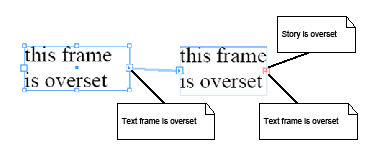
The following figure shows a story that is overset: the combined area of all linked frames associated with the story is not large enough to contain the text in the story. The figure shows a story associated with two linked frames. Both frames are overset, as is the story. You can determine whether a story is overset.
Solution
The text must be fully composed. Follow these steps:
Sample code
The figure in Detecting overset stories shows two linked text frames associated with a story. Both are said to be overset, as the text in the story overruns each frame. You can determine whether a text frame is overset.
Solution
If the frame has a span of 0 (zero), it is underset (that is, no characters flow into it from a preceding frame). If the final character of the primary story thread, not including the mandatory carriage return, does not exist in the frame, it is overset.
The text must be fully composed. Follow these steps:
Sample code
You can determine whether the characters in a particular story thread extend beyond a particular parcel (IParcel).
Solution
If the parcel has a span of 0 (zero), it is underset (that is, no characters flow into it from a preceding parcel). If the final character of the primary story thread, not including the mandatory carriage return, does not exist in the parcel, it is overset.
This solution depends on the text being fully composed.
To detect is a parcel is overset, follow these steps:
Sample code
Given a particular index, you can determine whether the composed text referred to by the index falls on a spline (rather than within a standard text frame (kFrameItemBoss).
Solution
The text must be fully composed. Follow these steps:
Given two text containers (IMultiColumnTextFrame), you can link them to allow one story to be associated with both.
Solution
Use ITextUtils::LinkTextFrames to link the two frames. If you need finer control over what happens with the text contained within the preexisting text frames, first manipulate the text content in the required fashion (see Story text), then use the kTextLinkCmdBoss to link the frames. This command requires the kMultiColumnItemBoss for both frames to be linked to be placed on the command's item list.
Sample code
Given two linked text frames (IMultiColumnTextFrame), you can unlink them.
Solution
Use kTextUnlinkCmdBoss, passing in the frame the break is to occur after, on the command item list.
Sample code
Given a text frame (IMultiColumnTextFrame), you can navigate to the next frame through which the primary story thread flows.
Solution
Sample code
A text frame has a set of associated options that describe how the text flows within the container, including the following:
You can modify the options for a text frame.
Solution
To change the frame options for the current selection, use the ITextFrameOptionsSuite suite. For example, to increment the number of columns, follow these steps:
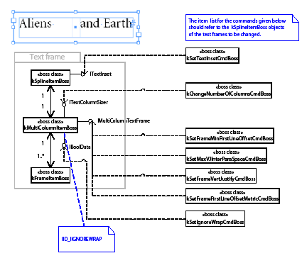
To change the frame options for an arbitrary text frame (IMultiColumnTextFrame on kMultiColumnItemBoss), use API-supplied commands. See the following figure, which shows commands that Mutate Text Frame Options:
Sample code
Description
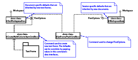
A text frame has a set of associated options that describe how the text flows within the container. These options exist on the workspace (the session workspace, which is inherited by new documents on the document workspace). They include the following:
You can modify the default options for a text frame.
Solution
Use the ITextFrameOptionsSuite suite. For example, to increment the number of columns, follow these steps:
Alternatively, to modify the default settings regardless of whether a document is open (for example, to target a particular document or the session default value rather than the front-most document default value), use kSetFramePrefsCmdBoss. See the following figure, which shows the relationships between workspaces and text-frame options.
This figure shows commands that mutate and use default text-frame options:
A page item can define a relationship with text. This relationship specifies what happens when a text frame overlaps the page item, and it affects line-wrapping behavior. The behavior that can be specified includes the following:
You can prescribe the wrapping behavior that a page item can enforce on text it overlaps.
Solution
Use Facade::ITextWrapFacade to control text-wrapping behavior.
Sometimes, you may need to use lower-level API commands such as the following:
Sample code
This section contains common use cases related to rendered text. The set of glyphs that make up rendered text is called the wax.
You can determine when text is composed.
Solution
On completion of composition within a text frame, the message kRecomposeBoss is transmitted along the IID_IFRAMECOMPOSER protocol to the frame item(kFrameItemBoss), spread (kSpreadBoss), and document (kDocBoss). To be notified of composition completion, attach an observer to one of these objects. Which object you attach to depends on whether you want to restrict the notifications to a single spread or page item.
The SnpInspectTextModel::ReportWaxLineLeading SDK snippet iterates over each wax line and reports the leading for all lines of text in a story.
You must keep your IWaxIterator in scope, to keep an IWaxLine interface pointer valid. The following sample code demonstrates a common error caused when IWaxIterator is not kept in scope:
To maintain references to several wax lines simultaneously, keep a wax iterator in scope for each wax line. The sample code discussed in Estimating the composed depth of text in a frame or parcel demonstrates this.
Wax lines and wax runs are created by a paragraph composer. The SingleLineComposer SDK sample is a paragraph composer that works on one line at a time. This sample demonstrates the construction of wax lines and wax runs.
You can access the wax for a particular range of text.
Solution
The text must be fully composed:
Sample code
You can estimate the depth of text in a text frame (kFrameItemBoss).
Solution
The text must be fully composed. Follow these steps:
Sample code
Normally, damaged text that requires recomposition is fixed by background composition. Your code, however, may find that the text in which it is interested is damaged; if so, it can force recomposition to fix the damage. For example, always check for damage before scanning the wax or relying on any spans that indicate the range of text stored in a frame or parcel.
You can recompose text within a story by either the index into the text model (TextIndex) or the visual container used to display the text (a frame or parcel). The most general approach is to use the parcel list composer (ITextParcelListComposer), which works for any text that can be composed. For example, it works whether the text is displayed in a frame or a table cell.
Do not assume that all text in the text model can be composed. Some features may store text in the text model that is never composed for display. See HidTxtParcelListComposer.cpp in the HiddenText example.
The following examples show the most common approaches used to force text to be recomposed.
This example shows recomposing story text by TextIndex using ITextParcelListComposer:
This example shows recomposing by parcel using ITextParcelListComposer:
This example shows recomposing story text by TextIndex using IFrameListComposer:
IGlobalRecompose provides methods that force all stories to recompose. The interface marks damage that forces recomposition, even though the stories have not changed. See the following example, which recomposes all stories in a document:
It is hard to observe recomposition, because to do so, you need to maintain an observer on each frame (kFrameItemBoss). See Observing changes that affect text for an alternative approach that relies on observing the cause rather than the effect.
Because many types of changes affect text, observing changes quickly becomes complex; for example:
An optimal strategy is to be aware recomposition has occurred and not try to observe everything that might happen.
Any change to text, attributes, styles, or layout that affects lines breaks causes damage. The change counter on the frame list (IFrameList::GetChangeCounter) is incremented any time something happens that requires recomposition. No notification is broadcast when the change counter is incremented, so you cannot catch the change immediately. In general, though, immediate feedback is not needed; the fact that something changed in a way that affects text needs to be determined only at fixed times.
For example, export a story from InDesign to a copy-editor application. When the story is imported back into InDesign, you may want to tell the user about changes to the layout or text styling that were made through InDesign. To arrange this, cache the value of IFrameList::GetChangeCounter when you export the story. You can then compare this cached value to the actual value when the story is imported. To notify users when layout changes are made that affect text, check IFrameList::GetChangeCounter using an idle task.
In the "Text Fundamentals" chapter of Adobe InDesign Programming Guide, see the section on "Paragraph Composers" for information on how to control the paragraph composer used to compose text. Programmatically, set the kTextAttrComposerBoss paragraph attribute to reference the paragraph composer to be used.
If you require access to only the character code data of a story, the simplest API to use is the TextIterator class. There are many code snippets that show how it is used, including SnpInspectTextModel::ReportCharacters. If you do not want to process character by character, use IComposeScanner to access the characters in a story in larger chunks. For a fully functional example, see the TextExportFilter SDK plug-in.
To access styled runs of text, use IComposeScanner. For an example, see Estimating text width.
You can estimate of the width of a character string for a given horizontal font using IFontInstance::MeasureWText. Code in the FrameLabel SDK sample plug-in FrmLblAdornment::GetPaintedBBox() demonstrates how to do this.
To apply this estimate to a range of text in a story, use IComposeScanner to access runs of characters with the same drawing style. The following example, EstimateTextWidth, illustrates this.
Have the text flow into a story with a layout (text frames), and compose it with whatever paragraph composer you want. You can then scan the wax generated to find the width and depth measurement you want. This is the only way you can account for the many properties that affect the composed text, such as the paragraph composer's line-breaking algorithm, hyphenation, and text-style changes like font, point size, and leading, as well as the effect of layout properties like text wrap and first baseline offset. The SnpEstimateTextDepth SDK code snippet provides an example of wax scanning.
It is much harder to estimate the width or depth of text without having the text of a story flow into a layout. In principle, you can use the scanner and drawing style (IComposeScanner and IDrawingStyle) to scan the text and apply your own line-breaking rules. This quickly becomes a sort of mini paragraph composer and requires some of the code in sample plug-ins like SingleLineComposer. Look at this sample's SLCTileComposer class for the kind of code you might use.
Hyphenation is a service provided to composition. A composition engine uses the set of hyphenation providers installed and registered with the application. Hyphenation providers are responsible for providing the set of hyphenations points that exist for a particular word. This is used by the composition engine to help define line-breaking policies. The hyphenation service can be controlled by a set of paragraph attributes. This section contains use cases for controlling the default application hyphenation service.
For a particular paragraph, you can turn off hyphenation.
Solution
Hyphenation function is controlled for each paragraph, using the kTextAttrHyphenModeBoss (signature interface ITextAttrHyphenMode) paragraph-level text attribute.
While four "modes" are defined by the interface (off, manual, dictionary, and algorithm), the default supplied hyphenation service uses only manual and algorithm. In manual mode, only hard hyphens and discretionary hyphens (added to the text using "Insert Special Character") are used. For the algorithm mode, hyphenation behavior is determined by hard hyphens, discretionary hyphens, hyphenation points provided by the dictionary, and a sophisticated algorithm used to determine best hyphenation.
Related documentation
Sample code
With the default hyphenation service, you can control hyphenation of capitalized words.
Solution
Use the kTextAttrHyphenCapBoss paragraph-level text attribute (interface ITextAttrBoolean). If this is turned off, capitalized words with discretionary hyphens are still hyphenated.
Related documentation
Sample code
With the default hyphenation service, you can control hyphenation of the last word in a paragraph.
Solution
Use the kTextAttrHyphenLastBoss paragraph-level text attribute (interface ITextAttrBoolean). If this is turned off, last words with discretionary hyphens are still hyphenated.
Related documentation
Sample code
Solution
Use the kTextAttrMinBeforeBoss paragraph-level attribute (interface ITextAttrInt16).
If there are discretionary hyphens before the first hyphenation point, they are ignored; that is, the word does not hyphenate at discretionary hyphens that occur before the minimum number of characters, as specified by this attribute.
Related documentation
Sample code
Solution
Use the kTextAttrMinAfterBoss paragraph-level attribute (interface ITextAttrInt16).
If there are discretionary hyphens after a hyphenation point, they are ignored; that is, the word does not hyphenate at discretionary hyphens that occur after the minimum number of characters, as specified by this attribute.
Related documentation
Sample code
Solution
Use the kTextAttrShortestWordBoss (interface ITextAttrInt16) paragraph-level attribute.
If there are discretionary hyphens in a word whose length is less than that specified by this attribute, they are ignored; that is the word is never be a candidate for hyphenation).
Related documentation
Sample code
You can define the maximum number of consecutive hyphens (the ladder) for text.
Solution
Use the kTextAttrHyphenLadderBoss paragraph-level attribute (interface ITextAttrInt16).
Related documentation
Sample code
The hyphenation zone dictates the minimum space required by the word that is the hyphenation target. If that space is not available (that is, the previous word encroaches on this zone), no hyphenation is done, and the hyphenation candidate is moved to the next line. You can control this function.
Solution
Use the kTextAttrHyphenZoneBoss paragraph-level attribute (interface ITextAttrRealNumber). This specifies the minimum width assigned to a candidate word before a hyphenation point (modulo any preceding whitespace), before the word is pushed to the next line.
Related documentation
Sample code
The algorithm used by the composer (in conjunction with the hyphenation service) to determine the hyphenation policy for text is complex. The hyphenation weight is a heuristic input used to guide the number of resulting hyphens. You can control this function.
Solution
Use the kTextAttrHyphenWeightBoss paragraph-level attribute (interface ITextAttrInt16).
Related documentation
Sample code
Description
Text can be specified as no break; that is, the text is not to be considered as a candidate for hyphenation.
Solution
Use the kTextAttrNoBreakBoss character-level attribute (interface ITextAttrBoolean).
Related documentation
Sample code
You can determine all fonts available to the application through the font subsystem.
Solution
The SnpInspectFontMgr::ReportAllFonts code snippet shows how to iterate through all fonts available to the application, by calling IFontMgr directly.
The SnpPerformFontGroupIterator code snippet shows how to implement a FontGroupIteratorCallBack (see IFontMgr.h) to iterate all fonts.
You can restrict the set of available fonts to a predefined set.
Solution
Controlling the set of installed fonts is an operating-system-wide issue that cannot be solved directly with InDesign APIs. InDesign APIs can be used to detect installed fonts (in both the system folder and application fonts folder). To manage fonts, use operating-system platform APIs.
You can obtain a particular, named font.
Solution
The solution depends on what information you have that identifies the font. See the SnpInspectFontMgr code snippet for several approaches, such as SnpInspectFontMgr::QueryFont.
Alternatively, implement a FontGroupIteratorCallBack (see SnpPerformFontGroupIterator.cpp) that finds the name of a PostScript font, given the full name of the font as returned by IPMFont::AppendFullName. For example, if you search for Courier Bold, you get the name of the PostScript font Courier-Bold.
Solution
Use the values of the kTextAttrFontUIDBoss and kTextAttrFontStyleBoss text attributes. The UID in kTextAttrFontUIDBoss's ITextAttrUID interface can be used to instantiate an IFontFamily object. The PMString in kTextAttrFontStyleBoss's ITextAttrFont interface gives you the stylistic variant (for example, Regular or Bold). From these, you can find the name of the font, as shown in the following example, which fin ds a font name from text attributes:
Alternately, use IComposeScanner to get the drawing style (IDrawingStyle) at a particular index in the text model, as shown in the following example, which finds a font name from the drawing style:
You can change the font used for either text in a story or a style that can be applied to text in a story.
Solution
To set the font used to display text in a story, override the kTextAttrFontUIDBoss and kTextAttrFontStyleBoss text attributes in the text model. For information on overriding text attributes, see the "Text Fundamentals" chapter in Adobe InDesign Programming Guide.
To set the font for a text style, add or change the value of the kTextAttrFontUIDBoss and kTextAttrFontStyleBoss text attributes in the style.
Solution
Use the UID to instantiate an IFontFamily interface, and get the name from there. Typically, the UID of a font is obtained from the kTextAttrFontUIDBoss text attribute, IDocFontMgr::GetFontGroupUID, or IDocumentFontUsage::GetNthUsedFontUID.
You can get information on the present or missing fonts used for the text in a story (not including nonrendered text, like that used in the notes feature).
Solution
SnpInspectFontMgr::ListFontsInDocument shows how to use IUsedFontList on kDocBoss to determine which fonts are in use in a document's stories. SnpInspectFontMgr::ReportDocumentFontUsage shows how to use the simpler IDocumentFontUsage API (existing on kDocBoss), a higher-level facade over the fonts used in a document. This mechanism does not report the fonts used in text for features like notes (text that is not displayed as part of the story). To catch all fonts used in all text in a story, regardless of whether it is visible in an exported asset, use the solution in Finding the font used to display a story's text.
You can get font information from (EPS or PDF) assets placed in a document.
Solution
IFontNames (on kEPSItem or kPlacedPDFItemBoss) holds the set of fonts required by or embedded in a particular placed asset. SnpInspectFontMgr::TestAssetsForFonts shows how to obtain font information for placed assets. SnpInspectFontMgr::ReportDocumentFontUsage shows how to use the simpler IDocumentFontUsage API (existing on kDocBoss, a higher-level facade over the fonts used in a document.
The set of fonts that are persistent in a document do not need to match the fonts used. You can access all fonts that exist in the persistent document.
Solution
Use IDocFontMgr (on session or document workspace) to access the fonts in the workspace. For the session workspace, this represents the set of default fonts. For the document workspace, this includes all fonts used in the document (text frames, text notes, etc.); however, it does not include fonts contained in placed assets.
Given a particular font, sometimes it is useful to detect any use restrictions that might apply.
Solution
SnpInspectFontMgr::ReportFontsWithRestrictions shows how to determine any use restrictions a particular font (IPMFont) might have.
If the user modifies the fonts installed during an instance of the application, the cooltype font subsystem is updated. You can be called when the application detects the font subsystem was updated (for example, a font was added or removed).
Solution
Attach an observer to the session (obtained from GetExecutionContextSession()) using the IID_IFONTMGR protocol, listening for the kFontSystemChangedMessage.
Your plug-in can be called when an attempt is made to access a nonexistent font.
Solution
Missing font responder services (IResponder implementation with service ID kMissingFontSignalResponderService) are called whenever the application queries the font manager for an unavailable font. The responder has the opportunity to respond with an alternative font to use (by populating the IMissingFontSignalData::SetResult with a valid font).
Only one missing font responder can dictate the font-replacement policy.
A font face can be described using different names (for example, "Regular" or "Plain" for a plain font face, "Italic" or "Cursive" for an italic font face, and "Bold" or "Heavy" for a bold font face).
Solution
ITextUtils has four methods that can help you deal with font face variants:
These methods implement the naming heuristics that define alternative names for font faces.
Given a particular font family (IFontFamily), you can get the index that identifies the correct font face, using the API IFontFamily::CorrectVariantIndex.
InDesign gives users more control over the parts of a document that can be searched and modified via the find/change dialog. Similarly, there are interfaces that allow you to work more effectively with find/change.
InDesign not only provides interfaces to find/change plain text, but also to find/change text using grep (Global Regular Expression Parser) strings, glyphs using glyph IDs, and objects using frame attributes. Find/change object are discussed in the Layout Fundamentals chapter of Adobe InDesign Plug-in Programming Guide. This section contains use cases dealing with text, grep, and glyph search.
For more information, see the "Text Fundamentals" and Layout Fundamentals chapters of Adobe InDesign Plug-in Programming Guide.
Solution
To set up options and perform search:
Sample code
Solution
To set up options and perform search, follow these steps. The first several steps are the same as for searching text strings.
Sample code
You can search text matching regular expressions specified by a grep string.
Solution
Searching using grep has the same interfaces as regular searching, and the processes are almost identical. The only differences are as follows:
Sample code
You can text matching regular expressions specified in a grep string with new string also specified in grep.
Solution
Replacing text with grep has the same interfaces and commands as standard text replacement. The only differences are as follows:
Sample code
Solution
Like searching for text, searching for a glyph involves setting find/change options and then performing a search. Follow these steps:
Sample code
Solution
The relationship between finding and replacing a glyph is similar to that between finding and replacing text. In addition to setting find options, we also need to specify change options. Follow these steps:
Sample code
This chapter presents table-related use cases. To learn to program with tables, do the following:
For help with specific programming issues, see the sections below for a use case that matches your needs.
SnippetRunner is a plug-in supplied by the SDK that lets you run code snippets, which can help you explore your use case.
Run InDesign with the SnippetRunner plug-in loaded. Use SnippetRunner to run the snippets listed below under "Sample code." See the "Snippets" section of the API reference documentation for more information regarding snippets and instructions on using SnippetRunner itself. Browse the source code of the sample snippets.
Sample code
Related APIs
A starting point for writing a plug-in that modifies a table through an active selection is to become familiar with the ITableSuite interface.
You can obtain the ITableSuite interface for the active selection from the ISelectionUtils interface aggregated on kUtilsBoss with code like the following:
Obtaining this interface pointer does not necessarily mean you can exercise the capabilities. Always test the ITableSuite::Can<DoSomething> method to determine a particular capability is available in the target, before calling ITableSuite::<DoSomething>.
If there are capabilities that cannot be obtained through this interface-like adding text to a table cell-but you still want to work with an active selection, use the suite pattern to implement your own suite. To implement your own suite, you need to write add-ins for the integrator suite boss class and at least the table suite and text suite boss classes (if modifying an existing table) or the text suite boss class (if creating a new table in an existing story). Suite implementation code can obtain an ITableModel interface pointer (effectively, a reference to a kTableModelBoss object) in a straightforward way through ITableTarget. You can then use the core AP Is (like ITableCommands) in addition to ITableModel, to manipulate the table properties.
If client code needs to work with tables that are chosen programmatically (rather than with tables for which the end user varies the active selection), you need to program using the APIs exposed on kTableModelBoss. Your task then is to find a table model (see Acquiring a table model reference).
How you acquire an interface on an instance of kTableModelBoss depends on whether you are working with an active selection or searching through all tables in a given story or the story list.
If working with an active selection, first be sure you need to use the API on kTableModelBoss. If the capability exists on ITableSuite, use it first. If you definitely need to work with the kTableModelBoss API (for example, ITableModel or ITableCommands), implement a suite pattern. ITableTarget identifies the table targeted for editing by a suite. For sample code, see TableBasics.
There are two ways to search through the story list (see the IStoryList interface):
The recommended mechanism for iterating over tables in a document involves using the ITextStoryThreadDictHier interface to look for boss objects that have both the ITextStoryThreadDict and ITableModel interfaces.
Tables are embedded in stories, so first you need to iterate over the stories in a document through the IStoryList interface. Once you have a story, use its ITextStoryThreadDictHier interface and NextUID (beginning with the UID of the story) to iterate over the collection of story thread dictionaries. If a boss object with an ITextStoryThreadDict interface also has an ITableModel interface, it is a table model.
For an example of using this mechanism to locate tables, see the SnpIterTableUseDictHier code snippet.
There is another mechanism that can be used to iterate over tables in a document, but we do not recommend it: ITableModelList should be used only with caution, as this interface may not be in a future version of the API. From ITableModelList, you can iterate through the tables using the GetModelCount and QueryNthModel methods.
To create a table in the story targeted by the active text selection, use ITableSuite::CanInsertTable and ITableSuite::InsertTable. To create a table at a TextIndex in a story chosen programmatically, call ITableUtils::CanInsertTableAt and ITableUtils::InsertTable. For sample code, see the SnpCreateTable SDK code snippet. The command that creates the table is kNewTableCmdBoss; however, as noted above, you do not need to process this command directly.
To convert the text range identified by the active text selection to a table, use ITableSuite::CanConvertTextToTable and ITableSuite::ConvertTextToTable. To convert a range of text in a story chosen programmatically to a table, call ITableUtils::ConvertTextToTable. The command that creates the table is kTextToTableCmdBos; however, as noted above, you do not need to process this command directly.
To delete a table that is selected, use ITableSuite::CanDeleteTable and ITableSuite::DeleteTable. To delete a table chosen programmatically, process the command returned by ITableCommands::QueryDeleteTableCmd. The command used to delete a table is kDeleteTableCmdBoss;, however, as noted above, you do not need to process this command directly.
To copy and paste a table, use the kTableCopyPasteCmdBoss command. The data interface for this command, ITableCopyPasteCmdData, specifies the source and destination tables' UIDRef values, the grid address of the destination table at which you want to paste the source content, and the level to which you want to copy attributes from the source to the destination tables.
For sample code, see the SnpCopyPasteTable SDK code snippet.
The SnpSortTable SDK code snippet indicates how to sort table data using table iterators, content access methods, and standard collections like K2Vector.
If the table has split or merged cells, the sorting operation is not well defined.
For most cases, sorting is done by the WideString < operator; however, if there is a special glyph in the text, you must define your own comparator function object. SnpSortTable.cpp indicates how to go about this, defining a comparator function object for a custom data class.
If your text contains end-user-defined characters (EUDC), you must get the character attribute at the special placeholder textchar (kTextChar_SpecialGlyph or kTextChar_NonRomanSpecialGlyph). The glyph ID is inserted as a character attribute strand so the composer can render it; this information is relevant to sorting.
To edit a table selected by the end user using active selection, use methods on ITableSuite to insert or delete rows or columns. For example, call ITableSuite::CanInsertRows to determine whether you can insert rows into the selected table; if so, call ITableSuite::InsertRows. To get ITableSuite, query the selection manager (ISelectionManager) for it or call ISelectionUtils::QuerySuite to get ITableSuite for the active selection.
To edit a table selected programmatically, use ITableCommands.
Sample code
To change the dimensions of a table selected by the end user using active selection, use ITableSuite. Call ITableSuite::CanChangeTableDimensions to determine whether the selection target supports the capability you require; if it does, call ITableSuite::ChangeRowDimensions.
To change the dimensions of a table selected programmatically, use ITableCommands aggregated on kTableModelBoss.
Row height is one of many table attributes (see the ITableAttrReport interface). It is represented by kRowAttrHeightBoss. This attribute can be applied when the user selects a table through ITableSuite::ApplyRowOverrides, but it is more convenient to use the ITableSuite::ResizeRows wrapper method or ITableCommands::ResizeRows when the table is chosen programmatically.
Merging or splitting cells can be done through ITableSuite for an abstract selection or through ITableCommands for a specific location within the table. The command of class kSplitCellCmdBoss does the work, but you can use ITableCommands::SplitCells and ITableCSuite::SplitCells rather than using the command directly.
You can set a table option that controls the appearance of the table or cell. For example, you may want to set the stroke or fill.
Apply an override for the table attribute. Table attributes define how the table appears. A table attribute (ITableAttrReport interface) describes a single table property.
To apply an override to the selected table or cells, use ITableSuite. To get ITableSuite, query the selection manager (ISelectionManager) for it or call ISelectionUtils::QuerySuite to get ITableSuite for the active selection.
To apply an override to a table or cells chosen programmatically, use ITableCommands.
Sample Code
To set the stroke for a cell, apply an attribute override. Use ITableSuite::ApplyCellStrokes to edit the stroke of cells that are selected. Use ITableCommands::ApplyCellStrokes to edit the stroke of cells chosen programmatically. This requires populating a data object defined in ICellStrokeAttrData, to target the cell sides to stroke and carry the parameters.
The following code fragment populates the data object for applying cell strokes to a cell:
To set the fill for a cell, apply an attribute override. Use ITableSuite to edit the fill of cells that are selected. Use ITableCommands to edit the fill of cells chosen programmatically. For sample code, see the SnpSetTableFill code snippet.
You can get the "rotation-follow-story" (yes or no) and rotation (angle) attributes using kCellAttrRotationFollowStoryBoss or kCellAttrRotationBoss. You may need to take account of the text direction when you determine whether a cell is overset.
In some cases, the best approach is to put an inline graphic into the text model, into the text span associated with the cell, although this may not fill the cell exactly.
The table layout (ITableLayout) is aggregated on kTableModelBoss. It provides very detailed information about the layout of the table. Use ITableFrame::GetParcelFrameUID to get at an individual table frame to which a parcel is mapped. This method yields a reference to a kTableFrameBoss object. Alternately, IParcelList, which is aggregated on the kTableCellContentBoss (as described in the "Getting a parcel, given a grid address") also has a method, GetParcelFrameUID, that you can use it to get to the corresponding frame.
It also is possible to discover the table frames in a story from the owned item strand. This mechanism is more delicate and requires additional information (from ITextStrand) to determine where one table ends and another begins.
Table model boss objects (see kTableModelBoss) are dependants of a story (see kTextStoryBoss). Many tables can be nested within a single story, and tables can be nested within one another to an arbitrary depth.
The interface ITableTextContainer provides a connection between the table model (kTableModelBoss) and the text model (on kTextStoryBoss) that encapsulates its textual content.
If you have an ITableModel interface, you can find the text model in which it is embedded, by querying for ITableTextContainer through this interface and using ITableTextContainer::QueryTextModel.
You can edit the text displayed in a table cell.
To set the text for a table cell, use ITableCommands::SetCellText.
To get the text for a table cell, locate the story thread (see interface ITextStoryThread) that stores the text the cell displays, then use TextIterator to access that range of text.
To format the text for a table cell, locate the story thread (see interface ITextStoryThread) that stores the text that the cell displays, then use ITextModelCmds::Apply::ApplyCmd to apply text attributes to that range of text.
Sample code
For every cell in the table, there is an associated parcel (IParcel) in a parcel list represented by IParcelList. Parcels are about geometry and represent the bounds of regions into which text composition can occur.
The interface IParcelList should not be confused with ITextParcelList, which is a cache for the text spans associated with each parcel. ITextParcelList is a key part of text composition but does not represent geometry. ITextParcelList is not likely to be used in client code in most cases, unless you are trying to determine whether a particular cell is overset.
Text cells are represented by kTextCellContentBoss. This class aggregates an IParcelList interface, which contains a list of parcels; the length of the list is likely to be at most one.
The parcel list on a kTextCellContentBoss object might contain, for example, one instance of a kTextCellParcelBoss object, which exposes an IParcel interface.
To work with a table, if you have a grid address and an ITableModel, you can get a reference to a kTextCellContentBoss. There are at least two ways to get to a kTextCellContentBoss:
The boss class kTextCellContentBoss aggregates ICellContent; when you have ICellContent, you can simply use QueryInterface to get IParcelList. Then you can use the methods on IParcelList (GetParcelCount and QueryNthParcel) to iterate over the parcel collection. There should be just one parcel that can be used to determine the bounds into which the cell text will be flowed. The SnpGetTableParcel sample code illustrates this concept.
Sample code
Given a grid address, there are several ways to get to cell text. You can use the method described above ("Getting a parcel, given a grid address") to acquire a reference to a cell content boss. For instance, when you have a content boss, check whether it aggregates ITextStoryThread; if it does, you can be confident it is a text cell. When you have an ITextStoryThread, you can ask it for the associated start, span, and text model (ITextModel). Once you have these three pieces of information, you can get the characters. For an example, see the SnpAccessTableContent::GetTextFromCell method SDK code snippet.
Alternatively, given an ITextModel (on kTextStoryBoss), query for IComposeScanner and use methods like IComposeScanner::QueryDataAt to acquire the characters.
It also is possible to use the ITableModel and ITextModel methods without interacting with ITextStoryThread methods directly. This is relatively easy. Given a GridAddress, turn it into a GridID by using ITableModel::GetGridID. Once you have a GridID, you can determine the text story thread associated with the given GridID. If you already have a table model reference, the quickest route is to use the ITableTextContainer interface (also on kTableModelBoss) to get the ITextModel (on kTextStoryBoss) in which the table is embedded, then find the thread start and span from the ITextModel.
There is an ITextParcelList interface that is aggregated on kTextCellContentBoss. The ITextUtils::IsOverset method takes an ITextParcelList as a parameter.
To find out which cells in a given table were overset, do the following:
Like paragraph and character styles, table and cell styles exist on the session or a particular document. You can get a list of table or cell styles available to a session or a document.
Solution
Table style and cell style are represented by kTableStyleBoss and kCellStyleBoss, respectively. To get the list of the styles, obtain the session or document workspace, then query the IStyleGroupManager interface identified by IID_ITABLESTYLEGROUPMANAGER (for table styles) or IID_ICELLSTYLEGROUPMANAGER (for cell styles). The interface provides the API, GetRootHierarchy(), which returns a pointer to IStyleGroupHierarchy at the root level. Use IStyleGroupHierarchy to iterate through the available styles.
Sample code
Within the document or application workspace, there is the concept of a root style. Except for the root table or cell style, each table or cell style has a parent style. A style inherits all attributes from its parent, maintaining only those attributes that are different from its immediate parent in its own attributes boss list. You can get all attributes of a given style.
Solution
IStyleInfo on kTableStyleBoss and kCellStyleBoss provide the API IStyleInfo::GetBasedOn that stores its immediate parent style. You can traverse up to root to collect all applicable attributes. However, we recommend using either ITableStylesFacade::GetTableStyleAttrsResolved() or ICellStylesFacade::GetCellStyleAttrsResolved() to get the complete list of attributes.
Sample code
You can determine what a style means to a particular attribute; that is, what value for a particular attribute would be applied to a table or cell.
Solution
Sample code
Solution
You can create table and cell styles by processing the required command (kCreateTableStyleCmdBoss or kCreateCellStyleCmdBoss); however, we recommended you use ITableStylesFacade::CreateTableStyle() or ICellStylesFacade::CreateCellStyle(). You may pass style name, parent style (based on style), and your own attributes that are different from the parent's.
The style name should be unique. To generate a unique name, call IStyleUtils::CreateUniqueName().
Sample code
Given a table or cell style, you might need to modify it, either by modifying the attributes the style represents or changing some other definitions of the style, like its style name.
Solution
You can handle changes to styles through the kEditTableStyleCmdBoss or kEditCellStyleCmdBoss command; however, we recommend using their respective facades: ITableStylesFacades::EditTableStyle() and ICellStylesFacades::EditCellStyle(). Generally, you will do the following:
Related APIs
You can delete a style from a document or a session.
Solution
Since a table or cell could have been applied to table and cell in the document or used in to define other styles, you must provide an alternate style as a replacement style before deletion. To delete an existing style, call ITableStylesFacades::DeleteTableStyle() or ICellStylesFacades::DeleteCellStyle().
Sample code
Given a table or cell style, you can apply it to a table, cell, or the current selection.
Solution
If you are dealing with a table/cell selection, query ITableStyleSuite or ICellStyleSuite from the active selection manager and call the ApplyTableStyle or ApplyCellStyle method to apply table or cell style to the selected table or cells.
To apply a table style to a table specified as a UIDRef of the table model, use ITableStylesFacade::ApplyTableStyle(). You have the options to override current table attribute overrides and cell styles applied.
To apply a cell style to one or more cells, use ICellStylesFacade::ApplyCellStyle(). You can specify the cell with a UIDRef of the table and a GridArea of the table.
Sample code
You can determine the table or cell style for a specific table or cell.
Solution
If you have a table/cell selection, obtain the selection suite interface ITableStyleSuite and ICellStyleSuite from the active selection manager and call the GetSelectedTableStyle or GetSelectedCellStyles method to get the applied table or cell styles.
To get the table style from a table specified as a UIDRef, use ITableStylesFacade::GetTableStyle().
To get the cell styles from cells specified by a UIDRef of the table and a GridArea, use ICellStylesFacade::GetSelectedCellStyles().
You can remove overrides of a table or cells, to leave the table and cells formatted to the applied table or cell style.
Solution
If you have a table/cell selection, obtain the suite interface ITableStyleSuite or ICellStyleSuite via the active selection manager, then call ITableStyleSuite::ClearLocalOverrides() or ICellStyleSuite::ClearOverrides().
To to remove local overrides from a table specified by a UIDRef of the table model, use ITableStylesFacade::ClearLocalOverrides(). You have an option to clear all cell styles applied to the table cells.
To remove local overrides from cells specified by a UIDRef of the table and a GridArea, use ICellStylesFacade::ClearCellStyleOverrides().
Each table style defines a set of regions such as headers and body rows. Each region can be assigned a cell style. You can get the cell style for a specific region in a table style.
Solution
Regional cell styles are considered table attributes of a table style. To get the attribute value of the related attributes, see Determining the value of an attribute within a style. The steps are described briefly below:
See Also
Sample code
You can set the cell style for specific regions in a table style.
Solution
Setting regional cell styles is the same process as modifying a table style. The steps are described briefly below:
See Also
Sample code
This chapter provides implementation hints for common use cases and answers frequently asked questions involving the Adobe InDesign graphics API.
You can get path information from a page item, such as a spline item, text outline, and text wrap.
Solution
Use the IPathGeometry interface to retrieve the path information, as follows:
Sample code
Related API
Solution
Use the kAddSplinePointsCmdBoss command, as follows:
Related APIs
You can create a compound path or shape from selected paths or graphics frames that overlap each other. (Compound shapes are created with Pathfinder commands in the InDesign user interface). See Creating a compound path from page items.
Solution
Sample code
Related APIs
You can create a compound path from the paths of a several page items, which may or may not be selected. (If all the page items are selected, you can use the solution described in Creating a compound path or compound shape from selection.) Since you will combine the page items into one page item, you can manipulate the resulting page item as a whole; for example, assign graphic attributes.
Solution
Sample code
Related APIs
You can see the visual effects of using different shapes in the same bounding box. You can select an object and convert it to a new type of shape programmatically.
Solution
The following steps assume the graphics frame already is selected.
Sample code
Related APIs
You can import a graphics file into an InDesign document and let the end user choose a position and size for placing the file in a spread.
Solution
Use the kImportAndLoadPlaceGunCmdBoss command to import the file and load the place gun, so the end user can place the item in the spread:
Sample code
Related APIs
Solution
Use kImportAndPlaceCmdBoss to import the file and place the item into an existing graphics frame, as follows:
Sample code
Related APIs
You can get the graphic page item from the layout selection, regardless of what is selected. You can get a list of page items from the layout selection target, but you do not know whether a selected item is the graphic page item itself or its graphics frame, and some settings are valid only on graphic page items, like clipping path and text wrap.
Solution
Traverse the page item hierarchy and use an interface specific to graphic page items (like IImageDataAccess) to identify graphic page items:
Sample code
Related APIs
You can shift a graphic within the graphics frame in which it was already placed.
Solution
Graphic-page-item transformations (like moves) are performed the same as for page items:
Sample code
Related API
You can fit a graphic page item to its graphics frame or fill the frame with the graphic page item.
Solution
If the content and/or frame is selected, use appropriate methods on IFrameContentSuite. This suite provides operations on selected items, like the IFrameContentSuite::FitFrameToContent method.
If you have a list of items, use appropriate methods on IFrameContentFacade, like the IFrameContentFacade::FitFrameToContent(UIDList& items) method.
Alternatively, create and directly process appropriate commands, like kFitFrameToContentCmdBoss, kFitContentToFrameCmdBoss, kFitContentPropCmdBoss, and kCenterContentInFrameCmdBoss. Note the following:
Sample code
Related APIs
With graphics placed on a spread, you can create or set clipping paths for the graphic page item.
Solution
Use IClippingPathSuite. This selection suite has everything that you need to perform clipping path operations, including getting the embedded Photoshop path and alpha channel, setting a clipping path, and converting a clipping path to a frame. Follow these steps:
Sample code
Related APIs
You can set text wrap mode for a list of page items.
Solution
Do one of the following:
Sample code
Related APIs
The effect of setting options is seen when the mode is set to Wrap Around Object Shape (IStandOff::kManualContour).
Solution
The recommended solution is very similar to that for setting text wrap mode. We recommend you use ITextWrapFacade when possible. Normally, setting contour options involves the following steps:
Sample code
Related APIs
You can change the settings of a display performance group. (For most cases, the default settings are suitable.) Display performance groups are defined as session preferences.
Solution
Use kSetDrawOptionsCmdBoss, as follows:
There are additional flags on the command that do not change the performance group but do change global preferences:
Sample code
Related APIs
You can use a display performance group other than the default performance group for a layout window. Each layout window has a default display performance group.
For instructions to modify group settings, see Modifying settings of a display performance group.
Solution
Sample code
Related APIs
Each graphic page item inherits the default display performance settings from the layout when the graphic page item is placed; however, you can force some graphic page items to be displayed at high resolution-using the high-quality performance group-under all circumstances.
Solution
If you are setting display performance for selected page items, use IDisplayPerformanceSuite::SetSelectionToHighQuality. Otherwise, if you want to set display performance settings for an arbitrary set of graphic page items, follow these steps:
This procedure sets the page item to be displayed using the high-quality performance group (group ID kHighQualityGroup). In standard setting, the high-quality performance group sets the highest quality possible in each category. In certain situations-for example, if the raster category of the group kHighQualityGroup is set to IDrawOptions::kRasterGrayOut- the raster image is displayed as a gray box.
To ensure the item always is displayed at high quality, set the display settings of the performance group first (see Modifying settings of a display performance group), and then set the page item's override to this group.
To let the page item override take effect, the Allow Object-Level Display Setting flag must be selected (View > Display Performance menu). To set this flag programmatically, process kSetDrawOptionsCmdBoss and pass kFalse to ISetDrawOptionsCmdData::SetIgnore.
Sample code
Related APIs
You can add a custom color; for example, to simulate a color from the Pantone Solid Coated library, PANTONE 368 C.
Solution
Sample code
Related APIs
You can create a new gradient swatch based on an existing color.
Solution
Sample code
Related APIs
You can iterate through the swatch list of a document or workspace to get information about the color or gradient information of the swatches.
Solution
Sample code
Related APIs
You can iterate through the ink list of a document or workspace to get information about inks used.
Solution
Sample code
Related APIs
You can get information on inks, such as what inks are defined in a workspace and a document, what inks are used for document preflight, and ink alias information.
Solution
Related APIs
You can get all images in a document that use a particular ICC profile; for example, the same profile as that used by the image you currently have.
Solution
There is no backward link from the profile to the images that use that profile, so you must iterate through the images using the link manager interfaces to find the images that use a specific profile. Follow these steps:
Related APIs
You can apply multiple graphic attributes to page items.
Solution
Sample code
Related APIs
You can apply graphic attribute to selected page items.
Solution
Use a selection suite, like IStrokeAttributeSuite or IGraphicAttributeSuite for page items, ITextAttributeSuite for text, or ITableSuite for tables.
Sample code
Related APIs
You can apply a single graphic attribute to any number of page items.
Solution
Use the solution for multiple attributes presented in Applying graphic attributes to the active selection, or do one of the following:
Sample code
Related APIs
You can get a specific graphic attribute value, like stroke weight or fill color, from a page item.
Solution
Sample code
Related APIs
You can get a list of all graphic attributes of a page item.
Solution
Related APIs
You can clear specific graphic attributes from a page item's override list. For example, when a new rendering attribute is changed, you need to remove the graphic attribute first, so the unused attribute boss is released.
Solution
Related APIs
You can change or set the graphic attributes of the graphics state.
Solution
Check whether there is a selection suite (for example, IStrokeAttributeSuite) that you can use. If nothing is selected, calling a selection suite changes defaults (the graphics state).
Alternatively, look at utility methods in IGraphicStateUtils, such as ProcessGfxStateApplyAttribute or ProcessGfxStateAddMultAttributes, with the specific graphic attribute boss or attribute list passed in.
Otherwise, create appropriate commands. For rendering attributes, use kUpdateDefRenderDataCmdBoss and kPrivateSetGSRenderDataCmdBoss; for other attributes, use kGfxStateChangeAttributeCmdBoss. You also can use kAddMultAttributesCmdBoss to set any number of attributes. Fill in suitable command data and process the command.
Related APIs
You can fill a layout page item with color.
Solution
Follow the procedure in Applying graphic attributes to the active selection or Applying one graphic attribute to page items.
To fill page items that are selected, use the IGraphicAttributeSuite::ChangeFillRenderObject(ClassID renderClassID, UID renderUID) method, where renderClass is kPMColorBoss or kGradientRenderingObjectBoss, and renderUID is the UID of the color or gradient swatch.
Alternatively, to fill arbitrary page items, use utilities and commands as follows:
Sample code
Related APIs
You can set a stroke color for of a range of text.
Solution
To set the stroke color of text that is selected, use IGraphicsAttributeSuite. Pass in graphic attributes instead of text attributes (for example, kGraphicStyleStrokeRenderingAttrBoss).
Alternatively, set stroke color using commands, as follows:
Related documentation
Sample code
Related APIs
You can set up the attribute values of a transparency effect.
Solution
We recommend using utility functions provided in IXPAttributeSuite and IXPAttributeUtils. For example, to put a directional feather with a top width of 10 points on a given page item:
Related APIs
You can determine whether a page item has a particular transparency effect applied and the value of a transparency attribute.
Solution
We recommend using utility functions provided in IXPAttributeSuite and IXPAttributeUtils. Find the attribute in which you are interested, then use the utility functions to get the value of the attribute. For example, to determine whether a given page item has a directional feather applied:
Related APIs
You can determine whether a page item has any transparency effect applied.
Solution
You must iterate through all transparency attributes that determine whether a particular attribute is applied. To get these attributes, see Getting transparency effect attributes. The following table lists the attributes that you should check to see whether a page item has transparency effects. If any attribute value is not equal to the value in column 3 of the table, that effect is applied.
| Transparency Effect | Attribute Type | Value When No Effect is Applied |
|---|---|---|
| Basic transparency | kBSOpacity | PMReal(100.) |
| kPMBlendNormal | kPMBlendNormal | |
| kBSKnockoutGroup | kFalse | |
| kBSIsolationGroup | kFalse | |
| Drop shadow | kDSMode | kDSMNone |
| Basic feather | kVTMode | kVTMNone |
| Inner shadow | kInnerShadowApply | kFalse |
| Outer glow | kOuterGlowApply | kFalse |
| Inner glow | kInnerGlowApply | kFalse |
| Bevel and emboss | kBevelEmbossApply | kFalse |
| Satin | kSatinApply | kFalse |
| Directional feather | kDirectionalFeatherApply | kFalse |
| Gradient feather | kGradientFeatherApply | kFalse |
Related APIs
You can let a page item determine the device to which it is drawing. In theory, it should not matter to a page item whether it is drawing to print, PDF, or screen. The fact that the graphics port is specialized for different devices in these three cases is transparent to the drawing code. There may be situations, however, in which the context determines how an item draws. For example, guides can be set to draw to the screen but not to print.
Solution
Use the IShape flag passed into the IShape::Draw method by the draw manager. See How do I detect a drawing device using drawing flags?.
Alternatively, use the viewport information from the GraphicsData pointer passed into the DrawShape method. See How do I detect a drawing device using the viewport boss?.
Sample code
Related APIs
You can create a custom shape for a new type of page item.
Solution
Sample code
Related APIs
You can create thumbnail images for page items. For example, you may want these images for previews.
Solution
Use SnapshotUtilsEx, as follows:
Alternatively, use SnapshotUtilsEx, as follows:
Sample code
Related APIs
Use the kOpenPathCmdBoss or kClosePathCmdBoss command.
Before processing the command, determine whether the path already is open or closed, using IPathGeometry::IsPathOpen.
You can change the clipping path through the user interface, by dragging path points using the Direct Selection tool. Programmatically, you can query IPathGeometry on the graphic page item and change the path points directly. We strongly recommend you use a command to change the points or encapsulate your changes in a command. See Inserting a new point into an existing path.
The swatch list is accessible through the interface ISwatchList on the application workspace or on the document workspace.
To obtain the active swatch list, use the following example code:
Before another swatch object (instance of kPMColorBoss) is created through a call to one of the ISwatchUtils::Create<XXX> methods, your code should verify whether it is necessary to do so-that is, whether the swatch already exists-using ISwatchUtils::GetNamedSwatch. If kInvalidUID is returned, the swatch does not exist in the current database and can be created.
We recommend that you first find a swatch that can be used as a substitute for the swatch to be deleted. Use ISwatchUtils::ReplaceAndDeleteSwatches to delete the swatch and replace it with the substitute. By providing a substitute, you ensure the document will not have a dangling, broken reference to the deleted swatch.
Adding a new rendering type is difficult and risky. Theoretically, you could implement a kRenderingObjectService and define a new rendering object with IID_IRENDERINGOBJECT and other interfaces. The following is a brief list of interface a new rendering type needs to provide:
If this new rendering object type is to have user-interface components that the user can create, edit, delete, duplicate, and interact with the graphic state and object styles, more is required.
We recommend you avoid implementing a new type of rendering object.
We recommend you get the current workspace first, then query for the IColorPresetsSettings interface and get the working profile. See the sample code in the following examples:
Getting the working color profile:
You may also use ICMSUtils to get IColorPresetsSettings directly:
You cannot entirely disable color management; however, InDesign allows you to emulate the Color Management Off behavior of InDesign CS2 and earlier: use the ICMSUtils::DoColorPresetsSettingsSetCmd method. Remember to set the first parameter to kTrue. You also may pass other parameters from current color preset settings.
To acquire the interface through the active graphic state, use the sample code in the following examples.
Acquiring IGraphicStateRenderObject through Active Graphic State:
To acquire the interface through IDataBase:
If you are applying a rendering attribute to a selection, use methods on IGraphicAttributeSuite; otherwise, use methods on IGraphicStateUtils or IGraphicsAttributeUtils to create appropriate commands and process them.
The code fragment in the following example uses a command to change the fill color of a spline:
The short answer is no. To apply rendering attributes, use kBoss_GfxStateApplyROAttributeCmd. For other attributes, use kGfxApplyAttrOverrideCmdBoss.
By using utility methods from IGraphicAttributeUtils, however, you need to determine only the name of your attribute; the implementation of these methods selects the appropriate command for you.
InDesign provides API support for types like new and improved drop shadows and new feather-like features. See IXPUtils::CreateImagePaintServer, which along with IGraphicsPort::SetAlphaServer allows you to do various kinds of soft masks, including drop shadows. The SnapshotUtilsEx class can obtain a grayscale alpha representation of any page item. Using these two, you can create a drop shadow, outer glow, or feather effect.
Other effects, like inner glow on text, are very difficult to create because of the inability to dynamically clip the effect to text as it is edited.
It is important to let the transparency manager know about changes to an item's transparency state, so it can properly track which pages have transparency. This is done through IXPManager::ItemXPChanged, which finds the transparency in your adornment only if your adornment implements the IFlattenerUsage interface, and responds appropriately.
Also, it is important to understand how to use the IGraphicsPort methods SetAlpha and SetAlphaServer, as well as starttransparencygroup and endtransparencygroup. These methods are critical for getting effects to draw correctly.
Two sample plug-ins are supplied in the SDK. The TransparencyEffect and TransparencyEffectUI SDK samples demonstrate how to create new transparency effects within InDesign documents.
If there is a selection, use the IStrokeAttributeSuite::ApplyStrokeWeight method; otherwise, use IGraphicAttributeUtils::CreateStrokeWeightCommand to create a command, then process the command.
If there is a selection, use the IGraphicAttributeSuite::ChangeStrokeRenderObject method; otherwise, use IGraphicAttributeUtils::CreateStrokeRenderingCommand to create a command, then process the command.
If there is a selection, use the IGraphicAttributeSuite::ChangeFillRenderObject method; otherwise, use IGraphicAttributeUtils::CreateFillRenderingCommand to create a command, then process the command.
See Applying fill color or a gradient to a page item.
If nothing is selected, call the IStrokeAttributeSuite::ApplyStrokeWeight method; otherwise, follow this example:
See Changing graphic attributes of the graphics state.
IGraphicsAttributeSuite is a selection-based suite. There is an implementation for selection and another for defaults (when there is no selection). Attributes have unique values when referring to defaults. All attribute classes may have multiple values when there are multiple selections.
For example, suppose the current selection contains a red-filled rectangle, a blue-filled oval, and a yellow-filled rectangle, and all three items have black stroke. If you query the active graphic attribute suite for the fill rendering attribute, it returns an attribute count of 3, because there are three different fills. It returns an attribute count of 1 for the stroke rendering attribute. In the fill case, if you want to know what the three fills are, you can use QueryAttribute and iterate on whichAttribute from index = 0 to index < 3. The attribute count tells you whether you have unique fill values.
IGraphicStateData::TargetType enumerates three values:
The GraphicsData class provides the GetGraphicsPort method to directly access the graphics port in preparation for drawing. The following example shows a sample code snippet:
The IShape class defines an enumeration of bit masks for the drawing flag argument supplied to IShape::Draw from the InDesign Draw Manager. The IShape::kPrinting mask indicates printing or PDF is taking place, as shown in the following example:
The GraphicsData class provides finer detail about the drawing device. As shown in the following example, the GraphicsData class provides an accessor to the viewport attribute interface, which resides on the viewport boss associated with the current drawing operation. From the viewport attribute interface, the code queries for the IPDFDocPort interface. Its presence means the viewport boss is a kPDFViewPortBoss, indicating PDF output. If the port is not for PDF output, the next step is to test for a printing port. This is done using a method on the viewport attribute interface of the window port boss. The GetViewPortIsPrintingPort method reflects the value of the IShape drawing flag value for printing. If the port is a printing port, the IPrintObject interface verifies it is a PostScript printing port; otherwise, the window port corresponds to a screen draw.
Invalidation can be caused by changes to the model (persistent data in a document) or direct invalidation. Both use the same mechanism for invalidating a view.
Views can be invalidated directly by using the ILayoutUtils::InvalidateViews method. The following code segment invalidates all views of the front document:
You can get a viewport directly from a window or a control view through the ViewPortAccess template and AcquireViewPort class, as shown in the following example:
Constructing an AcquireViewPort object lets you acquire the focus for the viewport, so you can do various drawing.
You also can access a viewport by doing either of the following:
An IGraphicsContext can be formed using the following:
viewPort and invalidRgn are the two parameters passed into the IControlView::Draw method. The "this" parameter is the "this" pointer to the control view object.
Use ArrangeUtils. The following code segment illustrates the usage:
Adornment is part of the drawing for decorated page items. Any page item that can have an attached adornment has the IPageitemAdornmentList interface, which provides the methods for adding and removing adornments. These methods are encapsulated in the commands listed in the following table:
| Command Boss | Description |
|---|---|
| kAddPageitemAdornmentCmdBoss | Add page item adornment. |
| kRemovePageitemAdornmentCmdBoss | Remove adornments. |
| kAddPageitemHandleAdornmentCmdBoss | Add page item handle adornments. |
| kRemovePageitemHandleAdornmentCmdBoss | Remove page item handle adornments. |
You import InDesign documents the same way as other graphics files. To place an InDesign file into a document, follow the steps in Placing a graphics file into a spread and Placing a graphics file into an existing graphics frame.
To learn how selection works, read the "Selection Fundamentals" chapter in Adobe InDesign Products Programming Guide. For help with your specific programming needs, look in this chapter for a use case that matches your needs.
The SDK provides several examples that help you learn how to work with selection. See the following tables.
Samples that use selection suites provided by the API
| SDK Sample | Description |
|---|---|
| StrokeWeightMutator | Displays and changes stroke weight using a suite provided by the API (IStrokeAttributeSuite). Observes the selection and widgets in a single-observer implementation. |
| TableAttributes | Displays and changes table attributes using a suite provided by the API (ITableSuite). Observes the selection and widgets with multiple distinct observer implementations. |
Samples that create new selection suites
| SDK Sample | Description |
|---|---|
| TableBasics | Implements a basic suite. |
| BasicPersistInterface | Extends the layout model by adding a custom data interface to a page item that stores an attribute. This implements an advanced suite to access and change this attribute, and it uses a selection extension to notify an ActiveSelectionObserver when this selection attribute changes. |
| BasicMenu | Enables an action or menu based on the state of the selection. Refer to this sample and to Adobe InDesign Porting Guide for information on porting Adobe InDesign ® 2.x code that used IID_NEED_LAYOUTSELECTION or similar. |
| TransparencyEffectUI | Uses a suite from a dialog that can be previewed. |
| TransparencyEffect | Implements a suite for use by a dialog that can be previewed. |
Related APIs
Description
You want to access or change a property of an object selected by the user, and you want to know whether the API provides a selection suite you can use.
Solution
See the API reference documentation page for kIntegratorSuiteBoss, which lists all suites available for use by client code; for example, IGraphicAttributeSuite and ITextAttributeSuite Look first at the suite interface names; an interface name can help you decide whether the suite is likely to help you. Next, look at the methods on the interface, to see whether they do what you want to do. For information on how to acquire and then call a suite interface, see Calling a selection suite.
Description
You want to access or change a property of an object selected by the user.
Solution
Description
You want to call a selection suite interface (for example, ITableSuite). How do you get its interface pointer?
Solution
To get a selection suite interface pointer, you must query a selection manager (see the ISelectionManager interface) for the suite in which you are interested. If the suite is available, its interface pointer is returned; otherwise, nil is returned.
Choosing the selection manager interface to query for the suite depends on the kind of code you are writing (see Obtaining the selection manager). To work with the active selection, use ISelectionUtils to get its selection manager. The following code queries the active selection manager to get ITableSuite. If the suite is obtained, it is asked whether the capability GetCellWidth is available. If the capability is available, it is used.
The ISelectionUtils::QuerySuite utility provides a handy shortcut for obtaining a suite from the active selection. The following code queries the active selection manager for the suite, because nil is passed as the second parameter.
Before using the active selection to obtain a suite as shown above, be sure this is the correct selection manager to use. Sometimes, the selection manager you should use is passed as a parameter (often as an IActiveContext parameter) or made available as a member of a C++ API base class. See Obtaining the selection manager for details.
Sample code
Related APIs
Description
You want to acquire a selection manager interface (ISelectionManager); this is likely so you can obtain a suite interface from it (see Calling a selection suite).
Solution
The selection manager (see the ISelectionManager interface) is the interface that identifies a boss class to be an abstract selection boss (ASB). Each document view has its own selection manager. The active selection is the selection manager for the document view with which the user is editing (that is, the front document view).
To work with the active selection, use the utility ISelectionUtils to get its selection manager. Most of the time, however, either client code is passed a parameter that identifies the selection manager to use or the selection manager is implied by the kind of code being written.
Follow these steps:
Sample code
Related APIs
The interfaces in the following table can be used to vary the selection programmatically.
| API | Purpose |
|---|---|
| ILayoutSelectionSuite | Select page items. |
| ISelectionManager | Select/deselect all. |
| ITableSelectionSuite | Select table cells. |
| ITextSelectionSuite | Select text in layout view,gGalley view, story editor view, and note view. |
| IXMLNodeSelectionSuite | Select XML structure. |
Sample code
Description
You want to update your user interface or another piece of selection client code when the selection changes.
Solution
Implement a selection observer (see ActiveSelectionObserver) and update your user interface when you receive messages from a suite. For sample code, see StrokeWeightMutator and TableAttributes.
If you cannot find an existing suite that sends the messages you need, implement a custom suite with a selection extension.
Most likely, you must make a design decision about how to observe changes to your widgets and to the selection. For example, suppose you have a widget that displays the stroke weight associated with the selection and allows that stroke weight to be changed. To synchronize the stroke weights displayed in the widget with the values associated with the selection, use a selection observer. To recognize a request by the user to change the stroke weight, use a widget observer. The main design decisions are as follows:
Using one observer to update the user interface when the selection changes
The StrokeWeightMutator sample plug-in is based on a design that uses a single observer on the widget boss class to observe both the widget's subject and the selection. The observer sub-classes ActiveSelectionObserver and, therefore, observes the active selection. To observe changes to your widget, follow these steps:
Using two observers to update the user interface when the selection changes
The TableAttributes sample plug-in is based on a design that uses two observers on the widget boss class.
The first observer is a selection observer that subclasses ActiveSelectionObserver. It updates the value displayed by the widget when it receives messages from a suite. It uses the selection manager referred to by ActiveSelectionObserver::fCurrentSelection to obtain any suite it needs.
The second observer observes the widget's subject and calls a suite to change the value of an attribute of the selection when the user changes the value of the widget. This is a good approach, and much of the application's user interface code uses it. A disadvantage to this approach is the lack of communication between the two observers. For example, how does the widget observer find the selection manager to use when it needs a suite? Most widgets use the application's active selection manager, because they are on panels and intended to reflect or change the active context. In this scenario, the widget's widget observer uses the selection manager found with ISelectionUtils::GetActiveSelection to obtain any suite it needs.
Sample code
Select text using interface ITextSelectionSuite; however, if you query for this interface using its default PMIID, you will not obtain it for note, galley, and story editor view selections. This interface does not use the default PMIID on these CSBs; instead, it uses IID_ITEMPTEXTSELECTION_SUITE. To obtain the suite, use code similar to the following:
Related APIs
Before implementing a custom suite, look for a suite provided by the API to help you. In some cases, none of the suites provided by the API meets your exact needs. For example, suppose you want to detect whether one or more characters of text are selected, enable an action when text is chosen, and modify the selected text in some way when the action is chosen. Several interfaces (like ITextAttributeSuite) are available and provide methods to modify the selected text, but not in the specific way in which you want your action to modify the selected text. As a result, you must implement a custom suite.
Two kinds of method are required for a suite interface. The first kind of method returns kTrue if an action can be done; the second kind of method does the action:
In your plug-in's ID.h file, declare a PMIID for the suite interface:
Sample code
Related APIs
Integrator suites have a very standard construction and usually are based on the templates provided in the API (see SelectionASBTemplates.tpp). The template is used to forward the call to the CSB suite and return its result to the caller, as follows:
To prevent dead-stripping, declare an ID for the implementation and register it:
Sample code
Related API
The CSB suite implementation is made available to text selections using an AddIn on the text suite boss (kTextSuiteBoss):
Examine the text target (ITextTarget) to see if one or more characters are selected. If so, do something with the text selection:
To prevent dead-stripping, declare IDs for the implementations and register them:
The implementation of a CSB suite deals with the selection format of that CSB. The only selection information the suite should need is from other interfaces on the CSB, primarily the target interface that identifies the selection target.
CSB suite implementation class names should align with the CSB they support; for example, XxxxSuiteLayoutCSB.cpp or XxxxSuiteTextCSB.cpp.
Your implementation can depend on the availability of interfaces on the suite boss class. For example, a text CSB suite can rely on any interface on kTextSuiteBoss. To access an interface on the CSB itself (for example, kTextSelectionBoss), check whether the returned interface pointer is nil, and gracefully handle the case when it is not available. Also do this to access one of the caches, such as ICellFocus on kTextSelectionBoss. This is required because scripting may reuse the suite boss classes, so some CSB interfaces may not be available all the time. For example, kTextScriptingSuiteBoss derives from kTextSuiteBoss and could use your suite.
Sample code
Related API
This example implements an action component (IActionComponent) that uses the suite to enable an action.
Add the following ActionDef to your plug-in's .fr file:
The kDisableIfSelectionDoesNotSupportIID flag indicates the action is disabled if the suite is not available. Your action component is not called unless the selection supports your suite. If the suite is available, the kCustomEnabling flag indicates your action component is to be called. A call to the suite finds out whether the action should be enabled:
Your suite can now enable an action and change the selected text when that action is clicked. Here is how to call your suite from your action component:
Sample code
Related API
Look for information about the CSBs on which your suite should be available. See the following table, which shows concrete selection boss classes and their parent suite boss classes
| CSB | Suite Boss Class | Target Interface |
|---|---|---|
| kNewLayoutSelectionBoss | kLayoutSuiteBoss | ILayoutTarget |
| kTextSelectionBoss | kTextSuiteBoss | ITextTarget |
| kTableSelectionBoss | kTableSuiteBoss | ITableTarget |
| kXMLStructureSelectionBoss | kXMLStructureSuiteBoss | IXMLNodeTarget |
| kNoteTextSelectionBoss | kNoteTextSuiteBoss | ITextTarget |
| kGalleyTextSelectionBoss | kGalleyTextSuiteBoss | ITextTarget |
| kStoryEditorSelectionBoss | kGalleyTextSuiteBoss(kStoryEditorSelectionBoss sub-classes kGalleyTextSelectionBoss) | ITextTarget |
| kDocWorkspaceBoss | kDocumentDefaultSuiteBoss | Not applicable. The suite targets whichever workspace interface contains its defaults |
| kWorkspaceBoss | kApplicationDefaultSuiteBoss | Not applicable |
In your ID.h file, declare an ImplementationID for the selection extension.
This declaration is in addition to the ImplementationID needed for the basic suite implementation. The ImplementationID is of an ISelectionExtension interface, as shown here:
Related documentation
Sample code
Related API
This resource associates the selection extension implementation with its suite implementation:
Sample code
Related API
Modify the suite implementation file as follows:
Sample code
Each CSB is responsible for defining the mechanism used to call selection extensions when selection attributes change.
Also, the text and table CSBs share the layout CSB's mechanism of observing the document's subject. This is required for commands that do not notify through the text focus or cell focus, but instead broadcast on the document's subject; for example, kChangeNumberOfColumnsCmdBoss and kOpticalMarginAlignmentCmdBoss. If you add custom attributes and find your selection extension is not being called when these attributes change, check that the command notifies the change on the appropriate subject.
The selection extension template must be used.
To prevent dead-stripping of your selection extension implementation, call the REGISTER_PMINTERFACE macro:
Related sample code
Try the following:
Try the following:
InDesign requires that you factor your code into at least two plug-ins:
If you write a model plug-in that implements commands and/or suites, write a user interface plug-in that drives these commands and/or suites as a client. For example, to add a new feature <X> and drive this through a panel, write two plug-ins: one named <X> and the other <X>UI. This particular factorization is employed widely throughout the application code base, such as the TransparencyEffects/UI or CustomDataLink/UI SDK sample plug-ins.
Writing a user interface for an Adobe ® InDesign plug-in is a complex task. This is because there is a strong connection between the user interface programming model and the persistence model for InDesign . In addition, writing a cross-platform user interface API is difficult, and it is not easy to shield developers from the inherent complexity of the task. Not only is the API cross-platform, it operates across multiple locales, adding even more complexity. The following are the steps that a developer of a plug-in interface typically performs:
If all your controls are on a dialog and you want to collect the state of all the controls only when the dialog is being dismissed, you do not need to subclass. Typically, an existing boss class is subclasses to add an IObserver interface to a subclass of the widget boss class, to enable notification about changes to the data model of the widget boss object to be received. When an existing widget boss class is being subclassed, a new boss class should be defined in the boss type definition file (typically named <project>.fr). In more specialized cases, you must subclass to provide your own implementation of required interfaces, such as for a tree view control. To also change the drawing behavior, you may want to override the IControlView interface.
If a widget boss class is subclassed, there also must be a new ODFRez custom resource type created that is bound to the new boss class by class ID. When existing ODFRez custom resource types are extended, define the new ODFRez custom resource types to be added to the top-level framework resource file.
Use the IControlView interface of a widget boss object; it has methods like ShowView and Enable, which can toggle the state of a widget boss object. There are many other methods on this interface that can be used; for example, to vary its dimensions.
There are two ways to add tips:
Typically, to be notified about widget events, you need to implement only IObserver; you subclass an existing widget boss class, adding your implementation of IObserver to the new boss class. Overriding the event handler for a widget is required only when adding highly specialized behavior.
Methods prefixed by "Get" or "Find," like IPanelControlData::GetWidget or FindWidget, do not increment the reference count, and the pointer returned should not be used as a constructor argument for an InterfacePtr. Methods named "Query"<name>, like IDialogController:QueryListControlDataInterface, are used as constructor arguments for an InterfacePtr, because the constructor tries to call AddRef and the destructor Release on the encapsulated pointer.
Encapsulate tests for interface pointers that can be nil in a construct, like the do ... while block in the following code, breaking when a nil pointer is encountered rather than causing the application to crash. We recommend the following pattern:
Use statements like ASSERT and TRACEFLOW to check your assumptions. For instance, if you have an IControlView interface, see the API documentation to determine which boss classes aggregate this interface in the core set.
The easiest way to create menu entries is to use DollyXs. The main requirement is to create a boss class with an implementation of IActionComponent; for an example, see kBscMnuActionComponentBoss.
You also must create ODFRez data statements (ActionDef and MenuDef) specifying the menu properties. For every ActionID defined, there should be a corresponding MenuDef and ActionDef entry. The MenuDef specifies where a menu item appears in the set of menus, and the ActionDef specifies how it is handled and its enabling conditions; for instance, if it should be enabled only when there is a front document. The following example has extracts from the MenuDef and ActionDef resources for the BasicMenu SDK sample:
You also need to define string keys for the menu path components, and translations of these keys when adding strings that do not already have translations. If you need to put your menu item in an existing menu, then you need have the parent menu's full path in the MenuDef. You would also need to know the positions of the menu items surrounding your intended menu location. To gather such information, the easiest way is to use the debug facility available in InDesign Build as describe below.
Or alternatively, you can choose a test menu to output all the menu information to the trace output of your choice by choosing the following test menu:
You should see a long log in your start up volume containing information such as:
The preceding entry tells you there is a menu path called "#CondTextUI_PanelMenu", it has an action associated with it which is called #CondTextUI_NewConditionTagMenu. Followed by the ActionID for the action, it's position in the menu and the menu flag as defined in the MenuDef. Then same action information follows for another action associated with the same menu.
When implementing a menu, you provide an implementation of the IActionComponent interface. The application framework calls the methods on the IActionComponent interface when the menu item is activated and at other points, such as if there is custom enabling specified in the ODFRez data statements.
Provide menu handling for each menu item you care about in the implementation of your IActionComponent interface.
There are several contextual menus, one for each context the application recognizes. The process of adding menu items to these context-sensitive menus is like that of adding normal menu items: in the MenuList resource, specify where the items should go and what the contents of the menu entries should be, by providing keys into the string tables.
IPalettePanelUtils contains a method for locating a panel given a WidgetID. Several SDK samples show how to navigate from the menu boss object to the panel boss object.
Alerts provide notifications to an end user; for instance, a warning or message about an error. They also can solicit a response from the end user, such as Yes, No, or some other response, so they can provide a means of data entry.
The function to create and work with alerts comes from the CAlert helper class; for details, see its API documentation. The CAlert class is straightforward to use, involving static methods with many default arguments. The following example shows how to create a warning alert from client code:
Alerts are an exception in the InDesign API, because you do not need to be concerned with boss classes or ODFRez types; these alerts are created using methods on the CAlert API helper class.
A common alert use is to display an error message of some kind. The following example shows a very common pattern for this:
The ModalAlert methods provide the most flexibility in terms of labels on buttons, icons displayed, ordering of buttons, and return value to be queried. Instances of this are used across the SDK samples; for instance, the Snapshot sample uses a ModalAlert to solicit a yes/no response.
Create a CAlert with two or three buttons. CAlert::ModalAlert returns the index of the button that was pressed, starting with "1" for the leftmost button.
Line-breaking algorithms for the text displayed in alerts depend on the routines provided by the platform API; there is no control over the composition of text for alerts.
If you do not want to depend on the platform algorithm to break strings for display in an alert, you can segment the text to be displayed by using the kLineSeparatorString constant (defined in CoreResTypes.h) to specify where lines of text in the alert should break. The following example shows how to define a string that would break across two lines in a predictable way:
A progress bar widget shows progress on a lengthy task, like import, export, or an elaborate conversion. The progress bar manager (IProgressBarManager) mediates creation and interaction with progress bars; for details, see its API documentation.
A progress bar appears in its own dialog (kProgressBarDialogBoss), which consists of a progress bar widget (kProgressBarWidgetBoss) and a cancel button (kProgressBarCancelButtonBoss) to end the current task.
A progress bar combines information about the number of tasks and the range of display associated with each task. The default display range is the interval [0,1], and each task added fills in another division on the progress bar when completed.
To create a progress bar, use a subclass of BaseProgressBar, like RangeProgressBar or TaskProgressBar (see ProgressBar.h).
Use progress bar helper class methods; for example, BaseProgressBar::SetPosition.
Use the SuppressProgressBarDisplay API class.
Dialogs are used to solicit input from an end user. This is a modal process; the end user must supply input or dismiss the dialog with a cancel gesture before returning to the main application.
A dialog created with the API is a window (kMovableModalWindowBoss) with a panel inside it. The kDialogBoss boss class and its descendants provide the panel's behavior. Classes k<whatever>DialogBoss, therefore, are panel boss classes; kDialogBoss extends kPrimaryResourcePanelWidgetBoss. Remember, when implementing the dialog, you are defining widgets within a panel that happens to be housed in a modal, movable window. The following table lists dialog boss classes:
| Widget Boss Class | ODFRez Custom Type | Example of Use |
|---|---|---|
| kDialogBoss | DialogBoss | Ancestor for all dialog boss classes. |
| kResizeDialogBoss | ResizeDialogWidget | Create a resizable dialog. |
| kSelectableDialogBoss | SelectableDialogBoss | Create a selectable dialog. |
| kTabSelectableDialogBoss | TabSelectableDialogBoss | Create a tab-selectable dialog. |
Most dialogs should have least two buttons:
Typically, the buttons derive their behavior from kButtonWidgetBoss and kCancelButtonWidgetBoss, respectively. The default value of the ButtonAttributes member is kTrue, meaning the OK control grabs the input focus when the dialog appears.
Although dialogs and panels appear to be quite different types of widgets, they share much behavior. The panel widget (kPalettePanelWidgetBoss) that provides the behavior for a panel housed within a floating palette uses much of the same code as the kDialogBoss class, which provides the behavior for a panel within a modal, moveable window.
The dialog architecture provides sophisticated features like preview capability, with the condition that dialogs that can be previewed also must be modal. A modal dialog is one in which the user must make a set of commitments (optionally previewing the result) and then dismiss the dialog with an affirmation to execute (OK or Done) or a Cancel. The end user cannot carry on with other activities while the modal dialog is open. The end user is blocked from other tasks, and the application waits for the end user to finish with a modal dialog before further processing can occur.
There are several examples in the SDK that involve working with dialogs, such as the BasicDialog SDK plug-in.
ResizeDialogWidget is a dialog resource that overrides the IControlView interface and replaces it with an ErasablePanelView implementation, to create a resizable dialog. For an example, see the Map Tags to Styles dialog on the Tags panel.
Although dialogs written with the InDesign API can be declared to be movable and modeless, in practice all dialogs in the application are movable but modal (see kMovableModalWindowBoss).
An abstraction called the dialog manager (IDialogMgr) instantiates new dialogs and queries for information about dialogs. Plug-ins that create dialogs, like BasicDialog, use this interface to instantiate the dialog. There also are selectable dialogs, where a list control is used to page through the dialog panels, and a tab-selectable dialog.
The standard method is to create a new boss class that subclasses kDialogBoss, a panel boss class. By convention, you also create other user interface elements that enable the dialog to be shown, like a menu component, shortcut, or button that brings up the dialog. Use the DollyXs template dialog to get a basic dialog.
The ancestor for all dialog boss classes is kDialogBoss. It is specialized by many subclasses, like kSelectableDialogBoss, providing behavior for a selectable dialog. It supports a preview capability, so end users can preview the effect of changes they might make without having to commit to changing the document.
The usual process to create a dialog is to subclass the kDialogboss class and provide an implementation of two interfaces, IDialogController (using the CDialogController helper class) and IObserver (using CDialogObserver).
The CDialogObserver partial implementation class has several responsibilities: it attaches observers to the standard OK (which should have the widget identifier kOKButtonWidgetID), Cancel (kCancelButtonWidgetID), and Preview buttons (kPreviewButtonWidgetID).
When creating a new dialog boss class, subclass the ODFRez custom resource type DialogBoss, and bind it onto the new dialog boss class. Also, define the view resources for each locale in a LocaleIndex resource.
Several SDK samples create dialogs; BasicDialog is the most stripped-down example.
Updating the layout of a user interface can be time-consuming once all the user interface elements, such as dialog boxes, have been mapped out. For example, even a small change may require you to recalculate the position, size, and alignment of all the elements.
By automatically resizing widgets based on text or labels, the Adobe Express View Engine (EVE) can help you to address this challenge. Not only does this make it quick and easy to make small changes to a layout, in most cases it also eliminates the need for multiple .fr files for different locales when localizing applications.
With EVE, you lay out a user interface once and then, given a correctly formed textual description of a dialog or palette, EVE dynamically generates the geometry of the user interface elements. With EVE, you create one resource file with the relative positioning and ordering of the widgets in a row-column manner. Doing so saves the time typically needed to generate different resources and define the actual position of the widgets.
All sample plug-ins in the InDesign SDK with a dialog use EVE for layout. The best advice we can provide is that you look through samples, such as BasicDialog, to understand how to use EVE.
It is neither necessary nor required that you use EVE to lay out panels. Panels are typically of a fixed size and, because of this, do not usually need flexible layouts.
For existing dialogs not developed with EVE, use the EVEConverter tool included in the SDK to convert them for use with EVE. For more information about using EVE, Using EVE for Dialogs.
Selectable dialogs have multiple panels, only one of which is visible at any time. This mechanism has been widely used across many applications. To move between panels in a selectable set, the dialog typically provides Prev (previous) and Next buttons (in the English locale). kSelectableDialogBoss and kTabSelectableDialogBoss provide the behavior for selectable dialogs. See the BasicSelectableDialog SDK sample.
The standard method is to create a new boss class that is a subclass of kSelectableDialogBoss or kTabSelectableDialogBoss. You must provide an implementation of the IDialogCreator interface and to add an IK2ServiceProvider interface that returns a number identifying the boss class as a dialog service provider. For more information, see the BasicSelectableDialog SDK sample plug-in.
There are two main use cases when working with selectable dialogs:
Previewable dialogs allow an action to be previewed before it is committed. Previews of parameter effects are found in the context of modal dialogs within applications, like the Transform dialogs (move, rotate, scale, and shear). With modeless panels, it is harder to define the commit semantics than for modal dialogs; consequently, the preview feature is restricted to modal dialogs.
There must be a check box widget with identifier kPreviewButtonWidgetID. The expectation is that it has an ITriStateControlData interface, which is consistent with the radio and check box buttons.
A previewable dialog involves subclassing kDialogBoss; it should have a check-box widget with the well known widget ID kPreviewButtonWidgetID. The preview subsystem commits the commands executed only when the dialog is dismissed with a positive confirmation, like OK or Done; otherwise, a previewable dialog is an ordinary dialog. It requires no new interfaces to be added to the dialog boss class than would be required for a non-previewable dialog implementation; however, some specialized implementation code is required. The TransparencyEffects SDK sample shows how to make use of this feature.
The kDialogBoss boss class and its descendants (typically named k<whatever>DialogBoss) aggregate the IDialogController and IObserver interfaces. To create and work with a dialog from client code, subclass kDialogBoss (or one of its descendants) and provide your own implementations of IDialogController and IObserver by specializing CDialogObserver, to handle notifications from the child controls.
The interfaces exposed by boss class kDialogBoss are in the SDK online documentation. The following table lists the responsibilities of some interfaces on this boss class:
| Interface | Description |
|---|---|
| IPanelControlData | Used to access the child widget hierarchy on the dialog. |
| ITextControlData | Used to set the dialog name. |
| IControlView | Uses the same implementation as panels to draw the appearance of the dialog panel. |
| IDialogController | Supports the dialog protocol and is unique to dialog boss classes. Helper methods connected with edit boxes are used to query and retrieve both strings and typed values, like real-valued numbers. Using the helper methods avoids locating the widget using methods like IPanelControlData::FindWidget, or querying for an ITextControlData or ITextValue interface. Helper dmethods for boolean and tri-state controls provide shortcuts to query and set the state of these controls. |
| IObserver | Receives notifications about changes in the state of the dialog controls. By default, the partial implementation CDialogObserver handles the OK, Cancel, and Preview buttons. Subclass CDialogObserver for the IObserver implementation added to a dialog boss class. |
There are two key aspects of messaging associated with dialogs:
The dialog protocol consists of the message sequence sent to the IDialogController:
Once the dialog is created, the first call made on the dialog is Open on the IDialog interface. Behind the scenes, this calls InitializeDialogFields on a IDialogController interface pointer obtained from the dialog boss object. Typically, a dialog uses the CDialogController utility class to provide most of the implementation of the methods of this interface, with an override of at least ApplyDialogFields. The following are the other key methods that can be overridden:
The implementation code behind dialogs provides careful bracketing of multiple commands invoked on ApplyDialogFields in the dialog controller. This ensures a command sequence is run when the OK button is pressed and the command sequence is aborted when the Cancel button is pressed. This mechanism works hand-in-hand with the preview capability to ensure that, when preview is operating, even if the effects of a command or command sequence are previewed, changes are not committed when the dialog is dismissed with a Cancel.
Add a service that advertises itself as a panel creator. Provide an implementation of the IPanelCreator interface, and make a binding in ODFRez code to the dialog to which the panel should be added.
Typically, when adding buttons to a dialog, you should ensure at least OK (or Done) and Cancel buttons are present. These type of buttons should use the widget boss classes named kDefaultButtonWidgetBoss and kDefaultCancelButtonWidgetBoss, bound to the ODFRez types named DefaultButtonWidget and DefaultCancelButtonWidget. The buttons should use the standard widget identifiers.
Create a new boss class that extends the kCheckBoxWidgetBoss boss class, and add an IObserver interface to this new boss class. When the widget is shown, the AutoAttach message gets sent; when hidden, AutoDetach.
Add ODFRez data statements that use the ODFRez type named CheckBoxWidget. The client code attaches to the widget boss object on an AutoAttach message (when the dialog is shown) to the IObserver implementation, and detaches on AutoDetach (when the dialog is hidden). Helper methods in CDialogObserver, like as AttachToWidget, are useful for this process. The client code registers for notifications along the IID_ITRISTATECONTROLDATA protocol. When the check box is clicked, update messages are sent to this observer.
One way to discover when a dialog is being repainted is to subclass the IControlView interface on a panel that covers the area of interest. On repainting, the IControlView::Draw message is sent.
A palette is an Adobe common user interface object, represented by a PaletteRef, which serves as a container for panels. A panel is a container for widgets (see IPanelControlData).
This section introduces some of the panel widgets in the InDesign API. There are two main distinctions for panel widgets:
A generic panel widget (kGenericPanelWidgetBoss) is a general-purpose container and is used in many places within the application. For example, the character panel consists of a set of generic panel widgets, with separator widgets to draw the lines on the panel. The generic panel widget is used on panels like the paragraph panel, transform panel, tab panel, and library panel. The following table lists a selection of panel boss classes:
| Widget boss class | ODFRez custom type | Description |
|---|---|---|
| kClusterPanelWidgetBoss | ClusterPanelWidget | Grouping widget required for mutually exclusive behavior of radio buttons (or check boxes). It draws without a border. |
| kControlStripWidgetBoss | ControlStripWidget | Basis of a control-strip panel. |
| kDetailKitPanelWidgetBoss | DetailKitPanelWidget | Used to provide your own PanelDetailController. |
| kErasableKitPanelWidgetBoss | ErasableKitPanelWidget | Top level kit. Erases before drawing. |
| kErasablePrimaryResourcePanelWidgetBoss | ErasablePrimaryResourcePanelWidget | Used for a root panel in a palette, like the Links panel, that uses this rather than a PalettePanelWidget. |
| kGenericPanelWidgetBoss | GenericPanelWidget | Workhorse panel widget that can be used as a container for other widgets without border decoration. |
| kGroupPanelWidgetBoss | GroupPanelWidget | Widget for enclosing a group, which draws a border with an optional title. |
| kKitPanelWidgetBoss | KitPanelWidget | Top level kit. Does not erase before drawing. |
| kKitViewHorzBoss | KitViewHorzWidget | Container for kit views in the horizontal dock. |
| kKitViewTabPanelBoss | KitViewTabPanelWidget | Container for kit views in a standard tabbed palette. Best used if the view has one control set. |
| kKitViewTabPanelWithDetailBoss | KitViewTabPanelWithDetailWidget | Container for kit views in a standard tabbed palette. Allows cycling widget to operate on control sets specified in the resource. |
| kKitViewVertBoss | KitViewVertWidget | Container for kit views in the vertical dock. |
| kPalettePanelWidgetBoss | PalettePanelWidget | Used for the root panel in a tabbed palette. |
| kPanelWithHiliteBorderWidgetBoss | PanelWithHiliteBorderWidget | Border-decorated panel. |
| kPanelWithInverseHiliteBorderWidgetBoss | PanelWithInverseHiliteBorderWidget | Border-decorated panel. |
| kPrimaryResourcePanelWidgetBoss | PrimaryResourcePanelWidget | Used as a root panel in a tabbed palette. |
Panels are containers for widgets and/or groups of widgets. Some are suitable as a root panel, while others can be only general-purpose containers. The table in Using a panel widget describes some capabilities and intended uses of panel boss classes.
The type definition for one of the key panel widgets is shown in the following example:
An instance of the ODFRez data defining a widget of the same type is shown in this example:
Panels can be created dynamically. The DynamicPanel SDK sample shows one mechanism to instantiate panels dynamically, and it creates an arbitrary sequence of panels that can be destroyed in the reverse order.
The general process for creating a dynamic panel is as follows:
PaletteRefUtils provides the methods necessary to show and hide a palette using a PaletteRef. IPanel manager provides methods to show and hide panels based on widget and action identifiers. When the last panel in a palette is hidden, the palette also is hidden. The SnpShowPalette sample demonstrates these APIs.
To show and hide a palette:
To show/hide a panel:
The control strip is a panel based on ControlStripWidget, which uses the new selection architecture to gather different sets of widgets into itself, based on the current selection. Existing widgets from other panels are relatively easy to add to the control strip; observers are taken care of automatically. New controls also can be added, but with much more effort.
The appearance of the control strip changes depending on document and selection state. This is shown in the following figure in a text-frame-selected state.

Kits are a form of dockable panel that collapses against the side of the workspace, as seen in the swatches panel. They are tab-selectable and open or collapse based on toggle-clicking the tab.
ErasableKitPanelWidget is the top-level kit. It erases before drawing. Most kits should use this. KitPanelWidget also is a top-level kit, but it does not erase before drawing. KitViewHorzWidget is the container for kit views that will be in the horizontal dock, and it also can be used for a tab-less floater view. KitViewVertWidget is the container for kit views that will be in the vertical dock, and it also can be used for a floater view without tabs.
KitViewTabPanelWidget is the container for kit views that will be in a standard tabbed palette. These are best used where the view has only one control set (especially a resizable one, since you must override the DetailController anyway). KitViewTabPanelWithDetailWidget is the deluxe container for kit views that will be in a standard tabbed palette. It is specialized to allow the cycling widget to operate on the specific control sets specified in resource, and it should be used most of the time.
The following figure shows a kit-view widget participating in a tabbed palette. The same widget also can participate in a horizontal or vertical dock situation.
Many panels within the user interface, like the Links panel, can be resized. The typical mechanism to create a resizable panel is to attach a window size-box widget to the panel to be resized. The developer must ensure the panel knows how to respond correctly to resize events. In practice, the key method to be implemented is IControlView::ConstrainDimensions. Resize events are generated automatically when the window size-box widget is activated by the end user. For an example of a resizable panel, see the SnippetRunner sample.
The following figure shows a resizable panel, the Paragraph Styles panel from the application. The end user can change the size with the window size box widget.
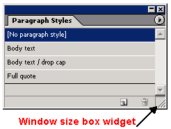
Typically, panel widgets are defined in terms of their relationship with their children. The key data interface is IPanelControlData, which allows access to their child widget hierarchy. Some widgets have a text label, accessible through ITextControlData.
Navigation through the child widgets on a panel is facilitated by IPanelControlData, the signature interface for a panel. The IControlView interface for panel widgets manipulates the visual representation. Typically, this involves delegating to the children to ensure they draw after the panel widget has drawn itself and any decorations. The ITextControlData interface allows the panel name to be set and queried.
A panel is a container widget that supports IPanelControlData. Given such an interface, it is necessary to call only GetWidget for the widget list of the panel control data; this navigates over the immediate children of a container, as follows:
To add new child widgets, given a pointer to an IControlView on the child widget boss object, use IPanelControlData::AddWidget.
The interface on the IPanelControlData container widget boss class provides a mechanism to traverse the widget hierarchy in the direction of the leaves, to search for a widget by ID. Then you can use the IPanelControlData::FindWidget method to get an IControlView pointer referring to that widget boss object.
A widget is contained within another widget when it is in the CPanelControlData list of the other widget. If the grouping widget is simply a frame, the ODFRez type GroupPanelWidget is appropriate. In the case of clustering of buttons, like radio buttons, check boxes, or other buttons that should be mutually exclusive, a ClusterPanelWidget is the correct type to use. This does not draw a frame, so a group panel widget is still required if a visible frame for the collection of widgets is required.
Many panels within the application show a feature of detail control, where either the set of widgets displayed or the physical properties of the widgets (like the height of rows in a tree view) change in response to a user gesture. This feature allows you to provide both a simplified user interface and a more elaborate interface for expert users. Alternatively, users may not always want to see the full range of configuration options, and this allows the widget set displayed in a panel to be varied by an end user. The SDK sample DetailControlListSize shows an example of varying tree-view row height.
The following figure shows the swatches panel at two different levels of detail. The IPanelDetailController interface can switch the level of detail. There are two implementations, for widget size and widget set composition. For a detail-controlled set of widgets, override IControlView::ConstrainDimensions. This provides the correct behavior on resize of the detail-controlled panel, because changing the detail control level typically forces a resize when updating the panel.
This figure shows a detail-controlled panel, showing large and small rows:
You must add an IPanelDetailController interface to a panel boss class that hosts the variable numbers of elements.
Override IControlView::ConstrainDimensions, a resizable panel control view. The client code defines the upper and lower dimensions of the panel. See the SnippetRunner SDK sample.
Working with controls on panels is not as straightforward as with controls on dialogs. Two patterns can be used:
You can add a multiline static text widget to a panel and associate it with a scroll bar almost entirely with ODFRez data statements. The ODFRez custom resource type StaticMultiLineTextWidget or the ODFRez type DefinedBreakMultiLineTextWidget is associated with the ODFRez type ScrollBarWidget through widget identifiers. Unless you require notification of changes associated with the widgets, this suffices to create a multiline static text widget.
There are edit boxes that provide highly specialized behavior; for instance, edit boxes can be created with an associated nudge control that is specialized for the display of text measures (like points) or units (like degrees). If the edit box is being added to a dialog, it typically is necessary to use only the correct ODFRez type and manipulate the edit-box widget through the utility methods on the CDialogController and CDialogObserver helper classes.
In the case where the edit box is added to a panel, if update events associated with Return or Enter being pressed are required, a subclass of an existing edit-box widget boss class is required. This subclass exposes an IObserver interface. In addition, the associated ODFRez custom resource type is subclassed and bound to the new boss class.
Suppose you need to add a combo box that displays measurements in points. The correct procedure is to subclass the kTextMeasureComboBoxWidgetBoss API widget boss class to add an IObserver interface, and attach to the widget boss object in the AutoAttach method of the observer implementation. Similarly, there is a data statement in ODFRez in the localized framework resource file involving a subclass of the ODFRez custom resource type named TextMeasureComboBoxWidget.
The widget boss observer listens for changes along the IID_ITEXTCONTROLDATA protocol. You must subclass the combo box when adding it to a panel, to get notified of change. Be sure the name you choose for the ODFRez subclass contains the name of the superclass. For example, MyTextMeasureComboBoxWidget is an acceptable name; MyWidget is not.
To create owner draw controls, override the IControlView::Draw method; however, the implementations of IControlView for the widgets in the widget set are complex, and the helper class CControlView provides only a minimal implementation. Usually, it is necessary to have the implementation header for the existing implementation (and its ancestors), and then subclass this implementation class.
For owner draw panels in the SDK, see the PanelTreeView and CustomDataLink SDK samples.
InDesign saves data related to panel-geometry properties in workspace XML files. A variety of preconfigured workspace XML files are installed to InDesign's presets folder (<appfolder>/Presets/InDesign Workspaces/en_US/). The workspace files placed in that folder will appear as options in the Window > Workspace menu. The default workspace is named Essentials, and it is also found in that menu. When InDesign starts up with no saved preferences, the Essentials workspace is used to arrange the palettes and menus in the workspace.
When a user creates a new workspace from the Window > Workspace > New Workspace... menu, a workspace file with the specified name is saved to the Workspaces folder within the user's InDesign preferences folder. If the user modifies the position or view of any panel, the workspace is updated and saved to a new file in the Workspaces preference folder. The new file's name is the currently selected workspace name with "_CurrentWorkspace.xml" appended. To save the applicat ion's state, InDesign does not alter the original workspace XML files.
In the default workspace, all third-party panels are grouped in one panel container, and the container is not visible at start-up. As a result, when InDesign is installed and run for the first time, third-party panels are not visible. When the user chooses to show a third-party panel, it is shown in the same panel container as other third-party panels. To override this default workspace behavior, you can add a workspace extension.
Essentially, a workspace extension is a workspace XML file located in a predetermined location, so InDesign reads the XML file at startup. The extension file contains the definition of the panel properties that you want to override in the default workspace. Extension files are loaded after the "default" workspace, but before the "current" workspace. This allows your extension to override default settings for your panel, but it preserves any workspace changes made by the user.
Generating a workspace extension
We recommend the following steps for generating your own workspace extension XML file:
The following table explains the relevant objects in the hierarchy for panel arrangement.
| Name | Workspace XML Tag | Description |
|---|---|---|
| Tab Palette | <palette> | The palette is the object the user perceives as a unit whose position and size can be controlled. Each tab palette contains an InDesign panel. |
| Tab Group | <tab-group> | A collection of one or more palettes. A tab group has at most one active palette. The active palette is the tab whose content is shown and whose tab is front-most. |
| Tab Pane | <tab-pane> | An anchored container for tab groups. |
| Dock | <dock> | A list of connected tab panes. |
The following figure shows a typical InDesign workspace, where toolbars and control bars are docked, and tab palettes are floating or docked.
SDK workspace extensions
The SDK contains sample workspace extension files, in <SDK>/presets/InDesign Workspaces/workspace extensions. To use a sample extension file:
Static text widgets are widely used throughout the application, typically as labels on panels and dialogs. They can display longer runs of text and provide for a scrolling display over multiple lines of text, with or without specified line breaks. In the following figure, static text widgets are used as labels on both the panel widget that frames the combo boxes and the combo boxes.
Although static text widgets cannot be edited, it is possible to vary the appearance and text in response to user events.
There are text widgets provided by the API that also display large amounts of text that can be scrolled through. There also are fitted text widgets, which make sure the frame of the widget always allows text to be displayed with a fixed padding around the text, regardless of the font. There is another variant that allows the font to be both specified in the ODFRez data statements and, potentially, dynamically varied through a particular interface on the boss class.
The following table shows the widget boss classes for static text widgets and the types they bind to, along with sample use in the application.
Static Text Widget Boss Classes
| Widget Boss Class | ODFRez Custom Type | Use |
|---|---|---|
| kStaticTextWidgetBoss | StaticTextWidget | Displays a single line of static text. An example is on the Stroke panel, in the widget that displays Weight. |
| kFittedStaticTextWidgetBoss | FittedStaticTextWidget | Displays text that always fits inside its frame. Helpful where the full text always must be displayed. |
| kGroupPanelTitleTextWidgetBoss | GroupPanelTitleTextWidget | Renders text in theme color if WinXP theme is on. |
| kInfoStaticTextWidgetBoss | InfoStaticTextWidget | Displays text in a font that can be specified in the ODFRez data statements. Can be used where a bold font might be required. |
| kInfoStaticTextAngleWidgetBoss | InfoStaticTextAngleWidget | Same as InfoStaticTextWidget, but validates degree entries. |
| kInfoStaticTextIntWidgetBoss | InfoStaticTextIntWidget | Same as InfoStaticTextWidget, but validates integer entries. |
| kInfoStaticTextPercentageWidgetBoss | InfoStaticTextPercentageWidget | Same as InfoStaticTextWidget, but validates percentage entries. |
| kInfoStaticTextXMeasurementWidgetBoss | InfoStaticTextXMeasurementWidget | Same as InfoStaticTextWidget, but validates X measurement entries. |
| kInfoStaticTextYMeasurementWidgetBoss | InfoStaticTextYMeasurementWidget | Same as InfoStaticTextWidget, but validates Y measurement entries. |
| kStaticMultiLineTextWidgetBoss | StaticMultiLineTextWidget | Displays multiple lines of text. Typically used in conjunction with a scroll bar widget for viewing. |
| kDefinedBreakMultiLineTextWidgetBoss | DefinedBreakMultiLineTextWidget | Allows developers to specify a character sequence that will create line breaks in a block of text. Any occurrences of the specified character sequence in the input text is replaced by a line break in the edit control. |
The ancestor of all static text widget boss classes is kStaticTextWidgetBoss. Text widgets using kInfoStaticTextWidgetBoss can have a variable font displayed. Text widgets using kFittedStaticTextWidgetBoss have a frame that is fitted to the size of the string in the font to display, with a specified padding. There also are two multi-line static text widgets, kStaticMultiLineTextWidgetBoss for the basic multiline widget, and kDefinedBreakMultiLineTextWidgetBoss for the type that accepts predefined line breaks.
Fitted static text widgets resize their frame to try to fit the text in the current drawing font with the specified padding. The kFittedStaticTextWidgetBoss boss class does not add any new interfaces compared with kStaticTextWidgetBoss. It overrides the implementation of the IControlView interface only to ensure the text fits when drawn.
The principal collaboration of interest is between the multi-line text widget types and the scroll-bar widget type, kScrollBarWidgetBoss. An association is established in the ODFRez between the multi-line text widgets and a scroll bar that is responsible for adjusting the views of the text drawn.
The ODFRez custom type associated with the kStaticTextWidgetBoss class is StaticTextWidget. The following example shows the type definition, which is found in Widgets.fh:
The following example shows a sample data definition for a static text widget:
This control encapsulates data of type PMString. The text for a static text widget is initialized through the ITextControlData interface, using the SetString method. The initial value is defined in a key-value pair in the StringTable for each locale of interest, where the key is placed in the CTextControlData field in the ODFRez data statement.
The ITextControlData interface stores the state of the label on the static text widget. IStaticMultiLineTextAttr finds the associated scroll bar widget to scroll a multi-line text widget. Once a reference to the scroll bar widget is obtained (use IControlView::FindWidget), query for its ICounterControlData, and use the methods on this interface to control the view.
Use the info-static text widget (kInfoStaticTextWidget), which is bound to the ODFRez type named InfoStaticTextWidget. The initial font the widget uses is defined in ODFRez data statements, and the font displayed can be changed through the IUIFontSpec interface on the widget boss object.
The API provides check-box buttons (kCheckBoxWidgetBoss) and radio buttons (kRadioButtonWidgetBoss) that operate like the equivalent platform controls. There also are fitted versions of the check boxes and radio buttons provided by the API; these have the additional feature that the button and associated text always fit within the frame, subject to a padding around the boundary. Radio button and check boxes are tri-state controls, and they aggregate an ITriStateControlData interface to represent their state.
The following figure shows a pair of radio buttons and a pair of check boxes. The cluster panel widget that owns the radio button widgets is not shown, but it has a bounding box that contains the radio buttons it owns.
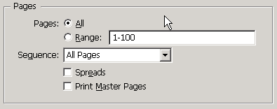
Radio buttons that operate as a logical unit should be contained within a cluster panel widget (kClusterPanelWidgetBoss), which has a bounding box that contains the union of their individual frames. Use the ClusterPanelWidget ODFRez type as an immediate parent.
The ODFRez custom resource type CheckBoxWidget is bound to the kCheckBoxWidgetBoss boss class. The ODFRez custom resource type RadioButtonWidget is bound to the kRadioButtonWidgetBoss boss class.
Check box and radio button widgets provided by the API are shown in the following table.
| Widget Boss Class | ODFRez Custom Type Associated | Use |
|---|---|---|
| kRadioButtonWidgetBoss | RadioButtonWidget | Displays a mutually exclusive set of choices, in conjunction with a cluster panel widget. |
| kFittedRadioButtonWidgetBoss | FittedRadioButtonWidget | A radio button that always fits within its frame. |
| kCheckBoxWidgetBoss | CheckBoxWidget | A standard check box. |
| kFittedCheckBoxWidgetBoss | FittedCheckBoxWidget | Check box that fits within frame, as frame resizes, with padding. |
The check box (kCheckBoxWidgetBoss) and radio button (kRadioButtonWidgetBoss) aggregate similar sets of interfaces. The fitted variants have the same interface profile, typically just replacing the IControlView implementation with one that draws the fitted text label. The interfaces aggregated are shown in the SDK online documentation. The ODFRez type expressions is in Widgets.fh.
The following example shows the type expression for the ODFRez type RadioButtonWidget. It comprises the ODFRez type CControlView (bound to IControlView) and the ODFrez type CTextControlData, bound to ITextControlData, which represents the label.
The following example shows a radio button widget being defined in ODFRez data statements:
Check boxes and radio buttons have a data interface, ITriStateControlData, to access their state. Check boxes and radio buttons are said to be tristate. The states are defined in an enumeration in the scope of the definition of ITriStateControlData. The states a tristate control can be in are unselected, selected and unknown (or mixed). The state of these tristate controls can be queried and set through the interface.
The data model for kCheckBoxWidgetBoss and kRadioButtonWidgetBoss is tri-state and can be in one of following states: selected, unselected, or mixed. It is represented by the value stored on the ITriStateControlData of the given widget boss object.
When the state of controls, like kRadioButtonWidgetBoss and kCheckBoxWidgetBoss, changes, notification is sent along the IID_ITRISTATECONTROLDATA protocol. The following messages are sent when the data model changes:
Messages are sent along the IID_ITRISTATECONTROLDATA protocol. To receive notification of these changes, attach an observer to the button. If your controls are on a dialog, an implementation derived from CDialogObserver makes it straightforward to attach and detach from the widget of interest. The API on IDialogController also makes it easy to initialize the state of the check boxes or radio buttons.
Use a cluster panel widget. For example, for a radio button to interoperate with other radio buttons and ensure mutually exclusive selection, a collection of widgets of ODFRez type RadioButtonWidget are defined as children of an ODFRez ClusterPanelWidget.
This enforces mutually exclusive behavior among a group of widgets (not only radio buttons) that expose IBooleanControlData or ITriStateControlData interfaces.
This section describes some button widgets available in the API. We focus on kButtonWidgetBoss and its descendants. Iconic buttons are discussed in Image widgets.
There is a nudge control widget (kNudgeControlWidgetBoss), which is a composite of two button-like widgets and is discussed briefly in this section. It is used in conjunction with edit boxes and combo boxes to provide the capability to nudge values up or down.
Buttons are used in many dialogs within the application. We do not recommend using the standard button (kButtonWidgetBoss) or its descendants on palette panels. Instead, use iconic buttons on palette panels, to conform with the application's look and feel. Buttons that derive behavior from kButtonWidgetBoss or a descendant of this boss class are bi-state controls.
The following figure shows a selection of button widgets. OK and Cancel buttons are on all dialogs. Whether other buttons are present depends on the requirements for the dialog. The enabling state of the buttons is set up initially by the dialog controller and can be modified by the dialog observer depending on the actions of the end user.
A default button is one that has keyboard focus by default. If the user pressed Return, the default button's event handler processes the event, and an observer on the default button receives an IObserver::Update message. kButtonWidgetBoss and an ODFRez type DefaultButtonWidget can be used if the default button is OK or Done-the button that allows an end user to confirm they accept their choices. The default button need not be OK or Done; it also can be Cancel (kCancelButtonWidgetBoss).
The following table lists button widget boss classes.
| Widget boss class | ODFRez type | Use |
|---|---|---|
| kButtonWidgetBoss | ButtonWidget | Used for any buttons on a panel or dialog. |
| kButtonWidgetBoss | DefaultButtonWidget | Represents the OK button on a dialog. Selected when the dialog appears. |
| kCancelButtonWidgetBoss | CancelButtonWidget | Used for a Cancel button on dialog. |
| kNudgeControlWidgetBoss | NudgeControlWidget | Wraps a nudge-up and a nudge-down button. Used with edit boxes and combo boxes. |
See the SDK online documentation for kButtonWidgetBoss and its descendants, to see the interfaces aggregated by button widgets, as well as some descendants of kButtonWidgetBoss in the required plug-in set.
The kButtonWidgetBoss class, in addition to taking the focus when a dialog appears, provides behavior to dismiss a dialog with an affirmation that the action should be executed or the commitments are completed. This class provides the behavior behind the button with a label like OK or Done that is intended to dismiss the dialog when it is pressed. kCancelButtonWidgetBoss is its counterpart and provides behavior behind a standard Cancel button on a dialog.
Nudge buttons collaborate with edit boxes and combo boxes to allow incremental changes in the control data model. The association is created by referencing a nudge button by widget ID in the definition of the edit box and combo box. Both these types of widgets have an ancestor responsible for dealing with any associated nudge buttons.
The ODFRez custom resource type corresponding to kButtonWidgetBoss is ButtonWidget or DefaultButtonWidget. The CTextControlData field specifies the label on the button. The type expression for ButtonWidget is shown in the following example.
The following example shows ODFRez data statements defining a button widget. Because the ODFRez type ButtonWidget is not subclassed, changes in the data model of this control are handled by the dialog observer rather than an observer for the individual button widget.
IBooleanControlData and ITriStateControlData are the key interfaces in working with button widgets. The IBooleanControlData interface provides access to the data model of bi-state buttons. A boolean control like a standard button can be in one of two states, selected or unselected. The state is set through the IBooleanControlData interface. Update messages are sent along the IID_IBOOLEANCONTROLDATA protocol.
For the bi-state buttons, it is possible to change the state and suppress the notification by calling the mutators with the notifyOfChange parameter set to kFalse.
The ITextControlData interface allows you to set button labels. The boss classes share the default implementation used by many of the controls.
The data model for kButtonWidgetBoss and its descendants is a boolean, so these are bi-state controls. Their state is represented by the value stored on their IBooleanControlData interface, and they notify of changes in this state along the default identifier for this interface, IID_IBOOLEANCONTROLDATA.
The button widget boss classes aggregate I<whatever>ControlData interfaces to allow the state to be queried and set. Usually, this results in a message being sent to attached observers that the control state has changed. It also is possible to set the state but suppress the notification about the change, to prevent observers from performing inappropriate updates when the state is set. In other words, the control change can be muted. This is done by setting the notifyOfChange to be kFalse in the mutator methods on these interfaces. This approach can be used when an observer listening for a notification on one or more controls wants to set up the state of a control it is observing, without receiving another notification about the state change. It is important not to be confused about how these controls work; typically the change parameter is expressed as a message identifier, rather than something more identifiable as a ClassID.
When the state of the controls that descend from kButtonWidgetBoss changes, notifications are sent along the IID_IBOOLEANCONTROLDATA protocol. Additional information is sent via the ClassID. To receive notification about the state change caused by a button press, attach to the button widget boss object's ISubject interface, and listen along the IID_IBOOLEANCONTROLDATA protocol.
The user interface guidelines recommend the widget should be 20 pixels high and a multiple of 5 pixels wide.
Where controls are placed on a dialog, client code can use the helper partial implementation class CDialogController and specialize or implement the appropriate methods. CDialogObserver typically implements an IObserver. The IDialogController interface has utility methods relevant to working with button widgets that set the initial state.
We recommend the IObserver interface be added to the dialog boss object with the superclass CDialogObserver, which provides helper methods like AttachToWidget() and DetachFromWidget(). These methods simplify the process of attaching to or detaching from a widget.
When a button is pressed, an IObserver::Update message is sent through the IObserver interface on the dialog boss object. Check the classID of the change to determine whether it is a kTrueStateMessage.
Edit boxes are displays of information that can be edited. In the application, they allow an end user to enter a value. The value can be constrained to be an integer or to be expressed in specific units, like picas, points, or degrees.
Edit boxes often are used with nudge button controls. The nudge button control provides precise, incremental control over the contents of edit boxes, particularly when control over parameters in layout-specific units is a requirement. This close coupling between the nudge and edit controls helps explain, in part, why the edit box boss classes descend from the kNudgeEditBoxWidgetBoss boss class.
The treatment of edit boxes is slightly different when they are used in dialogs rather than panels. In panels, typically a new boss class is created that derives from one of the <variant>EditBoxWidgetBoss classes, and it exposes an IObserver interface implemented in client code. This interface receives notifications of changes in the text edit box data model. If the specific ODFRez field controlling this property is kTrue, an observer attached to a particular control is notified on every keystroke. The following table lists a selection of the edit-box-related boss classes.
| Widget boss class | ODFRez custom type | Use |
|---|---|---|
| kTextEditBoxWidgetBoss | TextEditBoxWidget | Displays values that are strictly textual, or where you want to parse a value in your own code. |
| kAngleEditBoxWidgetBoss | AngleEditBoxWidget | Displays values in angular units. See the Rotation dialog. |
| kIntEditBoxWidgetBoss | IntEditBoxWidget | Displays integer values. See the Page Setup dialog. |
| kRealEditBoxWidgetBoss | RealEditBoxWidget | Displays floating point values. See the Scale dialog. |
| kPercentageEditBoxWidgetBoss | PercentageEditBoxWidget | Displays values in percentage units. See the Scale dialog. |
| kTextMeasureEditBoxWidgetBoss | TextMeasureEditBoxWidget | Displays values in the current text measurement units. See the Character panel (line weight element). |
| kLineWtMeasureEditBoxWidgetBoss | LineWtMeasureEditBoxWidget | Displays values in line weight units. See the Stroke panel, when the Dashed line type is selected. |
| kXMeasureEditBoxWidgetBoss | XMeasureEditBoxWidget | Displays values in current horizontal measurement units. |
| kYMeasureEditBoxWidgetBoss | YMeasureEditBoxWidget | Displays values in current vertical measurement units. |
The main responsibility of the edit-box widget boss classes is to provide for managed input and display of text strings and unit-specific values. Unit-specific variants remove the responsibility for parsing the input strings from the developer. Similarly, the client-code developer does not need to format the output strings when using unit-specific edit boxes. The edit-box widget boss classes also provide for validation of data entry, which is conditional on settings in the ODFRez data statements.
The principal collaboration is with the kNudgeControlWidgetBoss class, which provides the behavior for nudge controls used to bump values up and down by small increments. The mapping between an edit box and a nudge control is established through the ODFRez data statement for an edit box; no code needs to be written to enforce this collaboration.
The main point about the class hierarchy of the edit-box widget bosses is that there is a common ancestor for all edit boxes, which is a nudge edit-box widget boss class (kNudgeEditBoxWidgetBoss). There also are specialized edit boxes that work in units like degrees, percent, real, or integer values, or in measurements like line weight, text, and the measurement unit currently in force in the horizontal or vertical direction.
There are ODFRez custom resource types that map directly onto each of these boss classes, with the usual naming convention that k<variant>EditBoxWidgetBoss has a related ODFRez custom resource type named <variant>EditBoxWidget. The following example shows ODFRez data statements defining an edit-box widget.
All edit boxes share the same ODFRez custom resource types in their composition as the IntEditBoxWidget. The notable exception is the FontSpecTextEditBoxWidget type, which adds another ODFRez field of UIFontSpec type.
The kNudgeEditBoxWidgetBoss boss class aggregates interfaces like ITextControlData, ICursorRegion, INudgeObserver, and IEditBoxAttributes, along with other key interfaces like IControlView and IEventHandler. ITextValue queries and sets the value for any unit-specific edit-box widgets. ITextValue accesses the data model of unit-specific edit boxes without having to parse the input string or format the output string. It allows a unit-specific value to be set or queried in an edit box.
ITextControlData is used for untyped edit-box widgets, like the widget with behavior provided by kTextEditBoxWidgetBoss. The implementation of ICursorRegion determines how or whether the cursor changes when it enters an edit box.
Attaching an observer to a subclass of an edit-box widget boss class provides for notification about changes when the end user presses Return or Enter within the edit control. It also is possible to get notification about every keystroke, by setting a flag in the ODFRez data statement associated with the edit-box definition. For examples, see any sample that uses an edit box.
An edit-box widget boss class has a data model that typically consists of a string, which is accessed through the ITextControlData interface aggregated by the particular edit-box widget boss class. The ITextControlData interface provides controlled access to the control's data model for simple text strings. This is appropriate for boss classes like kTextEditBoxWidgetBoss. For unit-specialized edit boxes, the key interface to get and set values is ITextValue. This enables access to the measurement data in points, regardless of what measurement is being displayed. This eliminates the need to parse the string read back from the control or format the data for the control when setting a value.
When the data model changes, registered observers are sent an update message with class ID kTextChangeStateMessage along the IID_ITEXTCONTROLDATA protocol. For an observer on a unit-specific edit box, the client code in the update message should query for the ITextValue interface and call the GetTextAsValue method to determine the state of the edit box data model.
The most basic use of an edit box is in conjunction with a dialog. In this case, the value of the edit box can be queried only when the dialog is dismissed or the preview check box is selected, in the case of dialogs that allow preview. When the edit box is used on a panel, it is more practical to attach an observer to the edit control. The observer receives an update message when the content of the edit control changes; all keystrokes within the control result in a notification being sent to registered observers.
The simplest case to consider is when the edit box is attached to a dialog. If the dialog is implemented as recommended, using the CDialogController and CDialogObserver helper classes, setting and getting values from the text control is particularly simple. The application framework sends a sequence of messages to the dialog controller in this order:
This sequence of messages is referred to as the dialog protocol. In the case of the layer options dialog described previously, when the InitializeDialogFields message is sent to the dialog controller, the edit box is set up with an initial value through the CDialogController::SetTextControlData method. When the user presses OK, the dialog controller is sent a ValidateDialogFields message by the application framework; if this returns kDefaultWidgetId, an ApplyDialogFields message is sent.
Adobe user interface guidelines specify that buttons should be 20 pixels high and a multiple of 5 pixels wide.
This section describes widgets used to display images, including icons. These widgets also can have button-like functionality. Image-based widgets are found throughout the application. There are many image-widget boss classes, but few are relevant when writing client code.
There are several icon and picture widgets in the API. Which widget to use depends on whether an icon resource has enough image information or a bitmap or PICT image is required. In either case, a platform-specific resource must be created to hold the image and a binding must be made in ODFRez data statements. If icon resources are sufficient and no button-like behavior is required, the ODFRez type IconSuiteWidget can be used. If a bitmap or PICT image is necessary, the ODFRez type PictureWidget is appropriate. See the PictureIcon SDK sample.
A good example is the Layers panel, which changes the image associated with the eyeball icon depending on whether the layer is visible. The key is to acquire an IControlView interface pointer from an image-widget boss object and call SetRsrcID on this interface to change the picture.
Some of the widget boss classes shown in the following table do not respond to button clicks. Others are described here as pseudo buttons, to differentiate them from the boss classes that descend from kButtonWidgetBoss; however, they still respond to clicks and aggregate an IBooleanControlData interface. If you have a more complex requirement, like creating an image preview in a widget, the PanelTreeView SDK sample shows how to use a custom control view for a panel rather than an existing image-based widget.
To simplify the domain, client code should be able to perform most tasks using the following few widgets:
| Widget Boss Class | ODFRez Custom Type | Description |
|---|---|---|
| kChainButtonBoss | ChainButtonWidget | Used for the constrain proportions button. |
| kIconFieldWidgetBoss | IconFieldWidget | Used in warnings; RollOverIconButtonWidget. |
| kIconPopupBoss | No corresponding ODFRez custom resource type. | Used on tabbed palettes as the triangle icon for the pop-up menu. For internal use only. |
| kIconSuitePopupWidgetBoss | IconSuitePopupWidget | Used in places like the Info panel, where you see a small icon with a tiny triangle on the right-bottom corner. Clicking on the icon pops up a contextual menu. |
| kIconSuiteWidgetBoss | IconSuiteWidget | Used for icons on panels and dialogs. Examples include the warning icons on the Links panel and the top left icon on the Transform panel. |
| kOverPrintIconPushButtonBoss | OverPrintWidget | Not used. |
| kPictureWidgetBoss | PictureWidget | Used for some CJK widgets. The Toolbox has an instance of this boss class being subclassed. |
| kRollOverIconButtonBoss | RollOverIconButtonWidget | Widely used for example SDK samples. |
| kRollOverIconPushButtonBoss | RollOverIconPushButtonWidget | Used in a control strip for vertical justification mode buttons. |
| kSimpleIconSuiteButtonWidgetBoss | SimpleIconSuiteButtonWidget | Little used. See the Stroke panel. |
Most ODFRez types comprise nothing more than a CControlView field with an additional flag specifying whether some appearance should be applied.
The principal interfaces of interest to client-code developers are IControlView (for switching the image displayed) and IBooleanControlData (or at least the role it plays in notification). The IControlView interface dynamically varies the visual representation of a widget. There may be occasions to switch to a different picture depending on state; the methods on the IControlView interface, like SetPluginRsrcID and SetRsrcID, are relevant in this context.
Clients of the buttons with behavior provided by boss classes like kRollOverIconButtonBoss and derivatives can attach to the ISubject interface of an instance of a boss object and request notifications on the IID_IBOOLEANCONTROLDATA protocol. An update message is sent depending on the state of the pseudo-button widget. If selected, a kTrueStateMessage value is sent for the ClassID of the Update message with the IID_IBOOLEANCONTROLDATA protocol. If the button is unselected, the ClassID is kFalseStateMessage with the same protocol.
A common requirement is using a change in the displayed image to signal a state transition. For example, the Layers panel uses iconic buttons to indicate that a layer is locked or unlocked, visible or invisible. This can be done through the IControlView interface on a particular widget. To switch the icon or picture displayed, acquire an IControlView interface through IPanelControlData::FindWidget, and send a SetRsrcID message to the widget boss object to change the image being displayed.
This section describes two widely used and closely related widget groups, drop-down lists and combo boxes. Drop-down lists are non-editable displays of lists of information; combo boxes also are used to display non-editable drop-down lists of information, but the end user interacts with the list in a different way. The relation between the two is that a combo box is a composite of an edit-box control (with nudge buttons) and a drop-down list. A combo box allows a user to select from a drop-down list or use a text-edit box to enter a new choice. For example, the Character panel in the application uses several different kinds of combo boxes; see the following figure.
The widget that displays available fonts is a type-ahead combo box. There are several specialized combo boxes that display information in measurement units as shown in the following table.
| Widget Boss Class | ODFRez Custom Type | Example |
|---|---|---|
| kAngleComboBoxWidgetBoss | AngleComboBoxWidget | Displays a set of values in angular units. See the Transform panel. |
| kDropDownListWidgetBoss | DropDownListWidget | Displays a set of text values rather than numeric values, where no type-ahead or nudge is required. See the Stroke panel (Stroke-type). |
| kIntComboBoxWidgetBoss | IntComboBoxWidget | Displays a set of integer values. See the kerning combo box on the Character panel. |
| kLineWtMeasureComboBoxWidgetBoss | LineWtMeasureComboBoxWidget | Displays values in line weight units. See the Stroke panel. |
| kPercentageComboBoxWidgetBoss | PercentageComboBoxWidget | Displays values in percentage units. See the Transform panel. |
| kRealComboBoxWidgetBoss | RealComboBoxWidget | Displays a set of floating-point values. |
| kTextComboBoxWidgetBoss | TextComboBoxWidget | Displays textual values. See the Find/Change dialog. |
| kTextMeasureComboBoxWidgetBoss | TextMeasureComboBoxWidget | Displays units in the current text-measurement units. Use in the Character panel to specify leading. |
| kTypeaheadTextComboBoxWidgetBoss | TypeaheadTextComboBoxWidget | Allows a user to enter partial string and have the control predict the value to select. Used in the Character panel to display font families. |
| kXMeasureComboBoxWidgetBoss | XMeasureComboBoxWidget | Displays values in the current horizontal measurement units. |
| kYMeasureComboBoxWidgetBoss | YMeasureComboBoxWidget | Displays values in the current vertical measurement units. |
The API has many combo-box widget boss classes that provide rich behavior for combo boxes. The combo box can cooperate with a nudge control widget, to allow incremental changes in input parameters. Combo boxes are appropriate for displaying units like measurement units, angles, and percentages.
When input is selected from a list of values, the combo box is more convenient than the drop-down list. Type-ahead combo boxes allow quick access to a value in a sorted list; the user can enter keystrokes matching items in the list. For example, the font family combo box on the Character panel allows the first few characters of the font name to be entered, which scrolls the list to the desired location. The API has many types of combo boxes, some of which are shown in the preceding table.
The following are the measurement units specific to the layout of drop-down lists and combo boxes:
A different measurement system may be in force for each of these, and a combo box of a specialized type displays the choices in the contextually appropriate units. The preceding table shows a selection of the combo boxes available in the API.
Combo boxes are panel widgets; combo-box widget boss classes descend from kGenericPanelWidgetBoss. When instantiated, a combo-box widget boss object creates two children, a drop-down-list widget boss object and an edit-box widget boss object. There appear to be many widget boss classes related to combo boxes in the API, but those related to the encapsulated drop-down list and edit box within the combo-panel are implementation boss classes and not required for writing client code.
The data model for combo boxes consists of a string-list control data model for the drop-down (accessed via the IStringListControlData interface) and the data model for an edit box, represented by the ITextControlData interface. Changes in selection by the end user are sent to client code along the IID_ITEXTCONTROLDATA protocol. The edit box does not have an independent data model to the string list; it reflects the current selection in the drop-down list.
IStringListControlData populates both drop-down lists and combo boxes dynamically. IDropDownListController changes the state of a drop-down list or combo box drop-down, and it controls the current selection of the drop-down list or combo box. For example, to specify the item selected, enable or disable the control. The ITextControlData interface exposed by the kComboBoxWidget boss relates to the child edit-box widget. Similarly, the IEditBoxAttributes interface relates to the child edit-box widget. However, changes to selection are notified along the IID_ITEXTCONTROLDATA protocol for a combo box, which is not intuitive; a list-control data protocol might have been expected.
The splitter widget manages the dimensions of multiple panels within one container. For example, the Pages panel exploits a splitter widget to create two regions that can be sized co-dependently. The splitter widget divides both vertically and horizontally. The setting is determined by the bindings, normally specified on the CControlView-related portion of the ODFRez data statements that define the splitter. The following table shows some boss classes that implement splitters.
| Widget Boss Class | ODFRez Custom Type | Description |
|---|---|---|
| kSplitterWidgetBoss | SplitterWidget | Used in InCopy's Thesaurus panel. |
| kSplitterPanelWidgetBoss | SplitterPanelWidget | Used in XML panel. |
| kLayoutSplitterPanelWidgetBoss | LayoutSplitterPanelWidget | Used in Page panel. |
| kLinkedSplitterPanelWidgetBoss | LinkedSplitterPanelWidget | Used in XML Mapping and Word Preferences dialogs. |
The kSplitterWidgetBoss boss class and the kSplitterTrackerBossMessage tracker boss class cooperate to provide the behavior of the splitter widget. The splitter widget is initialized by ODFRez data statements. There is little need for additional customization of the splitter widget. The ODFRez custom resource type SplitterWidget is bound to the kSplitterWidgetBoss boss class. The superclass of kSplitterWidgetBoss is the base widget boss class, kBaseWidgetBoss.
The kSplitterWidgetBoss boss class exposes interfaces like ISplitterControlData, which provides access to the list of managed widgets. The ICursorRegion interface effectively is a signature that the widget is bound to a cursor provider. The ISplitterControlData interface provides access to the list of splitter-managed widgets and queries methods about the properties of the control.
The kSplitterTrackerBossMessage boss class provides the behavior behind the tracker. Much of the widget's capability comes from the implementation of ITracker on this widget boss class. The splitter-widget boss class event handler serves only to create the tracker and send it a BeginTracking message.
To provide scrolling views in the user interface, the API uses a pattern or assembly consisting of three elements, listed in the following table:
| Elements | Description |
|---|---|
| Panoramas | An aspect of a scrollable object that can be accessed through an IPanorama interface. Scrollable objects expose this interface. |
| Panorama syncs | Abstractions in the API that coordinate a scrollable view with scroll-bar controls, with behavior provided by one of two boss classes named xxxScrollBarPanoramaSyncBoss. For internal use. |
| Scroll bars | Controls whose behavior derives from the kScrollBarWidgetBoss widget boss class. |
A fundamental application of these elements is the layout widget. Scroll bars and panoramas occur widely within the application's plug-in code base.
Scroll bars are widgets with behavior deriving from kScrollBarWidgetBoss. The scroll bar data model is accessed through the ICounterControlData interface. Panoramas are aspects of objects that scroll; the IPanorama interface scrolls a view. The boss classes mentioned below expose an IPanorama interface.
The kScrollBarWidgetBoss boss class extends kBaseWidgetBoss and is bound to the ODFRez custom resource type ScrollBarWidget. When a scroll bar is added to a control like a StaticMultiLineTextWidget, it works hand-in-hand with a panorama (IPanorama) to produce the correct scrolling behavior of the dependent widgets. The scroll bar receives input from the end user, and the implementation code manipulates the view through the IPanorama interface.
The ICounterControlData interface is the key interface for scroll bars. It accesses the data model of a scroll-bar widget boss object and changes its state. The IPanorama interface manipulates a scrollable object's view.
The kScrollBarWidgetBoss class exposes ICounterControlData, the data model for a scroll bar widget.
An observer requesting changes in the data model of a scroll bar widget boss object attaches to its ICounterControlData interface and requests notification on the IID_ICOUNTERCONTROLDATA protocol. When the counter control data changes, registered observers are notified with an update message with the classID parameter of kCounterChangeStateMessage. The client also gets passed a pointer to a CounterControlUpdateParams object as the changedBy parameter of an IObserver::Update message.
A slider control is appropriate for situations in which an end user can enter a parameter that can vary continuously over a finite, determinate range. There are several standard sliders (descendants of kStdSliderWidgetBoss) in the application's user interface, such as on the Color panel, shown in here:
A pop-up slider (descendant of kPopupSliderBoss) can be used in the same situation, when the slider should appear only when the user wants to change a particular value rather than be continuously visible. The following figure shows an example of a pop-up slider in the Transparency panel. This slider controls the opacity of the selected page items. There also is a pop-up slider on the Swatches panel, which is used to vary the tint associated with a particular color in a swatch. This uses a class of pop-up slider specialized for the input of real-valued numbers.
Pop-up slider combo-box controls combine an edit box and a button. They are child widgets of a panel. The pop-up slider appears only when the end user clicks a button to show the slider in its own floating window. This pop-up slider is a relatively complex control, consisting of a cooperating assembly of an edit box, a button, a floating window, and a slider, which are owned and/or managed by a parent boss object that is a descendant of the generic panel widget boss class (kGenericPanelWidgetBoss). It allows you to pack more user interface into a given area of screen real estate than is possible with standard slider controls.
The following table shows boss classes that implement sliders:
| Widget Boss Class | ODFRez Custom Type | Example |
|---|---|---|
| kStdSliderWidgetBoss | (none: you create your own) | Slider that is continuously available, as on the Color panel. |
| kRealPopupSliderComboWidgetBoss | RealPopupSliderComboBoxWidget | Pop-up slider, as on the Swatches panel. |
| kIntPopupSliderComboWidgetBoss | IntPopupSliderComboBoxWidget | Pop-up slider with integer values, as on the Inks panel. |
| kPercentPopupSliderComboWidgetBoss | PercentPopupSliderComboBoxWidget | Pop-up slider with percentage values, as on the Transparency panel. |
To use the standard slider widget (kStdSliderWidgetBoss), create a new ODFRez custom resource type that can extend the ODFRez custom resource type CControlView, and add an ODFRez SliderControlData field. This new type is then bound to the subclass of kStdSliderWidgetBoss (k<whatever>SliderWidgetBoss). This new ODFRez custom resource type is bound to the boss class delivered by your own plug-in that extended the kStdSliderWidgetBoss boss class. There are other, subtle dependencies and interfaces required for the standard slider implementation to work correctly.
The slider pop-up widget is a compound widget, consisting of a panel, edit box, button widget, and slider. It is called a combo-box slider because it functions as if it were a combo box, with a slider replacing the traditional combo-box drop-down list.
The kPopupSliderComboBoxWidgetBoss boss class provides the core of the behavior for the combo-box slider. This boss class extends the kComboBoxWidgetBoss boss class. Do not use this kPopupSliderComboBoxWidgetBoss boss class directly; instead, use one of its subclasses, which have specified associated measurement units.
A pop-up slider has much functionality in common with combo-box widgets. A pop-up slider has part of its behavior provided by the kPopupSliderBoss boss class, which extends the standard slider widget boss (kStdSliderWidgetBoss).
The pop-up slider widget does not require an ODFRez CSliderControlData field to be initialized. Internally, the slider widget on the floating window does have an ISliderControlData interface, because the class kPopupSliderBoss derives from kStdSliderWidgetBoss; however, a pop-up slider is initialized by the settings obtained by querying through the ITextDataValidation interface. These setting specify the range through the interior ISliderControlData interface on the kPopupSliderBoss. The fields of the ODFRez type TextDataValidation in the ODFRez data statements defining the pop-up slider specify the maximum and minimum slider values.
ISliderControlData is an interface aggregated on the kStdSliderWidgetBoss boss class. It encapsulates information about the maximum and minimum values exposed in the control's range, and the current value of the slider setting. If the data value changes, notifications with ClassID equivalent to kRealChangeStateMessage are sent to registered observers of the slider boss object.
The boss class aggregates an IEventHandler interface. This should not need to be overridden. The event handler with implementation ID of kCSliderEHImpl is responsible for creating a tracker if required and calling the tracker methods in the appropriate sequence. There is an IControlView interface on the slider control, whose default implementation uses the ISliderStateData and ISliderControlData interfaces on the widget boss object to determine how to draw the visual representation of the control.
When the data model of a pop-up slider changes, an IObserver::Update message is sent to attached observers. Interested client code queries for the state of the pop-up slider by using the ITextValue interface. This allows the value of the slider state (percent, real, or integer) to be queried. Similarly, to set the state of the pop-up slider, use the ITextValue interface. Other properties of the pop-up slider are queried through the ISliderControlData interface. For example, this is used to determine the minimum or maximum of the pop-up slider range.
The state of the standard slider is represented by ISliderControlData. Changes to this state are broadcast along IID_ISLIDERCONTROLDATA.
The state of a pop-up slider is represented by ITextValue. Changes are broadcast with the IID_ISLIDERCONTROLDATA protocol.
Notifications about changes to the state of a standard slider control are sent along the IID_ISLIDERCONTROLDATA protocol to registered observers. The usual process in processing the IObserver::Update message is to query the data value through ISliderControlData::GetValue, to determine the control state. Add an IObserver interface to the kStdSliderWidgetBoss by subclassing. On receiving an AutoAttach message from the application core, the client code queries for the ISubject interface on the widget boss object and requests notifications along the IID_ISLIDERCONTROLDATA protocol. The observer then detaches in AutoDetach.
When changes occur in the slider control's data, IObserver::Update messages are sent to this observer. A message with ClassID of kRealChangeStateMessage is sent to the observer. The ISliderControlData interface then retrieves the current data value associated with the slider.
Pop-up slider notifications also are sent along the IID_ISLIDERCONTROLDATA protocol; however, the ClassID of the message is unique to the pop-up slider and is one of the following:
The superclass for all pop-up sliders is kPopupSliderComboBoxWidgetBoss. The core behavior of pop-up sliders comes from the IControlView implementation aggregated on this boss class. Another boss class, kPopupSliderButtonBoss, provides the behavior behind the button on the pop-up slider combo-box widget. The IEventHandler implementation aggregated on this kPopupSliderButtonBoss class is responsible for creating a floating window and adding a child widget, which is the slider the user manipulates.
The appearance of the pop-up slider is determined by the implementation of the IControlView interface with identifier kPopupSliderComboBoxViewImpl. This implementation is responsible for creating the child widgets that provide the behavior of the pop-up slider. When the pop-up slider is restored from persistent data (plug-in binary resource first time, or saved data database if its representation exists in it), it creates an object of class kPopupSliderButtonBoss to provide the behavior behind the button that shows the slider. An object of class kComboBoxEditBoxWidgetBoss also is created, to support the behavior of the edit box in the pop-up slider combo-box widget. The pop-up slider itself (kPopupSliderBoss) is created on demand by the class that implements the IEventHandler interface for the composite pop-up slider combo-box widget. Typically, the slider is shown on a left-button down event. The implementation creates an object of class kWindowBoss and specifies it is a floating window. It then creates an object of class kPopupSliderBoss and adds it as a child of this new window boss object.
A tree-view widget allows you to display hierarchical data; users can expand or contract nodes in the tree to increase or decrease the amount of detail displayed. A tree-view widget can have vertical and/or horizontal scroll bars, to allow end users to scroll within the view of the tree structure.
The tree-view control is complex. The basic procedure is as follows:
The following figure shows a tree view and indicates the widget boss classes that provide the behavior for the components of the tree view. The kTreeViewWidgetBoss class provides the behavior for the main control, the kTreeNodeWidgetBoss class provides the bulk of the behavior for nodes in the tree, and kTreeExpanderWidgetBoss provides the behavior of the triangle-icon that can be used to show or hide the children shown for a specific node.
The following sections describe how to work with the tree-view control. The control is relatively complex and can be tricky to use. The PanelTreeView SDK sample shows how to use these controls.
The API to use a tree-view control is written differently than platform-specific APIs, such as the API for the TreeView control on Windows or the Java ™/Swing tree-control. Instead of adding nodes to an InDesign tree-view control directly, client code provides the means for navigating through its own tree model. The tree-view control widget boss object (kTreeViewWidgetBoss) handles navigation, sends queries about the tree model, and asks for wid gets for a particular node when it needs them. This is carried out by the framework sending messages to the client code, asking for, say, a root node in the tree or a widget that can be used to display a particular uniquely identified node.
The following table shows boss classes that implement tree views:
| Widget Boss Class | ODFRez Custom Type | Responsibility |
|---|---|---|
| kTreeViewWidgetBoss | TreeViewWidget | Provides the main behavior for tree controls. |
| kTreeNodeWidgetBoss | TreeNodeWidget | Represents a node in tree view. Subclass to hear expand/collapse events with an observer or to override the event handler. |
| kTreeExpanderWidgetBoss | TreeExpanderWidget | Provides behavior to expand/collapse nodes of tree with children. |
The essence of working with the tree-view control is to subclass kTreeViewWidgetBoss and aggregate on it your implementation of the ITreeViewHierarchyAdapter interface. This enables you to adapt your data model to the needs of the InDesign tree-view control. You also are required to provide an implementation of the ITreeViewWidgetMgr interface, which allows your client code to specify which user interface widgets to create to display a given node, and also allows your client code to specify how the widgets should be placed.
Client code is required to notify the application framework when changes in the tree model take place, like nodes being added or deleted. This helps keep the tree model (based on your data) and the tree view synchronized. The key responsibilities of client code are as follows:
Client code provides methods for returning the root node and the parent or child node at a given index from any given node. Each node within the tree can have an associated data item. This might be a UID, in which case an API class (UIDNodeID) is used to represent each node. Alternatively, the data items may be entirely custom items that are unique to your client code, in which case it may be necessary to subclass an API type. Each node should be identified uniquely. This enables the application to render the correct view of the underlying data model provided by the client code.
When the tree view is updated, the application core may pass to the client code a reference to any node. It is up to the client code to provide an appropriate widget to render the node and populate the widget with a view of the associated data.
Adapter pattern
The tree-view control in the API uses the design pattern adapter, described in Design Patterns (Gamma, Helm, Johnson, and Vlissides, Addison-Wesley, 1995). At its most basic, the adapter pattern allows two existing but incompatible classes to work together without changing the public interface of either class. The classes required to work together are named in the pattern as client and adaptee.
An instance of the client sends particular messages to the target, an abstract API implemented by the adapter. The messages sent by the client are translated by the adapter into method calls on an adaptee. The adapter then manufactures an appropriate return value, if required, based on the adaptee's response. In terms of the tree control, the roles are occupied as shown in the following table.
| Role | Occupied by ... |
|---|---|
| Adaptee | The data model, such as a tree model representing the XML logical structure of a document. |
| Adapter | The plug-in client code's implementation of ITreeViewHierarchyAdapter. |
| Client | Application core, specifically, the widget run-time subsystem (not client code). |
| Target | The abstract API on ITreeViewHierarchyAdapter. |
Factory method pattern
The factory method pattern described in Design Patterns is used in implementing a working tree-view control. This pattern can be used when a framework needs to instantiate classes but has knowledge of only abstract classes, which cannot be instantiated directly. In implementing a tree control, a parameterized factory method is used, where an identifier is passed in by the framework specifying what type of object to manufacture. There is a factory method, ITreeViewWidgetMgr::CreateWidgetForNode, which is parameterized by passing a reference to the node being rendered. Client code is responsible for returning a new instance of an IControlView interface on a newly created widget boss object that can be used to render the node's associated data.
The core behavior for the tree view widget is determined by the kTreeViewWidgetBoss class. The first responsibility of client code is to subclass this boss class and create one's own boss class that provides implementations of ITreeViewHierarchyAdapter and ITreeViewWidgetMgr.
The behavior of individual nodes in the tree view control is provided by the kTreeNodeWidgetBoss boss class. Subclass this where you want to add an IObserver interface to obtain notification about, for instance, expansion or contraction events associated with tree nodes. There is a tree expander widget, with behavior provided by the kTreeExpanderWidgetBoss boss class. Key boss classes and their responsibilities are listed below.
There is an ODFRez custom resource type TreeViewWidget. Because client code must subclass kTreeViewWidgetBoss, it always is necessary to perform a corresponding subclass of TreeViewWidget and bind it to the new widget boss class, such as kMyTreeViewWidgetBoss. The ODFRez custom resource type TreeExpanderWidget is used on panels to render individual nodes in the tree. This widget allows the descendant nodes of a node to be displayed or collapsed. If no children are associated with a given node, a correct implementation is to hide this widget.
There also is a new ODFRez custom resource type created for displaying each node in the tree-view control. For tree-view controls on panels, a subclass of PrimaryResourcePanelWidget is appropriate. For tree-view controls on dialogs, an erasable panel is required, as the tree-view control does not know anything about erasing its own background. The PanelTreeView SDK sample shows how to use a tree-view control on a dialog and how to receive notification about different tree-related events.
This is one of the two interfaces you should implement to obtain a working tree-view control. The ITreeViewHiearchyAdapter interface provides the means for navigating through your tree model. It is like the adapter pattern, in that it provides a way for the TreeView widget to navigate your tree model without requiring your tree model to conform to any given interface.
Provide an implementation of this interface. ITreeViewWidgetMgr is where you create the tree-view control widgets in your client code and apply node data to the widget. There is a partial implementation of ITreeViewWidgetMgr, called CTreeViewWidgetMgr, that takes care of the widget placement implementation and simplifies the implementation of this interface.
This interface is aggregated on the kTreeViewWidgetBoss boss class; you are not expected to provide your own implementation of this interface. The principal responsibility of this interface is to keep the tree view synchronized with changes to the tree model. Client code should call methods in this interface to let the tree know when changes to the tree occur.
For example, client code should call ITreeViewMgr::ChangeRoot() to initialize the tree-view control. Call this whenever you want to regenerate the tree, like when the tree view control was in a state where it did not hear about changes to the data model and wants to start fresh. There also is a debug-only version of ChangeRoot() that validates an implementation of ITreeViewHierarchyAdapter.
Client code calls ITreeViewMgr::NodeAdded() and ITreeViewMgr::BeforeNodeDeleted() when nodes are added and about to be removed from the tree model. Failure to call these methods when changes occur in the tree model causes problems in the tree view, like nodes unintentionally disappearing.
ITreeViewMgr::NodeChanged() should be called when a nodes data has changed that will not affect the nodes height. If the change will affect the node's height, call ITreeViewMgr::BeforeNodeDeleted(), followed by ITreeViewMgr::NodeAdded().
Uniquely identifying each node
On examining the ITreeViewHierarchyAdapter interface, notice the extensively used class NodeID. This is best explained by looking at the problem it is trying to solve. When the tree view asks for the root node, the client needs to uniquely identify that node. In a simple case, a UID may be all that is needed to identify the node.
Not all tree models, however, have UIDs associated with each node. For example, the PanelTreeView SDK sample represents views onto the local file system, and each node encapsulates a path in the file system, not a UID-based object. That leads us to return a class that can be specified by the client but derives from a class providing the methods required by the tree-view control.
The main problem is that we would need to return a pointer to this class, which leads to potential problems with clean-up. To make clean-up easier, the framework uses the NodeID class as a smart pointer. NodeID is a class that holds and deletes pointers to NodeIDClass classes.
If your tree is UID-based, there is an existing NodeIDClass-based class you can use, UIDNodeID. If you require different data to identify your tree nodes, create your own class based on NodeIDClass.
NodeID and related classes
There are several classes that can be found as arguments and return types in the interfaces that should be implemented to create a working tree-view control. These are defined in the NodeID.h API header file. They have similar names, and confusion can arise between NodeID, which is like a smart pointer for the type NodeIDClass, and other classes, like UIDNodeID, which is a subclass of NodeIDClass. There also is a smart pointer, TreeNodePtr, which is used for descendants of type NodeIDClass, like UIDNodeID.
As discussed earlier, every node need to be identified uniquely. In InDesign, the NodeIDClass class represents an individual node. A subclass of this class, UIDNodeID, is available in the API. In reading UIDNodeID, remember it should have the suffix "-Class."
To muddy the water further, there is a NodeID class that is like a smart pointer and is used to manage the lifetime of dynamically created NodeIDClass objects. This class is found as a parameter on methods in ITreeViewHierarchyAdapter and ITreeViewWidgetMgr.
In certain situations, it may be adequate to use a UID to identify a tree node. There is a class in the API called UIDNodeID that can be used for these cases. Otherwise, you need to implement your own subclass of NodeIDClass that identifies each node uniquely. For an example of how this can be done, see PanelTreeView.
The following table lists the C++ classes related to the tree-view widget and their responsibilities.
| C++ Class | Responsibility |
|---|---|
| NodeIDClass | The data associated with each node. Allows each node to be uniquely identified. Subclass this type to create custom data nodes. |
| TreeNodePtr | A smart pointer that is the equivalent of InterfacePtr for NodeIDClass descendants. |
| NodeID_rv | A class for method return values similar to NodeID, except it gives up control of the encapsulated NodeIDClass rather than copying it. |
| NodeID | Manages the lifetime of objects of type NodeIDClass. |
Node recycling
The tree-view widget contains instantiated widgets for visible nodes. For example, when the end user scrolls down, the node that was on top is no longer visible, and there is a new visible node at the bottom. The application framework removes the top widget, and if it is of the same type (based on the WidgetID obtained from ITreeViewWidgetMgr::CreateWidgetForNode()) as the widget needed for the bottom node, the framework re-uses the widget for the bottom node. This is one reason the ITreeViewWidgetMgr::CreateWidgetForNode() and ITreeViewWidgetMgr::ApplyNodeIDToWidget() methods are distinct. It is necessary for the application framework to create new widgets only when there are no widgets of the right type to recycle.
Tree-view attributes
The tree-view control also has attributes that determine scroll information and whether the root item is shown. The attributes are set in the resource for the TreeView. Vertical and horizontal scroll bars are provided by the tree view (if desired), so you do not need to add them yourself. Specify in the resource whether you want no scroll bar, vertical only scroll bars, or horizontal and vertical scroll bars.
The scroll amounts for both horizontal and vertical scroll bars also are set in the resource. You must set two values for each scroll bar:
For example, the tree view control can be configured so the scroll button moves 20 pixels, but the thumb scroll moves just 1 pixel, allowing for greater accuracy. The thumb-scroll increment must be a factor of the scroll-button increment.
Another attribute on the TreeView specifies whether to display the root element. You should have only one root element, but you may not necessarily want to show it.
Some APIs have an explicit tree model behind the tree control (for instance, in Java Swing). The InDesign API control, however, leaves it up to the client code to determine how the tree data model is represented. It requires only that client code can provide certain kinds of information as requested about its data model, like the number of children it has.
Other controls have a simpler data model and a simple notification structure that relates directly to this data model. For example, an edit box has an ITextControlData interface that, when changed, notifies along the IID_ITEXTCONTROLDATA protocol. The situation is more complex for tree view controls.
There are at least two kinds of changes in which client code might be interested:
If you use the shadow (proxy) event-handler pattern shown in the PanelTreeView SDK sample, it also is possible to receive notification of events like double-clicks within the nodes of the tree view.
Implementing ITreeViewHierarchyAdapter
The ITreeViewHierarchyAdapter interface provides the means for navigating your tree. Its GetRootNode() method returns an instance of a node that represent your root node, with data allowing it to be uniquely identified as such.
The ITreeViewHierarchyAdapter::GetParentNode() method requests the parent node of a given node. If the given node is a root node, there is no parent for a root node, so return nil; otherwise, depending on the location of the node in your tree model, return its parent.
In implementing ITreeViewHierarchyAdapter::GetNumChildren(), return the number of children, given a node that is in your tree model. The ITreeViewHierarchyAdapter::GetNthChild() method is the counterpart to ITreeViewHierarchyAdapter::GetParentNode(). Since a node can have multiple children but only one parent, this method passes in the index position of the child node it is querying.
In implementing ITreeViewHierarchyAdapter::GetChildIndex(), the index refers to the index position used in the ITreeViewHierarchyAdapter::GetNthChild(), and the range of the index is from 0 to (number of children-1).
In implementing the ITreeViewHierarchyAdapter::GetGenericNodeID() method, simply return a dummy node that makes a generic node. This method is used primarily for persistence. When something is purged and the application framework must write out a NodeIDClass, it uses the ReadWrite() method on the NodeIDClass. When the application framework needs to read it back in, it needs to be able to create instances of that NodeIDClass. It uses ITreeViewHierarchyAdapter::GetGenericNodeID() to create an instance, then calls ReadWrite() on the NodeIDClass to initialize it.
Implementing ITreeViewWidgetMgr
The next implementation you need to provide is for ITreeViewWidgetMgr. This interface is like a widget factory method, because this is where you create widgets for the nodes in the tree. The two main methods are CreateWidgetForNode() and ApplyNodeIDToWidget().
The purpose of ITreeViewWidgetMgr::CreateWidgetForNode()is to create the right widget for the NodeID passed in. In this method, create the widget, but do not change the widget data to match the node.
Changing the widget data, such as setting the text of a static text widget on a panel to render the data associated with a node, happens in ITreeViewWidgetMgr::ApplyNodeIDToWidget().
These two methods are distinct, because the application framework re-uses widgets that are not needed. The framework creates the widget once in ITreeViewWidgetMgr::CreateWidgetForNode(), then uses it several times by calling ITreeViewWidgetMgr::ApplyNodeIDToWidget() and passing in a different NodeID. In this way, the framework is not continually creating and deleting widgets.
The implementation of the ITreeViewWidgetMgr::CreateWidgetForNode() method is where client code creates the widget from the resource, given a node. When the application framework wants to re-use a widget, it calls ITreeViewWidgetMgr::GetWidgetTypeForNode() to determine what widgets can be used with that node. GetWidgetTypeForNode() returns a WidgetID corresponding to the type of widget given.
When creating widgets for different types of nodes, the ITreeViewWidgetMgr::GetWidgetTypeForNode() method becomes significant. In the ITreeViewWidgetMgr::CreateWidgetForNode() method, you can look at the NodeID and determine what type of node to create.
The framework uses the widget's WidgetID to discriminate between different node types in the tree. The framework only calls ITreeViewWidgetMgr::ApplyNodeIDToWidget() with a widget that has the WidgetID returned in ITreeViewWidgetMgr::GetWidgetTypeForNode(). For this reason, widgets of the same type must have the same WidgetID.
Elements are added to the quick-apply dialog using a quick-apply service-provider boss (signature interface IQuickApplyService). The quick-apply service provides a set of QuickApplyFindListNodes to the application. These identify the name of the item to be added, a type, and an icon to accompany the item in the quick-apply dialog. Once the user selects an item in the quick-apply dialog, each quick-apply service is called in turn until one handles the item.
To implement a quick-apply service:
For an example of implementing a quick-apply service, see the SnippetRunner SDK sample.
The quick-apply subsystem supports the ability to filter out elements as the quick-apply dialog is being populated through the quick-apply filter service. This is called as entities are added to the quick-apply dialog.
To implement a quick-apply filter service:
For an example of implementing a quick-apply filter service, see the SuppUI SDK sample.
You can highlight information about tagged content items, by turning on the feature that shows either tagged frames or element markers in stories.
Solution
Sample code
Related APIs
You can show or hide the structure view.
Solution
Sample code
Related APIs
The structure view can show or hide information about element attributes, XML comments, processing instructions, and, if required, it can show snippets of text from XML elements that have text content. You can vary the information presented to your end users through the structure view and control its appearance.
Solution
You can change the appearance of the structure view if you know how to change the data stored in the interface that controls its appearance. The appearance of the structure view is controlled by preferences stored in IStructureViewPrefs on the session workspace (kWorkspaceBoss). You can change these in one of two ways:
Sample code
Related APIs
Description
You can make a programmatic selection in the structure view; for example, to specify the target node in the logical structure where XML should be imported. You should do so only if you are not concerned about trampling on the end-user's selection, because there is no easy way for you to restore the end-user's selection after setting your own selection programmatically.
If there is a selection in the structure view, you can use the high-level suite interfaces to manipulate logical structure; for instance, to create, modify, and delete elements and attributes (IXMLStructureSuite).
Solution
Use the selection suite named IXMLNodeSelectionSuite to select nodes in the structure view. An instance can be acquired from the selection manager (ISelectionManager).
The structure view must be visible to use the IXMLStructureSuite suite interface associated with an XML selection. The selection architecture is relatively complex but critical to programming InDesign; for details, see the "Selection" chapter of Adobe InDesign Products Programming Guide. The selection subsystem is a facade that tries to abstract away the model-specific details of different selection formats, to let client code deal with selections at a more abstract level.
Follow these steps:
Sample code
Related API
Suppose you are importing XML and you want to import XML into the selected element. For instance, you set a selection using the method described in Making a selection in the structure view. You have the choice of changing the option that persists with the document or setting the option to import into the selected element for one specific import.
Solution
The preference you want is stored in IXMLImportOptions. To set up the option for a one-time import, you parameterize an instance of kImportXMLDataBoss through its IXMLImportOptions interface. To change the option stored in the document workspace:
Sample code
Related API
Suppose that you know the path to an XML data file to import, the parent element for the imported elements, and that there is no selection in the structure view. You can import an XML file in this situation.
Solution
To import an XML file without a selection, use a low-level command. You can specify the XML element to parent the new elements or specify kInvalidXMLReference, in which case the root becomes the parent for the new elements. Follow these steps:
Sample code
Related API
If you have a selected XML element in the structure view, you can set up the import option to import into the selected node and use a high-level suite interface.
Solution
Sample code
Description
Suppose you have XML content that contains repeat elements; for example, a set of classified advertisements. Suppose you want to flow all the ads into one tagged story, creating new elements within the story for each occurrence of the classified ad. You can do this by turning on the feature to import repeating elements. Since this feature is on by default, unless you do not want it on sometimes and need to turn it off and back on, or the user turns the feature off, you normally may not need to do anything.
Solution
This is almost the same as importing XML normally, but you must enable the service that controls import of repeating elements if it is not enabled. The service is an instance of an import matchmaker service (kXMLRepeatTextElementsMatchMakerServiceBoss). For the service to run during import, the IXMLImportPreferences preference needs to be set up correctly.
Sample code
Related APIs
Suppose you have an XML template with optional elements (e.g., <copyright>). If these optional elements are not in the input, you can delete them from the XML template, which has placeholders for them, during the import process.
Solution
This is almost the same as importing an XML file normally (as described in Importing an XML file with no selection in the structure view). The main difference is that you must set up service-specific preferences (IXMLImportPreferences), as the feature is not enabled by default. Follow these steps:
Sample code
Related APIs
Suppose you created an XML template and have XML-based data to import, with tagged placeholders for elements in the incoming XML you want to include in your document. There are optional elements in the incoming XML, which you do not want to include in your InDesign document once imported; for instance, an element <media-metadata>. You can delete incoming elements that do not have a match in the XML template.
Solution
This is almost the same as importing an XML file normally (as described in Importing an XML file with no selection in the structure view). The main difference is that you must set up service-specific preferences (IXMLImportPreferences), as the feature is not enabled by default. Follow these steps:
Sample code
Related APIs
Suppose you have XML data that includes tables specified in CALS table format. You can import these tables into InDesign and manipulate them like InDesign tables.
Solution
This is almost the same as importing an XML file normally (as described in Importing an XML file with no selection in the structure view). The main difference is that you must set up service-specific preferences (IXMLImportPreferences). Follow these steps:
Sample code
Related APIs
Suppose you have custom content defined in an XML vocabulary embedded in XML that is being imported. You can take control when the DOM is serialized into the document.
Solution
Implement a SAX DOM serializer handler (ISAXDOMSerializerHandler).
For instance, InDesign supports XML round-tripping of untagged tables and Ruby (annotations intended for Japanese and other ideographic writing systems) through this mechanism.
Sample code
Related API
Suppose you have configuration data expressed in XML, and you want to read this data but are not interested in importing the XML directly into a document. You can read XML data but use the application's XML parser.
Solution
Implement a custom SAX content handler (ISAXContentHandler), which lets you take control when the XML parser encounters elements you registered to handle.
Sample code
Related API
You can vary XML export options, like whether to export from the selected element or vary the encoding of the XML exported from the default UTF-8.
Solution
Sample code
Related APIs
If you have one or more nodes selected in the structure view, you can export this as an XML data file.
Solution
Sample code
Related API
Suppose you want to export XML from the logical structure of your InDesign document. If you have a selection in the structure view, use a high-level suite interface, as described in Exporting XML data from a selection in the structure view. Without a selection, you can use the lower-level export provider mechanism.
Solution
XML export uses the standard export provider architecture, so you can use the service registry (IK2ServiceRegistry), as follows:
Sample code
Related APIs
Description
You can export a tagged table as an XML data file.
Solution
Sample code
Related APIs
If you have custom XML content, you can control the format of the content element when it is exported to XML file.
Solution
Use the XML Export handler extension pattern. Implement an XML export handler (IXMLExportHandler) as the provider of kXMLExportHandlerSignalService. In the provider, you can specify your custom way to write out specific XML elements.
For example, in the XML data updater sample plug-in, each data field is an XML element; however, during export, you can group all fields of a record into one XML element, to provide a more readable format.
Sample code
Related API
When you are creating tags and related objects (like tag-style mappings), you must decide where to store them. If you are acquiring references to objects that already exist, you also need to know where to look for them.
Solution
The choice is highly constrained for objects like tags (kXMLTagBoss) and related tag-style mappings (IXMLTagToStyleMap, IXMLStyleToTagMap); it will be a workspace (IWorkspace) of some kind.
Tags are in the session workspace (kWorkspaceBoss) or document workspace (kDocWorkspaceBoss). To establish default tags for new documents, create tags in the session workspace (kWorkspaceBoss). If you want the objects to be available only within a particular document, you create tags in the document workspace (kDocWorkspaceBoss) for the document of interest; see IDocument::GetDocWorkspace().
There are other kinds of information stored at the workspace level; see the API documentation for kWorkspaceBoss or kDocWorkspaceBoss, and examine the interfaces that contain "XML." Tag-to-style maps, style-to-tag maps, and import/export options are among the other kinds of information stored in workspaces.
To change this information, you must identify the target workspace in which the change is to take place.
How to obtain a reference to the workspace of interest depends on whether you are writing client code (user interface code) or model (model manipulation) code:
There are several methods on IXMLUtils that let you acquire XML-related interfaces on the workspaces, given a document database (IDataBase).
Sample code
Related APIs
Loading a set of tags from an XML file means that they can be used to mark up content items in the document. You also can load tags through importing a DTD, in which case InDesign creates tags when it finds element declarations in the DTD.
Solution
The tag list (see the API documentation for IXMLTagList) for a document is in the document workspace (kDocWorkspaceBoss). You can change the contents of the tag list through IXMLTagCommands, as follows:
Loading tags means changing the tag list (IXMLTagList) stored in a workspace. Which workspace to target depends on whether you just want to set up a default tag set for subsequent new documents or create a tag set for a given document. Note the following:
Under the hood, the low-level command kLoadTagListCmdBoss is processed whenever a tag-list is imported.
The following is and example of a tag list.
Sample code
Related API
You can save the tag list from a document, to enable the tags to be used in other documents or as defaults for new documents.
Solution
First, decide which tag list you want to save; that is, what workspace does it come from, and where to save it in the file system. Then follow these steps:
The tag list is exported as an XML document, with elements specifying the name and color index for each tag. A fragment of a tag list is shown in Loading tags.
Sample code
Related APIs
To tag document content (for example, with tags like "headline"), you need to create tag objects (kXMLTagBoss) in the document's tag list.
Solution
Tag objects (kXMLTagBoss) are managed by the IXMLTagList interface on kDocWorkspaceBoss or kWorkspaceBoss. Follow these steps:
Sample code
Related APIs
To create an XML element, you need a reference to a tag (kXMLTagBoss) that represents its name. Similarly, to apply a tag to content, like a story (kTextStoryBoss), graphic frame, or text range, you need a reference to a tag object.
Tags (kXMLTagBoss) are stored in the tag list (IXMLTagList) in a workspace (kDocWorkspaceBoss, kWorkspaceBoss). The tags specific to a document are held in its workspace (kDocWorkspaceBoss). The tag list is a collection of boss objects (kXMLTagBoss) that represent tags.
Solution
Sample code
Related APIs
Tags are represented by kXMLTagBoss. The IPersistUIDData interface on kXMLTagBoss refers to an instance of kUIColorDataBoss, which stores the tag color.
Solution
Sample code
Related APIs
You can change a tag's name and/or color. If you change the name, any tagged content items that used the old tag are tagged with the new tag.
Solution
Sample code
Related APIs
You can specify the appearance of XML-based content once it is imported into InDesign.
Solution
This mapping is stored in the IXMLTagToStyleMap interface on a workspace (kDocWorkspaceBoss/ kWorkspaceBoss). Follow these steps:
Sample code
Related API
Suppose that have a document with systematically applied styles (character/paragraph styles); you can create a logical structure that takes advantage of the systematic way the styles are used.
Solution
The first part of this process is creating a set of associations between styles that exist in the document and tags that will be used to mark up content in each style. This mapping (IXMLStyleToTagMap) is held in a workspace (kDocWorkspaceBoss/ kWorkspaceBoss). Follow these steps:
Sample code
Related API
You can use styles in a document to style incoming XML. Assume you already set up the associations between tags and styles in the XML template (as described in Creating a mapping from tag to style). What you need to do is apply the mapping that is already set up within the document.
Solution
Even if you added to the mapping new associations between tags and styles, the document would not appear any different until you apply the mapping to the document. To do this, you must process a low-level command, as follows:
Sample code
Related APIs
Assume you created an associative mapping from styles to tags, because you want to apply structure to a document with systematically applied styles; see Creating a mapping from style to tag. Having created the mapping within the document workspace, you need to apply the mapping, for the structure to be created in the document.
Solution
Pay attention to naming in this area, as there is a low-level command to process, kXMLCreateStyleToTagElementsCmdBoss, which has a slightly different name than the low-level command in Applying tag-to-style mapping to style incoming XML. The name "kXMLCreateStyleToTagElementsCmdBoss" is logically correct, since when applying a style-to-tag mapping, you are creating new XML elements in the logical structure. The operation of applying a tag-to-style map does not create new styles, it only applies existing ones with the specified names.
Sample code
Related APIs
You can iterate through the logical structure from its root or start validating the logical structure from the root. For these use cases, you need a reference to the root element in the logical structure.
The root element is represented by a kTextXMLElementBoss class, manipulated through its IIDXMLElement interface.
Solution
Sample code
Related APIs
The document element is the parent of the root element and peers of the root element, such as the DTD element and comments and processing instructions at the document level. To iterate through these top-level elements, you need a reference to the document element. You also need a reference to the document element when dealing with XML validation.
The document element is represented by the kXMLDocumentBoss class.
Solution
Use a method on IXMLUtils to acquire a reference to the instance of kXMLDocumentBoss that represents the XML element for a given InDesign document.
Sample code
Related APIs
You can traverse the tree of XML elements in a document; for example, to find elements that match a particular specification and then take some action.
Solution
To iterate through the logical structure during import, implement an extension pattern; in the "XML Fundamentals" chapter of Adobe InDesign Programming Guide, see the section on "Post-Import Responder." To iterate through the logical structure once the document is fully loaded, start from the root, iterate through its children, and descend the tree recursively. Follow these steps:
Sample code
Related APIs
If you have a reference to a page item or other object, you can determine whether it can be tagged.
Solution
The IXMLUtils utility interface has a method, IsTaggablePageItem, that allows client code to determine whether a given boss object can be tagged. There also is a method on IXMLUtils, GetActualContent, which lets client code acquire a reference (UIDRef) to the underlying object supporting the tagging operation (see IXMLReferenceData).
Sample code
Related APIs
If you have a tagged story, you can find out what text is tagged and by what element within each story.
Solution
Use XMLContentIterator to traverse the child elements of a given element. This is particularly useful for elements with text content; e.g. tag text ranges.
Sample code
Related API
If you have a selection, or you know how to create a selection in the structure view programmatically, you can create new elements in the logical structure easily. If you have no selection or it is inconvenient or not possible to create one, use the method described in Creating new elements with no selection.
One way to add and remove elements from the logical structure is to use the IXMLNodeSelectionSuite suite interface to program a selection in the structure view, then use IXMLStructureSuite, which acts on a selection in the structure view.
Under the hood, when an element is created, the low-level command kXMLCreateElementCmdBoss is processed. When an element is deleted, the low-level command kXMLDeleteElementCmdBoss is processed.
You can create, modify, and delete attributes with methods on IXMLAttributeCommands.
Solution
Related documentation
Sample code
Related API
Description
You can create new elements in the logical structure, with a known parent and no selection in any view. If you have a selection in the structure view that indicates the new parent, use the method described in Creating new elements with parent selected.
Solution
The IXMLElementCommands command facade provides methods (CreateElement overloads) to create a new element in the logical structure not associated with a content item. Follow these steps:
Sample code
Related APIs
If you have a selected element in the structure view, you can modify its attributes; for example, create a new attribute, change an existing attribute, or delete an attribute.
Solution
The IXMLStructureSuite suite interface, which can be used in the case of a selection in the structure view, provides methods to make this straightforward. Follow these steps:
Sample code
Related APIs
Assume that there is no selection of any kind. You can create, modify, or delete attributes of an element in the logical structure.
Solution
There is a command facade (IXMLAttributeCommands) on the kUtilsBoss boss class, which provides methods to make this straightforward. Follow these steps:
Related API
You can tag a graphic frame as a placeholder for an image you will import later or already imported.
Solution
The procedure depends on whether you have a selection. If you have no selection of any kind, follow these steps:
If you have a selection, use the IXMLTagSuite interface. This suite is available in many views; for instance, if the graphic frame to be tagged is selected in the layout view, use IXMLTagSuite.
Sample code
Related APIs
Description
You can tag a story as a placeholder for stories in incoming XML, or tag an existing story.
Solution
The solution depends on whether you have an existing selection. If there is no selection, follow these steps:
If there is an existing selection, follow these steps:
Sample code
Related APIs
You can tag a range of text, either text within a paragraph or a paragraph itself.
Solution
Sample code
Related API
If you have an InDesign table, you can turn it into a structured table; for example, so it can be round-tripped through XML.
Solution
Sample code
Related APIs
Description
You can add comments and/or processing instructions, regardless of whether there is a selection.
Solution
Sample code
Related APIs
Solution
Again the solution depends on whether there is a selection and, if there is a selection, what type of selection it is. Modifying comments and processing instructions without a selection involves processing low-level commands.
When there is a selection, follow these steps:
If there is no selection, follow these steps:
Sample code
Related APIs
You can be notified when particular XML-related changes occur, such as an element being deleted.
When the logical structure is changed (e.g., elements are added or deleted, or associations are added to the tag-style mappings), notifications are sent out. If you know how the change is identified, you can attach your own observer to the correct subject and listen for these notifications.
Changes are notified to observers of changes to the backing-store subject. For instance, the structure-view tree widget has an observer on the backing store subject, to enable it to synchronize its state with the model's state.
Solution
Related APIs
Description
You can associate a DTD with the logical structure of a document, to allow you to perform validation and other functions, like discovering what elements are valid to insert at a given node in the logical structure.
Solution
Process the low-level command kXMLLoadDTDCmdBoss. This creates an instance of the boss class kXMLDTDBoss in the document's backing store.
Sample code
Related API
If you associated a DTD with the logical structure of a document, you can determine the validity of the logical structure, given the grammar represented by the DTD.
Solution
There are several ways to validate the logical structure of a document against a DTD:
The ActionID for actions to validate the logical structure from the root can be found in the header file source/public/includes/XMediaUIID.h. Note that there is no public API to give you easy access to change the contents of the validation window in the InDesign user interface (see "XML validation errors window" in the Programming Guide chapter titled "XML fundamentals") and you have to figure out how to display these errors yourself if you take this route.
Sample code
Related APIs
Description
Suppose you imported a DTD into an InDesign document, as in Associating a DTD with a document. You can constrain the elements that can be added by an end user at a given node in the logical structure.
Solution
Related APIs
You can transform incoming XML with an XSL stylesheet. Specifically, you can translate one XML vocabulary in which the source XML is expressed into another XML vocabulary that your XML template understands.
Solution
In addition to implementing an XML transformer, you need to invoke the built-in XSLT engine within InDesign. Follow these steps:
Sample code
Related APIs
To learn how versioning persistent data works:
For help with your specific programming problem, see the sections below for a use case that matches your need.
Description
SnippetRunner is an SDK-supplied plug-in that lets you run code snippets, which can help you explore your use case.
Recommendations
Sample code
Related API
Description
Suppose you are looking for assets on the SDK that will help you program with versioning persistent data.
Recommendations
See <SDK>/docs/references/index.chm (or HTML format). SDK sample plug-in descriptions are available from the "Samples" tab. API documentation is available from the "API Classes" tab. Documentation for boss classes and their aggregated interfaces is available from the "Boss Classes" tab.
To use the schema-based conversion mechanism, tell the conversion manager that your plug-in has a conversion provider. For an example, see <SDK>/source/sdksamples/persistentlist/PstLst.fr.
Implementations are supplied by the SDK. Remember to include ShuksanID.h in your .fr file.
To determine how to change the format of your plug-in's persistent data, follow these steps:
No conversion is required to add boss classes or implementations. To remove a boss class or an implementation at a specific format number, use the RemoveClass, RemoveImplementation, or RemoveAllImplementation directives.
The following example shows a resource that holds a list of individual directives that define the history of the plug-in's bosses and implementations:
You can put as many individual directives into a single DirectiveList resource as you like. Line by line, the preceding list of directives tells the conversion manager the following:
You might need to use this technique in the following situations:
To change the ID of a boss or of an implementation, use the ReplaceClass or ReplaceImplementation directives, as shown in the following example:
Line by line, the preceding list of directives tells the conversion manager the following:
If you change the ReadWrite() of a persistent implementation such that you are adding, moving, or removing an XferID() call (used to read or write ClassIDs and implementationIDs), you need a content iterator. If you do not have one, you will get an assert when the debug application shuts down, to remind you that you need one.
The conversion manager algorithm relies on the ability to find every ClassID and ImplementationID in a document. It then determines, for each ID, whether it needs to be converted. It finds all these IDs by iterating through the document database. At the outermost level, the conversion algorithm iterates through all UIDs in the database. Because each UID is a class, it first asks whether the class needs conversion. Next, it gets the content iterator for the class and iterates through all ImplementationIDs the class contains.
If an implementation does not need to be converted, the conversion manager checks whether there is a content iterator associated with the implementation. Unless the implementation contains embedded ClassIDs or ImplementationIDs, usually there is not an iterator, because the implementation reads and writes only simple data (for example, PMString and Int32). If there is a content iterator, however, the conversion manager looks at each ClassID and ImplementationID the implementation contains, to see whether it needs conversion. (This process is recursive.) The content iterator must match what the ReadWrite() routine does, or it fails.
To add a content iterator for your implementation:
For a working example of a content iterator, see Snapshot SDK sample.
You might want to increment a plug-in's format number in the PluginVersion resource, even though you did not change the data format. In this case, you can perform a null conversion to tell the content manager about the new format number. For example, working with the SchemaFormatNumber resource:
This resource, along with the lack of any DirectiveList resources specific to these versions, causes the schema-based converter to generate a null conversion from format number 1.0 of each implementation to format number 2.1. Not including this resource causes an assert:Assert: "ConversionMgr::AddTargetConversion() - Unable to convert plugin 'MYPLUGIN.PLN' from format 1.0 to format 2.0."
To find out about changes to data conversion-related APIs, see the API Advisor reports, found in <SDK>/docs/references.
If your plug-in stores a persistent preference PMString on the kDocWorkspace, you might have done either of the following:
When specifying a schema resource, some fields might require implicit type conversion. The following table shows which data types can be implicitly converted and which cause an illegal conversion. In the table, Y denotes a legal conversion, and N denotes an illegal conversion. Here are further notes on Y:
| Â | Bool8 | Bool16 | Int8 | Uint8 | Int16 | Uint16 | Int32 | Uint32 | Real | ID | Obj | Ref |
|---|---|---|---|---|---|---|---|---|---|---|---|---|
| Bool8 | — | Y | Y1 | Y1 | Y1 | Y1 | Y1 | Y1 | N | N | N | N |
| Bool16 | Y | — | Y1 | Y1 | Y1 | Y1 | Y1 | Y1 | N | N | N | N |
| Int8 | Y2 | Y2 | — | Y3 | Y | Y3 | Y | Y3 | Y | N | N | N |
| Uint8 | Y2 | Y2 | Y6 | — | Y | Y | Y | Y | Y | N | N | N |
| Int16 | Y2 | Y2 | Y6 | Y4 | — | Y3 | Y | Y3 | Y | N | N | N |
| Uint16 | Y2 | Y2 | Y6 | Y6 | Y6 | — | Y | Y | Y | N | N | N |
| Int32 | Y2 | Y2 | Y6 | Y4 | Y6 | Y4 | — | Y3 | Y | N | N | N |
| Uint32 | Y2 | Y2 | Y6 | Y6 | Y6 | Y6 | Y6 | — | Y | N | N | N |
| Real | N | N | Y7 | Y5 | Y7 | Y5 | Y7 | Y5 | — | N | N | N |
| ID | Y8 | Y8 | N | N | N | N | N | N | N | — | N | N |
| Obj | N | N | N | N | N | N | N | N | N | N | — | N |
| Ref | N | N | N | N | N | N | N | N | N | N | N | — |
This chapter describes use cases and frequently asked questions related to commands.
Suppose you want to determine whether an API is provided that can help you perform a task, such as the following:
To determine whether an API is provided that will help you:
Suppose you want to determine the commands that the application uses to effect some change. For example, you want to find the command that is processed when you use the Paragraph Options dialog to change a text style.
Using the Spy plug-ins:
Using the Diagnostics plug-in, turn on command tracing, by selecting Test > Diagnostics > Command > Trace All Commands.
Treat the output with caution. It reveals the commands used to make the change, but a utility may exist that can process this command for you. Check the command's documentation in the API Reference for information on available utilities.
Suppose you need to modify an object that persists in a document or defaults.
Objects that persist in a database that supports undo, such as documents (see kDocBoss) or defaults (see kWorkspaceBoss), must be modified using commands. You must not call interfaces that set persistent data on these objects directly.
To process a command:
Suppose you want to make a change to a document or defaults, but you need to delay the change so it occurs later. For example, when the application is launched, you want to automatically load some data into defaults. There is a service you can use to get called on start-up (see the IStartupShutdownService interface), but you need to wait until the application is fully initialized before loading the data.
Schedule a command to be processed at a later time. The command is processed when the application is idle, based on the specified priority.
To schedule a command:
Suppose you want to group a set of modifications into one undoable operation. For example, you want to place a set of images into a document and apply a special effect to each one. On undo, all images should be removed from the document; on redo, they should be restored.
Process the commands that perform the changes within a new command sequence:
Suppose you want to group a set of modifications into one undoable operation and, within this operation, you need sophisticated flow control that allows for fail/retry semantics. For example, while refreshing the content of the files linked to a document, you find a file is missing and want to allow the user to browse for the missing file and then proceed.
To process two or more commands within an abortable command sequence:
Example of fail/retry semantics in an abortable command sequence:
Suppose you call a method on an interface, and you get the assert "DataBase change outside of Begin/End Transaction!"
You must process a command to modify that interface. Call a utility that processes the command for you.
This chapter describes solutions to problems that can be encountered when working with notification.
Suppose you want to know the predefined set of events for which the application calls responders. For example, the application can call responders when documents open and close.
Each event has a corresponding ServiceID. A responder can register interest in one or more of these events by returning the ServiceIDs of interest from its IK2ServiceProvider implementation. The following table lists the ServiceIDs for events in which responders frequently are interested.
Frequently used responder events and ServiceIDs
| Event | ServiceID | Signal-manager boss class |
|---|---|---|
| Create document | kBeforeNewDocSignalResponderService | kDocumentSignalMgrBoss |
| kDuringNewDocSignalResponderService | kDocumentSignalMgrBoss | |
| kAfterNewDocSignalResponderService | kDocumentSignalMgrBoss | |
| Open document | kBeforeOpenDocSignalResponderService | kDocumentSignalMgrBoss |
| kDuringOpenDocSignalResponderService | kDocumentSignalMgrBoss | |
| kAfterOpenDocSignalResponderService | kDocumentSignalMgrBoss | |
| Save document | kBeforeSaveDocSignalResponderService | kDocumentSignalMgrBoss |
| kAfterSaveDocSignalResponderService | kDocumentSignalMgrBoss | |
| Save document as a new file | kBeforeSaveAsDocSignalResponderService | kDocumentSignalMgrBoss |
| kAfterSaveAsDocSignalResponderService | kDocumentSignalMgrBoss | |
| Save copy of document | kBeforeSaveACopyDocSignalResponderService | kDocumentSignalMgrBoss |
| kDuringSaveACopyDocSignalResponderService | kDocumentSignalMgrBoss | |
| kAfterSaveACopyDocSignalResponderService | kDocumentSignalMgrBoss | |
| Revert document | kBeforeRevertDocSignalResponderService | kDocumentSignalMgrBoss |
| kAfterRevertDocSignalResponderService | kDocumentSignalMgrBoss | |
| Close document | kBeforeCloseDocSignalResponderService | kDocumentSignalMgrBoss |
| kAfterCloseDocSignalResponderService | kDocumentSignalMgrBoss | |
| Create new page item | kNewPISignalResponderService | kNewPISignalMgrBoss |
| Create new story | kNewStorySignalResponderService | kNewStorySignalMgrBoss |
| Delete story | kDeleteStoryRespService | kDeleteStoryCmdBoss |
The preceding table is not a complete list of the responder services provided by the application. See the documentation on working with a particular domain, such as layout or text, for information on the responder services the domain provides. If you do not find the information you need, you can determine the current set of responder services supported by the application as follows:
If the responder is to handle a single event, the API provides service-provider implementations that can be used to register interest. As a result, you need not write the C++ class that implements IK2ServiceProvider. For example, if a responder is required that reacts to the before close signal, the existing API-supplied implementation (kBeforeCloseDocSignalRespServiceImpl) can be declared in the boss class definition. The following table lists frequently used service-provider implementations provided by the API.
| ServiceID | API-provided ImplementationID |
|---|---|
| kBeforeNewDocSignalResponderService | kBeforeNewDocSignalRespServiceImpl |
| kDuringNewDocSignalResponderService | kDuringNewDocSignalRespServiceImpl |
| kAfterNewDocSignalResponderService | kAfterNewDocSignalRespServiceImpl |
| kBeforeOpenDocSignalResponderService | kBeforeOpenDocSignalRespServiceImpl |
| kDuringOpenDocSignalResponderService | kDuringOpenDocSignalRespServiceImpl |
| kAfterOpenDocSignalResponderService | kAfterOpenDocSignalRespServiceImpl |
| kBeforeSaveDocSignalResponderService | kBeforeSaveDocSignalRespServiceImpl |
| kAfterSaveDocSignalResponderService | kAfterSaveDocSignalRespServiceImpl |
| kBeforeSaveAsDocSignalResponderService | kBeforeSaveAsDocSignalRespServiceImpl |
| kAfterSaveAsDocSignalResponderService | kAfterSaveAsDocSignalRespServiceImpl |
| kBeforeSaveACopyDocSignalResponderService | kBeforeSaveACopyDocSignalRespServiceImpl |
| kDuringSaveACopyDocSignalResponderService | kDuringSaveACopyDocSignalRespServiceImpl |
| kAfterSaveACopyDocSignalResponderService | kAfterSaveACopyDocSignalRespServiceImpl |
| kBeforeRevertDocSignalResponderService | kBeforeRevertDocSignalRespServiceImpl |
| kAfterRevertDocSignalResponderService | kAfterRevertDocSignalRespServiceImpl |
| kBeforeCloseDocSignalResponderService | kBeforeCloseDocSignalRespServiceImpl |
| kAfterCloseDocSignalResponderService | kAfterCloseDocSignalRespServiceImpl |
| kNewPISignalResponderService | kNewPISignalRespServiceImpl |
| kNewStorySignalResponderService | kNewStorySignalRespServiceImpl |
| kDeleteStoryRespService | kDeleteStoryRespServiceImpl |
Suppose you want to discover the broadcasts that the application makes to notify a change.
The Spy plug-in can be configured to log all commands that are executing, along with the subjects notified, the protocol used for notification, and the change that occurs. Perform the action of interest, and Spy provides the information required to observe the action.
Using the Spy plug-in, do the following:
Suppose you use lazy notification to observe objects in the model and want to access the information in the lazy notification data that is broadcast by the application.
The lazy notification data objects used within the application are not documented in the public API.
Lazy notification data objects are data-carrying (C++) objects created by the message originator before they call ISubject::ModelChange. The type of data contained in a lazy notification data object varies. Each notification protocol used by the application either has a fixed C++ data type or does not use lazy notification data at all. Observers need to know the type, so they can safely cast a LazyNotificationData pointer to a concrete class. For example, changes to the spread list are notified on protocol IID_ISPREADLIST, using a type of ListLazyNotificationData<UID>.
Suppose you need to optimize lazy notification. For example, you observe a large number of objects in the model and present a view of all these objects in your user interface. Your command is changing only a small subset of those objects, and you want the observer to refresh the data in the view for only the objects that change.
The API provides the templated lazy notification data types identified in the following table, which can be used to pass information about the objects that change, from the message originator into IObserver::LazyUpdate.
| API | Note |
|---|---|
| ListLazyNotificationData | Templated class used to pass a list containing a given type. For example, ListLazyNotificationData<UID> can be used for a list of UIDs, and ListLazyNotificationData<ClassID> can be used to pass a list of ClassIDs. |
| TreeLazyNotificationData | Templated class used to pass a tree containing a given type. For example, TreeLazyNotificationData<UID> can be used to pass a tree of UIDs. |
For example, consider a plug-in that adds a list of custom styles to a document and a panel that displays them. The panel has an observer that receives lazy notification when custom styles are modified. If the observer receives a nil-pointer for the lazy notification data, this indicates that all custom styles were modified. The observer should examine all custom styles in the document and refresh the entire panel. If the observer receives a lazy notification data object that is not nil, the object can be used to discover the subset of custom styles that were modified. The observer needs to examine only the affected custom styles in the document and refresh their associated data in the panel.
Consider a command that can lock one custom style object at a time. The command notifies using the document's ISubject interface and broadcasts the UID of the affected custom style in a lazy notification data object, as shown in the following example.
Consider an observer that refreshes a list of these custom styles in a panel. It is attached to a document's ISubject interface for lazy notification when custom styles change. It can use the lazy notification data object to discover the custom style that was affected and optimize the objects that are refreshed, as shown in the following example, which receives UIDs of affected objects via ListLazyNot ificationData:
Lazy notification data-object lifetime
A lazy notification data object is created and populated by a message originator (the entity that calls ISubject::ModelChange, usually a command). The lazy notification data object is allocated on the heap using the new operator, and it is passed to the subject via the ISubject::ModelChange method; ownership passes to the application core. Since only one update message is set to observers for all messages sent (per protocol on a subject) in a sequence, changes in the lazy notification data object accumulate (see LazyNotificationData::Add()). For example, if within a command sequence a loop creates several page items, the creation of the page items being broadcast using lazy notification. Any lazy notification data objects passed into the ISubject::ModelChange method of the subject by the command creating the individual page items are merged. Only one lazy notification data object is passed to the lazy observers. Lazy notification data objects are tied to the lifetime of the command history; however, they can be purged in certain situations (such as low memory). Observers using lazy notification must not assume the existence of an lazy notification data.
Lazy-notification data and undo/redo
Lazy notification data objects must deal appropriately with undo and redo. For example, if the do operation creates a page item, resulting in a UID being placed in the lazy notification data, some understanding of what this means must be provided for undo/redo. API-supplied lazy notification data objects dealing with UIDs generally maintain three sets, those that were added, those that were removed, and those that changed. On undo/redo, the lazy notification data object is invoked to provide a clone (see LazyNotificationData::Clone()). For our simple example, this means on undo the "removed" and "added" lists are swapped, and the observer is called with the cloned list.
Lazy-notification data values
A lazy notification data parameter can be nil; in this case, the observer must re-build whatever information it requires directly from the model. The parameter also can be nil under certain circumstances (such as low memory conditions) controlled by the core application.
Implementation
The abstract base class for lazy notification data classes is LazyNotificationData. To use the templated classes ListLazyNotificationData or TreeLazyNotificationData for your own types, follow the instructions provided in the API Reference. To implement a new type of lazy notification data object, provide an implementation of LazyNotificationData.
This chapter presents case studies of working with snippet export, snippet import, and snippets and libraries.
Description
Suppose you have a selection or want to make one programmatically and export a snippet from the selection.
Solution
Related documentation
Related APIs
Related function
Suppose you want to export page items as a snippet, without involving the selection subsystem; for example, because you do not want to trample the end-user selection, or you do not have a view open onto the document.
Solution
If you want to export without involving selection, you are responsible for collecting the root objects for your snippet, which should have IDOMElement interfaces. That is, these objects must participate in the scripting DOM. To export page items, you need to create a PageItem snippet, which uses the default export policy. Follow these steps:
Related documentation
Sample code
Related APIs
Suppose you want to export all swatches in a given document to a snippet file, including all the gradients, solid colors, and tints. Alternately, you might be interested in exporting one or a set of swatches from a given document.
Solution
Use ISnippetExport::ExportDocumentResource(), as demonstrated in the SnpImportExportSnippet code snippet.
Related documentation
Sample code
Related APIs (for swatches)
Suppose you want to export all paragraph styles and character styles from a document, or export a subset of the styles to a snippet.
Solution
Use ISnippetExport::ExportAppPrefs(), as demonstrated by the SnpShareAppResources code snippet.
Related documentation
Sample code
Suppose you want to export all object styles in a given document, or a subset of those styles, to a snippet.
Solution
Use ISnippetExport::ExportDocumentResource(), as demonstrated by the SnpImportExport code snippet.
Sample code
Related APIs
Suppose you want to export a set of nodes in the logical-structure tree, along with the placed content items, because you want to transfer the logical structure and the associated content items into another document. For example, you want to transfer part of one XML template into another, including the frames in the first document, as well as the logical structure.
Solution
Export a snippet based on the set of XML elements of interest. This lets you import the snippet into another document, and the placed content items would be transferred over into the new document.
The difference between this and a normal XML export is that the normal export does not know how to export any information about the native InDesign document objects; for example, exported XML does not carry information about text frames, graphic frames, spread layers and so on. This information is represented in the snippet, which lets you interchange chunks of an InDesign document with another, carrying over all the dependencies.
Follow these steps:
Related documentation
Sample code
Suppose you already exported some or all of the swatches from a document, and you want to import them into another document.
Solution
You need to decide what node in the scripting DOM will be the target for the import. You need to target the document, which means you should parent the incoming snippet on the document (kDocBoss). Follow these steps:
Related documentation
Sample code
Suppose you want to import a set of paragraph and/or character styles from a snippet.
Solution
You can import these into the document element. If you have a document reference (IDocument), acquire the IXMLFragment interface and use ISnippetImport::ImportFromStream.
Related documentation
Related API
Sample code
Suppose you want to import object styles previously exported as a snippet.
Solution
Use ISnippetImport::ImportFromStream, as demonstrated in SnpImportExportSnippet.
Suppose you want to import some styled text, and you are not sure exactly what the target for the import should be. Assume you exported a story and already have one in a snippet.
The behavior of the application when it comes to snippets containing text needs to be examined carefully. If the root object in the snippet is a story (from a kTextStoryBoss object), the snippet expects to be inside an ICML or INCX file. If you drag this onto a document, it places the styled text as you expect. If you change the snippet file extension to .idms or .inds, instead of .icml or .incx, the snippet will not create styled text on import; instead, you will see the XML content.
On the other hand, if you export from the containing frame, you can drag in an .idms or .inds file containing styled text and get back a text frame with your styled text in it.
Solution
Using the low-level snippet-import mechanism is not easy when importing a story from INCX. It is safer to use the InCopy import provider (IImportProvider).
Related documentation
Suppose you want to import some page items you have already exported as described in Exporting page items to a snippet (without selection).
Solution
Sample code
Suppose you want to import a set of XML elements that were already exported as described in Exporting XML elements as a snippet. Suppose the XML elements were placed, and you want to create content in the layout on import.
Solution
Related documentation
Sample code
To a large extent, the dependence of asset libraries on snippets is hidden from end users. If your customers use asset libraries in their workflow, however, and you have persistent data added to document objects, you may need to add function so you can round-trip your data through snippets, because that is how assets with your data would be stored in asset libraries.
Solution
Be sure that any persistent data you add to the boss DOM also is added into the scripting DOM. This means making at least the persistent data in your plug-in scriptable.
Related documentation
Sample code
Suppose you have an InDesign CS (version 3) asset library (INDL) file, and you want to update it to the current version.
Solution
Use the ConvertToSnippets method on ILibraryAssetCollection.
Related documentation
Sample code
Since assets are held as snippet in library files, is there some way to get at the data? For example, suppose your end users create asset libraries locally, but you do not want to store libraries in the back-end database; rather, you want to just store the assets in them as individual snippets, and re-create the libraries from snippets stored in your back-end database. You then have a requirement to break apart an asset library into individual snippets. Fortunately, because the asset library is just a wrapper around snippets with other directory-type information, it is relatively easy to do this.
Solution
If you just wanted to place a page item from an existing asset library to a document, you would use the existing API; for example, ILibrarySuite or ILibraryCmdUtils. Both of these require you to be familiar with the representation of assets in the library, so some of the content is still relevant to that use case.
Suppose, however, you want to export the contents of an asset library as individual snippet files. Follow these steps:
Sample code
Related APIs
Suppose you have a snippet file and want to somehow add it directly into an asset library, without going through the operation of placing the file into a document and then adding it from the document into the asset library.
Solution
If you just want to add an existing page item in a document to an asset library (kSnippetBasedCatalogBoss), there are APIs such as ILibrarySuite and ILibraryCmdUtils that help in this operation.
A more interesting operation from the snippet perspective is adding a snippet directly from a file into an asset library (kSnippetBasedCatalogBoss), without first placing the snippet in a document. Implementing this operation on the current public API is impossible. You might think of going through the scrap database rather than having to create a document, but you cannot import a snippet file into the scrap database, as it does not have a DOM element (IDOMElement) hierarchy; see kScrapDocBoss and compare with kDocBoss.
Suppose you want to create a new assignment in an InDesign document.
There are several ways to create a new assignment:
Suppose you want to add text stories or images to an existing assignment.
Suppose you want to know the content of an assignment.
Suppose you want to delete an existing assignment from a document.
 1.8.3.1
